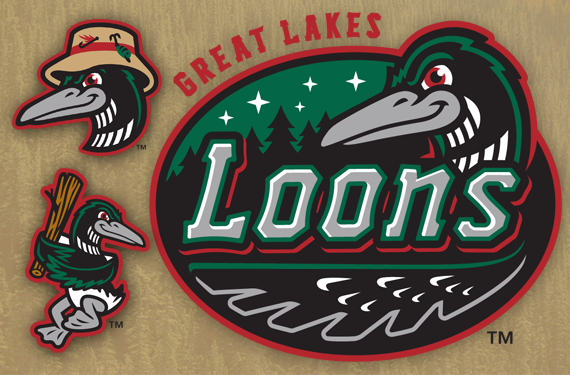
The Great Lakes Loons, Class A affiliate of the Los Angeles Dodgers, just moments ago unveiled a new suite of logos. The new look, designed by the prolific firm Brandiose, is a substantial update to the team’s previous logo, which had been around since the Loons’ inception in 2007. It’s the last major update to a minor league baseball identity that we’ll see this offseason.

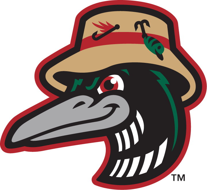
The new logos focus on Michigan in the summertime, featuring a scene that evokes s’mores and ghost stories around a crackling fire.
“We’re going really deep into that summer camp on Lake Michigan story,” said Brandiose’s Jason Klein. “They have fire pits and rocking chairs in that stadium. It’s like going camping in the woods, that brand.”
 While the new look represents a substantial update to the original logos (at right), it is not a wholesale change. The color palette is nearly the same as the previous logo set, save for a slightly lighter green, and the primary figure is still the loon itself.
“It was important that there was some consistency with our previous identity” said Chris Mundhenk, the team’s Vice President for Marketing and Entertainment. “We didn’t want to necessarily completely blow it up.”

The new logos have a similar feeling to the old, but while the previous loon had a docile, pleasant look about him, this new look feels a little more menacing.
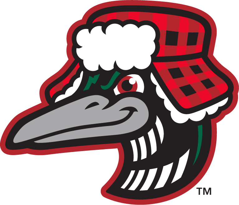
The most innovative logos in the suite are the two seasonal alternates above, which play into the disparate weather that fans in Michigan experience.
“Winters here are brutal—there’s really no way around it,” Mundhenk said. “Even into early spring, April, early May, we get rough weather. So we thought, how can we embrace that as part of our region? We actually worked with [Brandiose] on a secondary mark that’s a winter loon that I think is something that I think our fans are going to get excited about.”
Of course, you can’t have a winter loon without a summer loon.
“Being a northern climate team, your southern months are so important, and you try to pack as much as you can into it,” Mundhenk said. “You spend a lot of time outdoors. One of the alternate logos is a summer loon. We really like it because it speaks to the outdoors.”

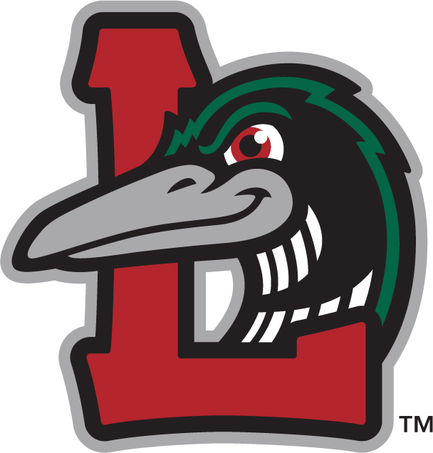
When the Loons are on the road, they’ll wear a logo that’s new to the team, but familiar to every baseball fan.
“Our away logo is the biggest departure from our original identity to our new identity,” Mundhenk said. “It has a more traditional feel. You think of interlocking logos, you think of LA or the New York teams. It has a bit of that classic feel to it.”


The loons have long had a bird holding a bat as part of their logo set (at right). Of course, the swinging character is a Brandiose signature, so they were not going to miss the opportunity to include an update in the revised identity.
The new loon (above) is swinging a piece of wood—which, if you’re following the summertime in Michigan narrative, is likely a log pulled directly from a pile by a campfire.


The logos will feature a proprietary font used in the wordmark, on road uniforms, and for numbers and names on jerseys.
Speaking of uniforms, the team’s home, away, and alternate looks are fairly traditional.
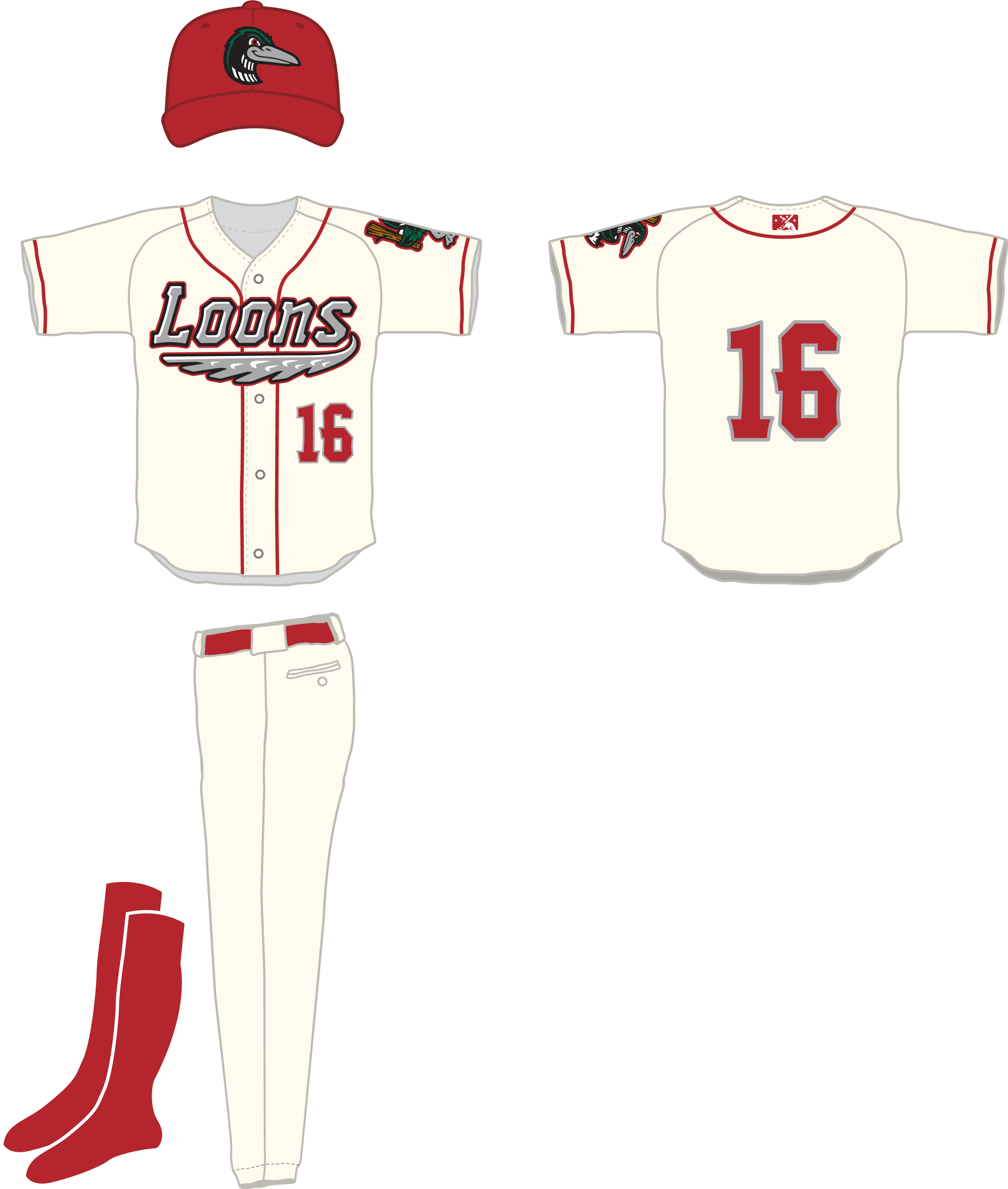


The biggest change in the Loons’ uniforms is that the alternate above is green rather than red, as it was previously.
All told, this is a strong update for a team that’s had a well-established but conservative identity. The new logo set offers classic-feeling marks that will keep longtime fans of the team and traditionalists happy, but enough variety and innovation to appeal to younger fans, too.
Related stories:
 Here there be the story behind the Dayton Dragons
  TinCaps Hold Vote to Choose Cancer Charity Jersey
  It’s Corny, But it’s Good: The Story Behind the Cedar Rapids Kernels
  Glory Days: The Story Behind the Clinton LumberKings
  The Apple of Our Eye: The Story Behind the Fort Wayne TinCaps
  South Bend Cubs Unveil New Logos

