

Corpus Christi, Texas, sits on the Gulf of Mexico, where recreational and commercial fishing are a big deal. So when you look at the identity for the Double-A Corpus Christi Hooks, the connection to fishing is obvious.
And indeed, if you call up the Hooks and ask them about the origin of their logo and nickname, they’ll send you a statement that begins like this: “The Hooks name acknowledges Corpus Christi’s association with both commercial and recreational fishing on the South Texas coast.”
However, as is usually the case, the story runs deeper than that.
In 2005, the city of Round Rock, Texas, 250 miles from Corpus Christi, went from having a Double-A franchise to having a Triple-A franchise. The Round Rock Express had been a Double-A Astros affiliate since 2000, but when the Triple-A Edmonton Trappers moved to Round Rock to assume the mantle of the Round Rock Express, the Double-A franchise moved to Corpus Christi to become the Hooks.

Both the Express and the Hooks are owned by Ryan-Sanders Baseball Inc., whose CEO is Reid Ryan, son of Hall of Famer Nolan Ryan. When it came time to name the new team in Corpus Christi, Reid Ryan knew what he wanted the team to be called, and his reasons went beyond a mere connection to the fishing industry.
“His dad had, in addition to his amazing fastball, a great curveball, which, in baseball parlance, is sometimes referred to as a hook,” said Dan Simon of Studio Simon, who created the Hooks’ logo. “Reid liked that tie-in.”
This makes two teams named for Nolan Ryan’s pitches, as the Round Rock Express’s name comes from the nickname “The Ryan Express,” inspired by his fastball.
Reid Ryan, who is now the president of the Hooks’ parent club, the Houston Astros, even had an idea of what the logo might look like, and faxed this sketch to Dan Simon.

“It was the proverbial scribbles on a cocktail napkin, although it wasn’t on a cocktail napkin, it was on some type of a piece of paper,” Simon said. “It was the stick figure equivalent of an anthropomorphized fish hook.”
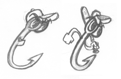
Dan Simon turned Reid Ryan’s cocktail-napkin doodles into the sketches above. In the interest of giving credit where credit is due, Simon notes that he is not a cartoonist, so he turned to character artist Kevin Bright, his former coworker from his days in the employ of the Los Angeles Dodgers, to help develop the body of the hook character.

With the character, named “Rusty Hook,” fully developed, Dan Simon set about creating the rest of the identity for the Hooks. This process was a bit out of sequence for Simon, who usually does not begin the process of developing a complete identity by creating a cap logo.
“Normally when I do an identity,” he said, “I tend to do the primary logo first and then everything grows from there. The reason for that is the primary logo usually has a character in it, it has a typographic element in it, it’s got all the colors that are going to be part of the system, and then really everything kind of grows out of there.”

For the details of the Hooks’ primary logo, which does not actually feature Rusty, we turn again to the formal statement provided by the team: “The Hooks’ primary colors of navy blue and light blue represent the ocean and sky. There’s a tip of the cap to the State of Texas on the lone star CORPUS CHRISTI banner, and of course the eyelets of the hooks serve as the o’s in the Hooks name.”

While the hooks serve as the double-O in the primary logo, Simon used those very same hooks to create an alternate CC logo. This logo not only serves as the road cap logo, but it’s also used on the team’s road jerseys. Simon suggested this deviation from baseball custom simply because “Corpus Christi” is an awful lot of letters to fit on a road jersey.

“What I told them was I don’t recommend putting Corpus Christi on the road jersey,” he said, “so let’s just use the CC as the left chest logo on the road jersey.” (That’s current Astro George Springer wearing the CC logo in 2013 above.)

The Hooks followed that suggestion, though a decade later, they asked Simon to create a “Corpus Christi” jersey for their 10th season, which he did using the hooks as C’s and the team’s custom typeface to fill in the rest.
The Hooks franchise has been around since 1968, playing with six names in five cities, but they’ve finally found a long-term home in Corpus Christi. Their identity has remained largely unchanged since 2005. And while the identity is superficially related to their hometown’s connection with fishing, a peek beneath the surface reveals that there’s a little more to the story behind their nickname. Just when you expect one right down the middle, you can count on the Ryan family to throw you a curve.
Related stories:
 More Cowbell: The Story Behind the Visalia Rawhide
  Pilot Episode: The Story Behind the Lakeland Flying Tigers
  The Ocean Blue? The Story Behind the Columbus Clippers
  That Nashville Sound: The Story Behind the Nickname
  It’s Corny, But it’s Good: The Story Behind the Cedar Rapids Kernels
  The Story Behind the Carolina Mudcats: It’s the Fish, Stupid
  Rancho Cucamonga Quakes are the Picture of Stability