
A move that’s been a year in the making finally came to fruition today, as the Michigan Wolverines unveiled their updated identity for their transition to Nike’s Jumpman branding.
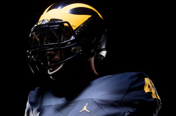
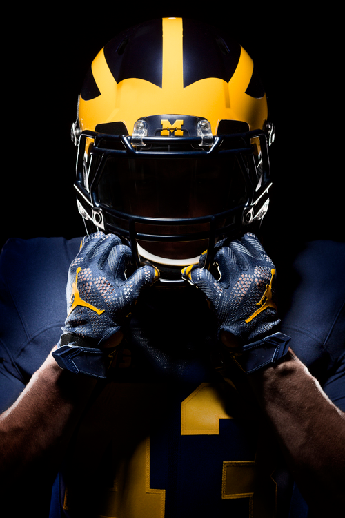
While each sport at Michigan is receiving new uniforms, the highest-profile unveiling involved the prestigious football program’s uniforms. If you were expecting a radical change in that regard, then you were mistaken. This is Michigan, so you know what you’re going to get: Extremely simple maize-and-blue uniforms that are topped with the classic/iconic winged helmet.


Additionally, the team is keeping the Harbaugh-approved throwback-esque uniforms that they wore last season under the Adidas umbrella. So, Michigan wearing all-white on the road won’t be a one-year wonder for the Wolverines. Instead, it’s a look that you might want to get used to as long as Jim Harbaugh is coaching the team.

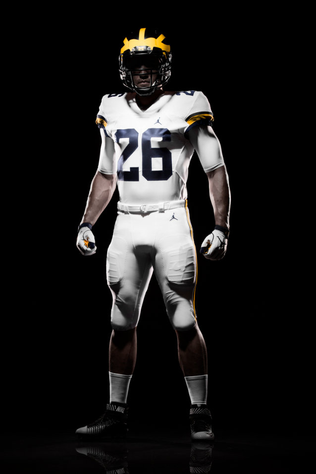

Also, other changes appear to be a slight shift in the shade of maize gold, and an updated font/number set.


Personally, I’ve always been a fan of stylized block numbers, so I approve of this interesting little wrinkle to Michigan’s uniform set. It’s modern but traditional at the same time, which is the happy medium that I personally look for when it comes to uniforms.
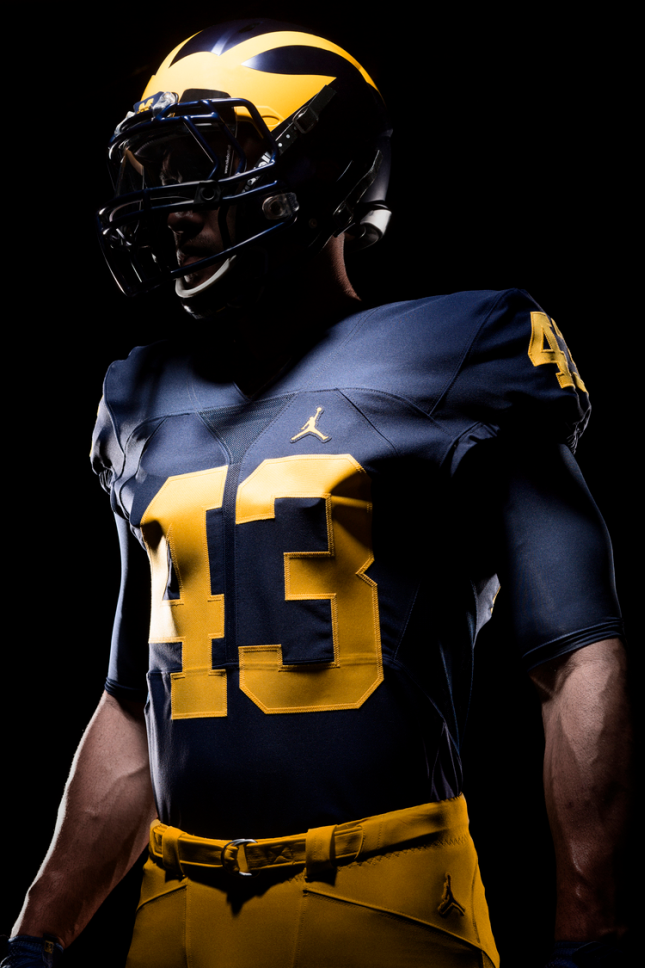
Granted, it’s a bit odd to see the Jumpman logo on a non-basketball unform, but I’d imagine that we’ll all get used to it sooner rather than later. Meanwhile, ESPN’s Darren Rovell had an interesting note to share with us while he was at the unveiling:

At least Jim Harbaugh won’t have to go to Wal-Mart to pick up his khakis, now. Khakis and Jumpman logo aside, what do you all think of Michigan’s “new” look?
Related stories:
 Michigan Wolverines and Florida Gators will have college Color Rush game
  Nebraska Cornhuskers pay tribute to 1997 football team with mesh-numbered jerseys
  Nebraska will wear chrome alternate uniforms for 2016 game vs. Northwestern
  Duke Blue Devils football throws it back to the 1960s with bowl helmet
  Northwestern will pay tribute to 1995 Rose Bowl team with throwback look
  Michigan Wolverines football will wear all-white on the road for 2015
  University of Michigan will reportedly return to Nike
  Maryland Terrapins Unveil “Star Spangled” Football Uniforms