
![]()
The Miami Marlins are changing their logo for 2017.
Now, don’t get too excited or anticipate too much, the change is extremely minor, we’re talking “Cleveland Browns” minor… in fact that’s the new primary logo at the top of this post. You likely didn’t even notice the difference.
The Marlins are going “for a more consistent look across all their logos”, Miami Marlins director of creative services Eddie Fernandez explained to me over during a phone call earlier this week. “There were variations depending on what colour the logo was on, this way it’s the same.”
Fernandez is right, the Marlins branding guidelines perviously called for the “M” in the primary logo to be filled in black if it was on a light background and to be filled in white if it was on black, orange or anything “dark”. Now it will remain the same across the board.
Mr. Fernandez was quick to clarify (and this is very important to note) that this change is for print or digital applications only. The different variations based on colour we had seen from 2012 through 2016 will still appear on the Marlins caps and jerseys in 2017. This includes keeping the black “M” on the sleeve patch for the home white jerseys.
Here’s a side-by-side to show you how the primary logo has changed from last season to 2017:
![]()
Changes include the inside of the “M” going from black to white, getting rid of an extra silver stripe in the “M” (just above the blue), and the elimination of the “MIAMI” wordmark from under the logo. Combined those small changes add up to a much more clean look.
There is an additional change which is only visible when the logo is applied to a dark background, and that is a new wedge of white added to the marlin and continues around the entire outside of the logo, as you’ll see below:
![]()
The changes are minimal, but it’s an upgrade overall, the “MIAMI” wordmark which seemed unnecessary but still served a purpose making it clear that they were changing the name of the club when first introduced for the 2012 season. Now that “Miami Marlins” rolls right off the tongue it’s safe to remove, eliminating the wordmark also increases the size of the main focus of logo.
Related stories:
 MLB Releases 2019 Spring Training Cap Collection
 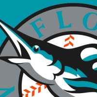 A Teal Treat: Marlins Throw Back to 1993 This Weekend
  Miami Marlins will all wear number 16 in tribute to Jose Fernandez
  Marlins Bring Back Grey Jersey, Drop Orange Caps
  Camo Caps to be worn by all MLB Teams, Full Gallery Here
  New MLB Uniforms… In-Action!