

When the Sacramento Kings kicked off the NBA’s rollout of new uniforms, I mentioned in our post on the topic that we probably weren’t going to see too many teams make major changes with their uniforms. Teams like the Kings, Pistons, Celtics, Thunder, and Raptors haven’t made major changes. However, it appears that the Cavaliers are going to have a new design coming, and the Pacers went ahead and officially unveiled their brand-new look as well.

The first thing that caught my eye was the fact that the Pacers decided to put their city name and nickname on the front of the jersey. This is a design element that you see in college basketball and lower levels of basketball as well, and it’s something that you rarely ever see in the NBA. However, given the Pacers’ past efforts to pay tribute to the lower levels of the game (by paying tribute to a movie about high school basketball from a long, long time ago), it’s not a surprise that they’d go down this route.
What is a surprise is the fact that the Pacers combined an old-school idea with a decidedly-modern striping pattern on the uniform. Here’s their reasoning:
Both uniforms also feature unique lining along the sides of both the jersey and the shorts, featuring dynamic gold lines on blue piping. These dimensional lines invoke the imagery of Indiana farmland and are a physical representation of growth, tying into the notion that basketball is grown in Indiana.


While the Pacers didn’t touch their primary logos, they did add a couple of secondary logos — namely a “state icon” logo and a seal logo as well, which further expands on the whole “Indiana farmland” thing going on with the striping pattern.
![]()
![]()
Finally, the striping pattern makes a sublimated appearance on the Pacers’ new court design as well. The playing surface also features a much larger center court logo, and the “state icon” logos also make an appearance as well. It’s a simple court, but there’s just enough involved to make things interesting as well.

Overall, I’d say that I’m a fan of the new logos and the court looks pretty nice as well. However, I’m not really impressed with the uniforms. The idea of going with the full team name on the uniforms was actually a very nice one, but if you’re going to go with an idea like that then you should probably go with an old-school design as well. It just seems like the old-school idea there is clashing with the new-school piping.
With that being said, I’d imagine that if you’re a fan of modern-looking uniforms then you’ll probably like it no matter what. Are you in this camp, or do you agree with me when it comes to the uniforms? What do you think of the overall refresh for the Pacers?
Related stories:
 Denver Nuggets switch to navy with new uniforms
 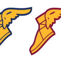 Cleveland Cavaliers will have new uniforms for 2017-18 season
  Celtics Announce GE Advertisement on Jersey in 2017-18
  Indiana Pacers will continue wearing “Hickory” uniforms in 2016-17
  Indiana Pacers Celebrate 50th Season in 2017
  2013 NBA Phantom Conference Champs Merchandise
  NBA Ready to Take us all Back to the ’90s
  T-Wolves/Pacers ABA throwback game pics