

Ever since the Minnesota Timberwolves unveiled their new logo set, there’s been plenty of anticipation about what they’d look like in their brand new uniforms for the 2017-18 season. Now we know exactly what they’ll look like after the team unveiled their new uniforms for the 2017-18 season, and it’s definitely a huge departure from what they’ve worn historically and it’s also unique to anything we’ve seen in the NBA.

It’s safe to say that this striping pattern on the jerseys is unlike anything else in the league. The closest comparison I can think of is to what the Washington Wizards currently look like and even still, it’s definitely different from what they were. Again, this is a look that’s completely unique to the Timberwolves and their identity.
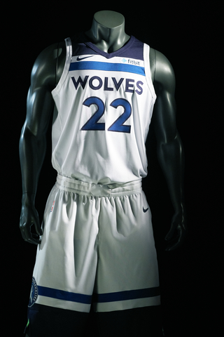
For those of you who were expecting Minnesota’s green to play a more prominent role in their uniform, you might come away from this unveiling a little disappointed. The uniforms are mostly blue, and that includes the Icon uniforms, which marks the first time in team history that they’ve decided to wear navy blue colored uniforms instead of the brighter shad eof blue that they were used to.

Meanwhile, it appears that the lone trace of green on the uniforms is on the shorts. It’s barely there, but it’s there.

I’d imagine that there’s a chance that we could see them go green with their third uniforms but for now, you’ll have to deal with the mostly-blue set from the Wolves. Overall, I’d imagine that the reaction to this set will be mixed. It’s not super-modern like what we’ve seen from teams like the Cavaliers and Pacers, but it’s still a fresher look than what you’ll see from teams with more traditional looks.
What do you all think? Are you a fan of the new look for the T-Wolves, or do you think that they should’ve gone in a different direction here?
Related stories:
 Minnesota Timberwolves will not wear fourth jersey until February 1st
  Timberwolves and Magic unveil jersey sponsors for upcoming season
  Cleveland Cavaliers will have new uniforms for 2017-18 season
  Minnesota Timberwolves will reveal new logo on April 11 Timberwolves will go with different shade of blue and green for revamp
  The Minnesota Timberwolves are probably headed for a rebrand
  Logo Links Mar 6, 2012: MLB Forbids Throwback, NBA Jersey Sponsors? T-Wolves/Pacers ABA throwback game pics