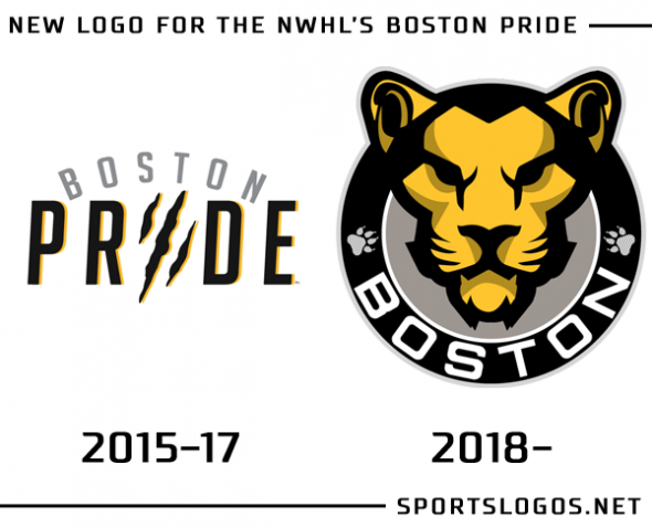
The Boston Pride of the National Women’s Hockey League just upgraded their logo in a big way.
Going from what was obviously the weakest of the logos in the four-team NWHL, the Pride dropped the simple wordmark with a scratch mark in place of the “I” in “Pride” for a roundel featuring the head of a lion, the city name arched below.
“The fans and everyone in the Boston Pride hockey community loved the uniform, but wanted something more than words,” NWHL Commissioner Dani Rylan was quoted as saying in the official release on the NWHL’s website.
The task of redesigning the Pride went to M Style Marketing, a marketing/brand-management firm based out of New York who had previously worked in the sports industry with the National Hockey League and CONCACAF.
“A stoic and fierce lion was illustrated to present the tough image of the Pride, the NWHL’s first champions”, Rob Striar, founder of M Style said in the official release. “The lioness is well known for its hunting prowess as well as ability to work within complex teamwork – perfectly summing up the Pride.”
New uniforms for the Pride will be released at a later date, the 2017-18 NWHL season, their third, will get underway with teams in Boston, Buffalo, Newark, and New Haven on October 28th.


