The year has come to a close and with that comes our announcement of the winners of the 2017 Creamer Awards, our sixth annual recognition of the best in new sports logos over the course of the past twelve months.
Before we reveal the results I’d like to take a minute to acknowledge and thank our judging panel for graciously volunteering their time to help determine the winners this year; a big round of applause for Brodie Brazil, Maury Brown, Tyler Kepner, Zach Lowe, Paul Lukas, Jay Onrait, Rob Neyer, Ray Ratto, Jesse Spector, and Greg Wyshynski this ridiculously talented group of individuals joined SportsLogos.Net contributors Demetrius Bell, Paul Caputo, Clark Rasmussen, and myself Chris Creamer in casting ballots ranking their top three choices in each category. We’re also including the ballot “cast” by those who participated in our special vote held yesterday, the top three in each poll getting a vote equal to those cast by our judges.
Logos were only eligible for consideration of these awards if they made their in-game debut during the 2017 calendar year, so a logo unveiled in 2017 but not scheduled for use until 2018 would be featured in our awards next year.
As the late, great Tom Petty once said, “Don’t bore us, get to the chorus”. Let’s get to it.
We’ll kick things off with the best primary logo of the year, recent winners of this award include the Toronto Maple Leafs in 2016, and the AHL’s Milwaukee Admirals in 2015.
The nominees:
Minnesota Timberwolves (NBA), RARE Design
Memphis Redbirds, (PCL Triple-A), Studio Simon
Lynchburg Hillcats (CRL Single-A), Brandiose
Kootenay Ice (WHL), Fanbrandz
Edmundston Blizzard (MJHL), Productions Rouj
Boston Pride (NWHL), M Style Marketing
Portland Trail Blazers (NBA), Nike
Norfolk Admirals (ECHL)
Killer 3s (BIG3), Todd Radom
Fayetteville Marksmen (SPHL)
And the Creamer goes to…
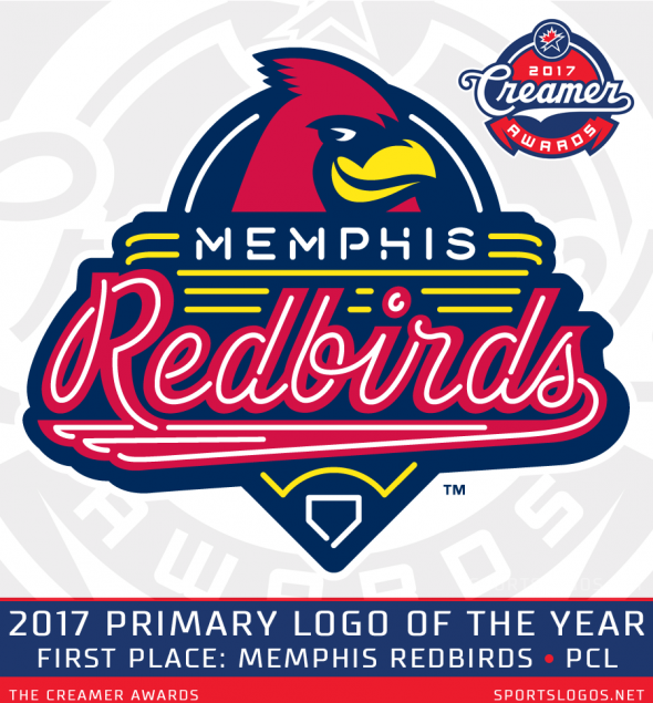
Memphis Redbirds
Pacific Coast League
Designer: Dan Simon, Studio Simon
In an era in which Minor League Baseball teams are ditching their traditional names for a more modern moniker such as Jumbo Shrimp or Baby Cakes, the Memphis Redbirds kept it simple and stuck with a name that both worked for them and kept a connection to their parent franchise, the St. Louis Cardinals.
“We could have gone several different routes, and I always use the ‘Memphis Mudbugs’ as an example,” Peter Freund, owner of the Redbirds told SportsLogos.Net earlier this year. “You’ve got the Mississippi River, you’ve got the crawfish. We could have just done a total rebrand. That would be what has become more typical in minor league baseball. I almost feel like we were the outlier, we were the one that was unique as opposed to the other teams that were *attempting* to be unique.”
The logo features Rockey, the Redbirds mascot, peeking out from behind a neon sign with the team name above the bottom half of a baseball diamond. The use of neon signs throughout their identity a nod to the signage used throughout Memphis’ famous Beale Street. It’s equal parts team, city, and sport all while maintaining a close tie to the Cardinals throughout. If you can make all those elements work together *and* make it look good then you got yourself a winner, and that’s what the Redbirds have here, the winner of the 2017 Creamer Award for Best New Primary Logo of the Year.
Congratulations to Redbirds owner Peter Freund and Dan Simon of Studio Simon for their win! It’s the second Creamer Award win for Simon, who had previously won in this category in 2015 for the Milwaukee Admirals logo. Memphis appeared on 10 of the 15 ballots, getting a first place vote on four of those.
“The Memphis Redbirds logo looks like the greatest baseball themed diner I’ve never been to, where they had a stack of pancakes with strawberry syrup called The Musial or some such.” – Grey Wyshynski
“The Redbirds’ primary logo is a sharp, clever re-design that blends their parent team’s heritage (the cardinal) with something distinctive to their city (the neon). Brilliant.” – Tyler Kepner
Second place this year goes to the Minnesota Timberwolves of the NBA, designed by Rodney Richardson’s RARE. The Timberwolves made use of a popular secondary logo, updating it and incorporating new elements to give the team a fresh new look that feels like they should’ve been using for years.
“This logo managed to excel on a few levels. It’s a solid upgrade over their most recent logo, it’s a nice call-back to the roundel logo that represented the team’s first logo from its inaugural days and it’s just generally a striking logo to look at thanks to the shade of green serving as a positive contrast to the shades of blue that dominate the rest of the logo.” – Demetrius Bell
Our bronze medal goes to the Kootenay Ice of the Western Hockey League (love the hidden “ICE” in this logo), designed by the Bill Frederick’s team at Fanbrandz who gave this junior hockey team the identity update they so desperately needed. Well done!
“A complete night and day from their old logo, like it skipped two generations.” – Brodie Brazil
“Much improved. A classic junior hockey logo” – Jay Onrait
Congratulations to all our finalists! When you consider all the new logos to come out across the many different sports and levels of sport throughout the world to finish top ten or even top fifty is extremely impressive.
Speaking of top fifty… a look now at those top fifty overall primary logos. The top ten were determined by the judges scorecards while spots 11-50 were based entirely upon on the logo ratings readers of this site hand out on each logo detail page on the site.
The fan vote yesterday really helped the Edmundston Blizzard, who rallied their Twitter followers to have them finish first on that ballot, that alone bumped the Blizzard up two spots from ten to eight. Ice Cube’s new BIG3 three-on-three basketball league, with all logos designed by Todd Radom, made their presence felt — seven of their eight teams made it into the top fifty this year with the Killer 3’s leading the way finishing fifth.
***
Moving on now to our best new alternate logo of the year category, won last year by the Midwest League’s Great Lakes Loons, and the Utica Comets the year before that.
The nominees:
Rice Owls (NCAA), Torch Creative
Memphis Hustle, (NBA G-League), Memphis Grizzlies/Bryan Rumfola
Cleveland Cavaliers (NBA), Nike Design
Florida Fire Frogs (FSL), Brandiose
South Bay Lakers (NBA G-League), J Alexander Diaz/Erica Rodriguez
Binghamton Devils (AHL), Ben Douglass
Indiana Pacers (NBA), Indiana Pacers
Memphis Redbirds (PCL), Studio Simon
Iowa Wolves (NBA G-League), RARE Design
Bismarck Larks (Northwoods League)
And the Creamer goes to…
Memphis Redbirds
Pacific Coast League
Designer: Dan Simon, Studio Simon
Redbirds sweep! For the first time in the history of these awards a team has won both the primary and alternate logos of the year categories.
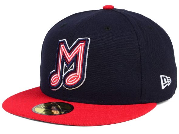
Memphis’ alternate logo, worn on the front of their alternate cap, combines the letter “M” for Memphis with a musical note for the city’s association with music, neon lights added inside the M-note (like the primary mark) as a nod to the neon signs on Beale Street.
“Our music note M—which is basically just an M, but it’s got the neon tubing and it’s shaped like a music note—that M is identifiable with Memphis,” Redbirds owner Peter Freund told us. “I think it’s fabulous, and I think that it’s timeless, and I think 20 years from, that music note M will always be associated with the Memphis minor league baseball team.”
I think Freund’s right, and what a great way to kick off a future timeless logo than with an award! The 2017 Creamer Award winner for best new alternate logo.
The Redbirds “M” logo finished first on 7 of the 15 ballots, appearing on 12.
“An alternate logo doesn’t have to encapsulate everything, and the Redbirds’ alternate logo understands that. It brings you the idea of Memphis, playing off the brilliant new primary logo with the neon effect, and adds the musical notes to further that cabaret theme — this team is another entertainment option in a city richly known for different entertainment. It plays even if the team eventually changes affiliation from St. Louis, and that’s good, because it’s a great logo.” – Jesse Spector
“It’ll be tough to find a Minor League cap that’s better-looking and just as distinctive as this one is. It’s unique without being gaudy and it’s also still fun. The primary logo is already excellent and the alternate logo doesn’t fall far from the tree of excellence.” – Demetrius Bell
“As alternative logos go, I’m always drawn to how it works on caps. Clean, and tying the rich music community in Memphis, the use of the neon and music notes for the Redbirds alternate makes me want to go order that cap, now. Will scale cleanly and clearly.” – Maury Brown
Finishing second to the Redbirds, hopefully not starting some sort of fierce rivalry here…
The Memphis Hustle of the NBA Gatorade League, designed in-house by Bryan Rumfola and the Memphis Grizzlies design staff. The alternate logo for the Hustle combines an “M” and an “H” together in a way which would make the Milwaukee Brewers and Montreal Expos proud. It’s a logo that looks like it could have been made forty years ago, then replaced during some ill-advised meeting in the 90s, before being brought back in all it’s glory in 2017. An instant classic, I say.
“This one stands out to me for its creative use of typography. It takes a moment to figure out what’s going on, but that’s part of its visual engagement.” – Paul Caputo
Rounding out the top three…
 The Bismarck Larks of the independent baseball Northwoods League who finished just ahead of the G-League’s South Bay Lakers to take the bronze. The Larks logo shows a yellow and silver lark brandishing a baseball bat in a fairly menacing manner, a departure from what you typically expect from a lark, the tiny ground-dwelling songbird.
“What I like best about the Bismarck Larks logo is that it looks like the bird is pressuring me to pay protection money and that he really would enjoy breaking my legs if I didn’t, which I believe is the true spirit of baseball.” – Greg Wyshynski
Congratulations again to all our nominees and finalists in our alternate logo of the year category!
***
We shift now to the league-side of things to look at logos celebrating events or just the leagues themselves for our next category, the best new league logo of the year. Our nominees…
MLB World Series, MLB Creative Services
NCAA Div II Sunshine State Conference, Joe Bosack
NCAA Men’s Final Four Phoenix, Joe Bosack
CPL All-Star Game Holly Springs, Skye Design Studios
BIG3 Basketball, Todd Radom
KHL All-Star Game Ufa, Denis Davydov
NHL Centennial, Fanbrandz
NASCAR, RARE Design
NHL Winter Classic St Louis, Fanbrandz
Northwest-Pioneer League All-Star Game Hillsboro, Studio Simon
And the Creamer goes to…
2017 All-Star Game – Hillsboro, OR
Northwest League/Pioneer League
Designer: Dan Simon, Studio Simon
Somebody’s gotta stop Dan Simon, this is his third award of the year and fourth overall. Incredible!
The 2017 NWL/PL All-Star Game hosted by the Hillsboro Hops (who have an incredible logo themselves) takes the prize in a category which had been dominated by the NHL for the past two years. The logo features the beautiful landscape of the Oregon and the Pacific Northwest with pine trees and mountains as well as a silhouette of the Hops home ballpark Ron Tonkin Field. A green hop is added at the bottom of the logo within a blue star. An all-around high quality logo, giving a Major League feel to a Minor League game. Congratulations to the Hops, the Northwest and Pioneer Leagues, and of course to Dan Simon who will be running out of room on his office shelf by the end of this year.
“I’ve never been to Hillsboro, Oregon but this logo made me feel like I’d be welcome there at any time and that’s mostly due to the font. Also, this logo did a great job of taking the primary elements from the Hillsboro Hops’ primary logo and turning it into a logo that would fit seamlessly into the Hops’ identity. It’s a lovely visual mark and one of the better logos that you’ll see at the minor league level.” – Demetrius Bell
“This logo accomplishes a lot without feeling cluttered. It incorporates the Hillsboro Hops’ logo as well as some iconic scenery from the Northwest League’s environs, and maintains a pleasant, eye-catching color palette.” – Paul Caputo
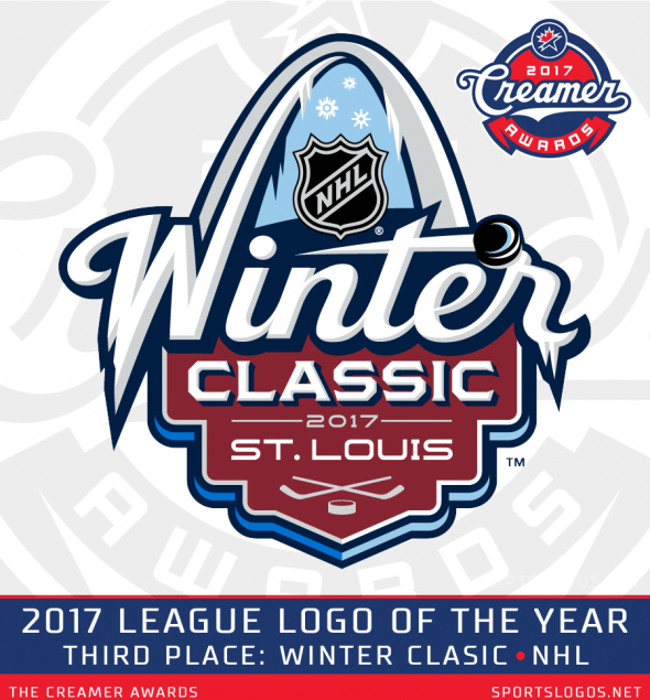
While the first place winner finished well above the rest, the battle for second place was tight with just a single vote point making the difference. Not that it was too important to those involved as both second and third place were National Hockey League logos designed by Fanbrandz:
“Speaking as a hockey writer, it’s not often the NHL gets something really, really right, but look at this logo. It’s simple, it conveys the epic nature of the centennial and just looks important.” – Greg Wyshynski
“The St. Louis Winter Classic is my clear #1 out of the league logos. The use of the W that transitions into the Arch is a great use of lettering and enforcing the location.” – Maury Brown
The NHL had a solid year, as always, when it comes to their logos but they just couldn’t quite Hop one past Hillsboro to take home their third consecutive Creamer Award for league logo of the year.
Coming in fourth, and just barely missing out for the bronze was the league logo for BIG3 Basketball. The logo for the Kontinental Hockey League’s All-Star Game in Ufa, Russia finished in fifth.
***
Normally this is where we’d end the best and focus on the worst. I’m not going to do that this year, for two reasons… one, I’ve made far too many friends in this industry and I’m not too keen on the idea of giving any of them a black eye, and two, the MPLS City FC logo we gave this award to last year was so terrible that we couldn’t possibly top it. I suppose it worked, the team announced a new logo just a few weeks ago. The power of public shame I suppose, but no more of that.
Instead I decided to introduce a new category for the best team anniversary logo of the year, the nominees…
Toronto Maple Leafs (NHL), 100th
Los Angeles Kings (NHL), 50th
Brandon Wheat Kings (WHL), 50th
New York Knicks (NBA), 70th
Niagara IceDogs (OHL), 10th
Red Deer Rebels (WHL), 25th
Pittsburgh Penguins (NHL), 50th
Albuquerque Isotopes (PCL), 15th
Philadelphia Flyers (NHL), 50th
Sault Ste. Marie Greyhounds (OHL), 45th
I don’t think any of those are Dan Simon logos, so we’re probably looking at a different winner here.
The Creamer goes to…
 Toronto Maple Leafs 100th Anniversary
National Hockey League
Designer: Toronto Maple Leafs
This one wasn’t even close on the ballots, the Toronto Maple Leafs 100th anniversary logo finished first on eight of the fifteen ballots cast. The logo, a silver bevelled version of their new primary mark (which won the best primary logo category last year).
“The Maple Leafs Centennial Anniversary comes at a very special time in the team’s history,” Leafs president and alternate governor Brendan Shanahan said at the time. “It allows us to look back and celebrate the great players, accomplishments and special memories of one of the most important franchises in hockey, but at the same time, look ahead to the next 100 years and the start of an exciting new chapter in team history.”
The Leafs recently capped off their 100th anniversary celebrations by wearing throwback uniforms from the 1918 Toronto Arenas this past Tuesday for an afternoon game, played one-hundred years to the day of the first game in Toronto NHL hockey history.
“In the pantheon of clean, classic, and clear logos, I stagger to remember one as good as what the Maple Leafs have done for their centennial anniversary. It’s so simple, and clear that you could see it a mile away yet scale down small and it would translate well in both.” – Maury Brown
“The fewer words the better, and the Leafs got their message out with none at all.” – Ray Ratto
“So simple, clean, classy and classic” – Brodie Brazil
Coming in second place was the New York Knicks with their 70th anniversary logo…
Followed by the Philadelphia Flyers 50th anniversary mark.
***
Before we wrap things up, let’s once again acknowledge our judges, they’re all good people, I recommend you follow each and every one of them on Twitter and then subscribe to whatever publication or media outlet they happen to be presently contributing to.
Brodie Brazil – Is the host of both the Oakland Athletics and San Jose Sharks Pregame & Postgame Live shows on NBC Sports California. Twitter: @BrodieNBCS
Demetrius Bell who for the last four years has been keeping you up-to-date here at SportsLogos.Net on all logo and uniform matters mostly relating to college, soccer, and basketball. Also writes for Forbes and SB Nation’s Talking Chop blog. Twitter: @fergoe
Maury Brown is a sportswriter who focuses on the business side of baseball for Forbes. He’s also the owner of BizBall LLC and has a weekly guest spot on Fox Sports Radio in Portland, Oregon. Twitter: @BizBallMaury
Paul Caputo a regular contributor at SportsLogos.Net and is the man behind “The Story Behind” series here, which looks at the origin stories behind Minor League baseball names and logos. Twitter: @Count2Baseball
Chris Creamer is the founder and editor of SportsLogos.Net and has been doing nothing much else other than looking at logos and uniforms all day for the past 20+ years. Occasional contributor to NHL.com as well as The Buffalo News. Twitter: @sportslogosnet
Tyler Kepner is the national baseball writer for the New York Times who had previously covered the New York Yankees and the Mets. Has also spent time covering the Seattle Mariners for the Seattle Post-Intelligencer, and Anaheim Angels for the Riverside Press-Enterprise. Twitter: @tylerkepner
Zach Lowe is a senior writer at ESPN and considered by many to be one of the premier basketball writers in the world today. Previously has written for Sports Illustrated and Grantland, Lowe also hosts “The Lowe Post” podcast. Twitter: @ZachLowe_NBA
Paul Lukas should require no introduction to this audience, but just in case… he’s been a longtime contributor to ESPN and, of course, is the main man behind the legendary Uni Watch blog. Twitter: @UniWatch
Rob Neyer has been a sportswriter for over twenty years who has previously written for ESPN, SB Nation, and Fox Sports. Has authored six (yes, six!) baseball books. Twitter @robneyer
Jay Onrait is one of two anchors in on TSN’s SportsCentre with Jay and Dan, previously seen in the U.S. on Fox Sports 1. Beloved all across Canada, he’s been the author of two books, “Anchorboy” and “Number Two”, and once called SportsLogos.Net “awesome” on national television. Twitter: @jayonrait
Clark Rasmussen is a longtime contributor right here at SportsLogos.Net and played an extremely important role in the “Great Vegas NHL Nickname Hunt of ’16” and I imagine plans doing the same with Seattle. Red Wings history fans should check out his very comprehensive site at DetroitHockey.Net. Twitter: @detroithockey96
Ray Ratto has spent five impressive decades as a sportswriter in the San Francisco Bay Area, including time with the San Francisco Examiner and San Francisco Chronicle. Since 2010 has been a senior insider for NBC Sports Bay Area. Twitter: @RattoNBCS
Jesse Spector is currently a contributor to many including the New Jersey Devils, theScore, Deal Breaker, and Colorado Rockies Magazine as well as hosting two podcasts: “Locked on Yankees” and “Jesse Spector Is…”. Twitter: @jessespector
Greg Wyshynski is the Senior NHL Writer for NHL.com and host of two podcasts: ESPN ON ICE, which is about hockey, and PUCK SOUP, which is sorta about hockey. Can be found @wyshynski on Twitter.
***
That’s it for 2017, our twentieth anniversary year here at SportsLogos.Net (20th anniversary patches still available *cough*). I’d like to thank each and every one of you for your support and readership over these years; I’d like to congratulate all the winners, you’ll receive your Creamer Awards within a few weeks! Congrats as well to all the nominees, the teams, and their designers; as I said earlier in this post when you consider the avalanche of new logos that are introduced around the world during any given year, to be in the top ten is an incredible feat itself!
If you’re feeling like you need more awards, well then you can just take a look through our past five Creamer Awards posts as well: 2012, 2013, 2014, 2015, and 2016.
I hope you all have a very safe and enjoyable holiday season, and I look forward to you joining us back here again in 2018.


