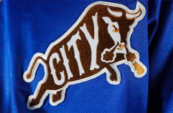
The Durham Bulls’ unveiled their 2018 uniform set yesterday, including a new “Bull City” alternate logo. The new logo features the classic bull from the team’s longstanding branding, with the word “City” added inside.
Designer Brian Begley, quoted in a statement, said this about creating the new look for a classic team: “Using just the bull from the primary logo, I created the lettering for, ‘CITY’ to fill the guts of this element. This design represents the winning Durham community with history and class.”
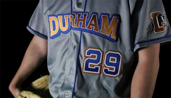
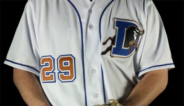
The Bulls’ announcement included three uniform sets. In addition to alternate uniforms featuring the Bull City logo, the team also unveiled updated road grays and home whites.
The gray road uniforms adopt a longstanding baseball tradition that the Bulls had been thwarting in recent years.
“Moving forward, it was important that ‘Durham’ return to the front of the team’s road jersey,” the team’s statement said. “In the last iteration of the Bulls’ away uniform, only the team name emblazoned the front. Now, the city the team calls home will be prominently featured for road games.
The home whites feature the classic D logo on the chest, which is a return to a look from the recent past, with a twist.
“The team’s new home jersey hearkens back to the Bulls’ uniforms from the mid-2000s, as the famous ‘D’ logo returns to a prominent spot on the front of the uniform,” the team said. “However, the numbers on the front and back jump off the jersey in the team’s burnt orange, a stark contrast to the blue ‘D.'”
The Bulls will take to the field in their new threads April 5.


