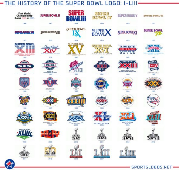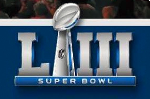
Thanks to the program for Super Bowl LII (and the many people on Twitter and via email who sent it to me) we’ve got ourselves a look at the logo that will be used for next year’s Super Bowl LIII in Atlanta.
Yeah, like we didn’t already know what it’s gonna look like.
Surprise, it’s the same. Maybe the shade of blue is a little darker:
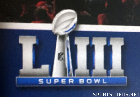
The logo follows the exact same format as what was introduced for Super Bowl LI last year, “L”s to the left of him, “I”‘s are to the right and here he is, Vince Lombardi stuck in the middle with blue.
What we could be witnessing here is a 4-5 year logo style rotation.
* Super Bowls 40-44 all incorporated a blue and red star.
* Super Bowls 45-49 all used trophy up top, stadium behind, numerals below
* Super Bowl 50 was a special circumstance for the anniversary
* Super Bowls 51-53 (54?) now using the same “L *trophy* III” design
* Super Bowl 55 something new?
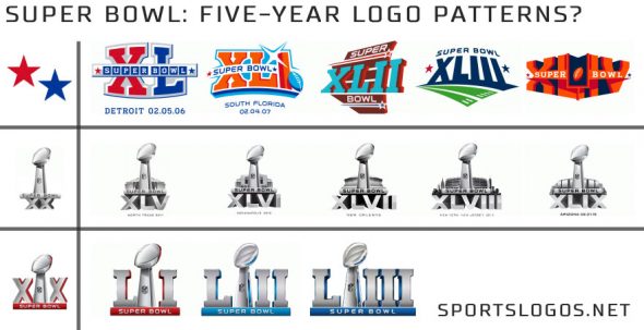
Either way, the nine Super Bowl logos from 45 through 53 are clearly heavily templated versus any other era; 40-44 may have some early attempt to incorporate some sort of common visual element from game to game, before moving forward (and then some) when they discovered it wasn’t strong enough.
