The Atlanta Braves have made a couple of changes heading into the 2018 season, but the one you’ll see the most of is the one you probably didn’t even notice happened at all… the Braves changed their colours.
It’s a change so minor, so insignificant that the team is unlikely to even make an official announcement about it, but it’s still the first adjustment to the Braves’ colours in over 30 years and it’s big news to those of us in the sports logo and uniform community.
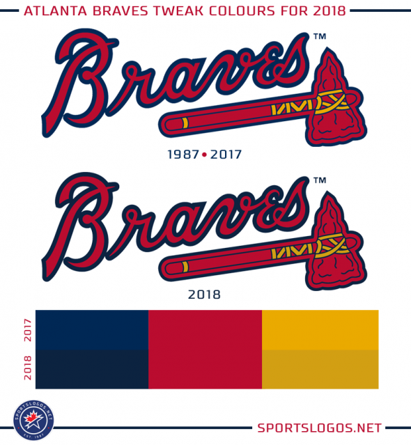
The blue and the gold are both darker; not noticeable when you see them on their own but side-by-side you can certainly see the difference. The red stays the same as it has since 1987.
The new blue is actually the exact same shade of blue the team used when they moved from Milwaukee to Atlanta in 1966, call it a deliberate retro move if you like but I figure this is probably just a coincidence.
“My take on it is that they’re doing this primarily to match the uniform manufacturer’s stock fabrics and threads.”, said Donovan Moore, founder and editor of the fantastic ColorWerx sports colour history site. “This is why we saw a slew of colour changes in the NFL back in 2012 when Nike took over the uniform contract.”
Teams typically have a few sets of colours depending on their usage — print, digital, web, textile. Atlanta has used a darker blue as their textile colour than what you’d see for all other uses.
“The old Navy blue was essentially a ‘dark Royal blue’ for all intents and purposes, matched to a very dark Navy blue cap and fabric/thread color. [The new Navy blue] is a much more standardized colour and probably eliminates the disconnect between the print/digital format and what is worn on-field.”, Moore added. “Most fans won’t notice the Navy change, and certainly not the change in Gold, but I believe it was probably changed to better match the caps”.
In a later message Mr. Moore pointed out the new Braves gold is identical to the lighter shade of the two used by the Jacksonville Jaguars; the southeastern teams sticking together.
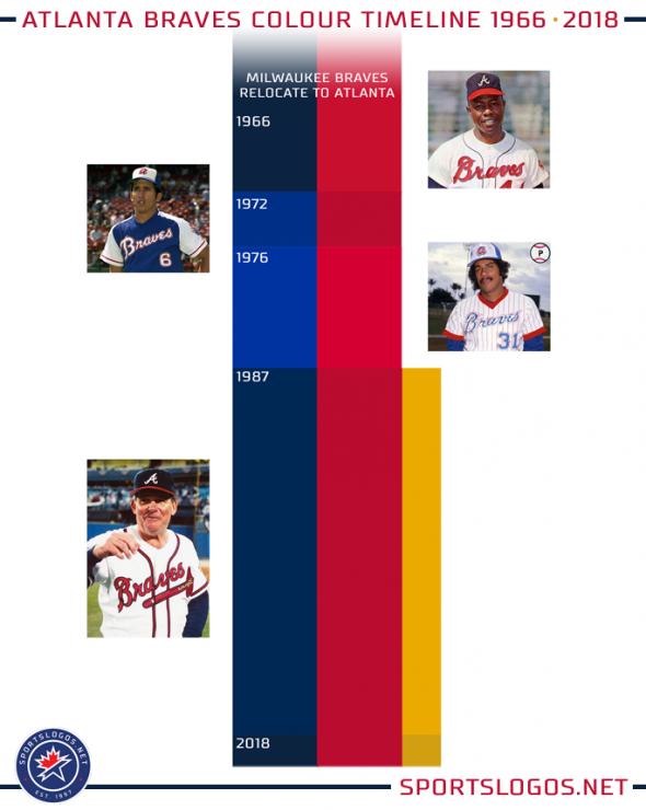
The Braves have gone through a few colour changes in their 43 seasons since heading south but have always stuck to a predominantly blue and red look; the biggest deviation from that norm was, of course, what happened in the 70s and 80s. While those uniforms were quite different for the club, when you look at just the colours over the course of their history it’s been a fairly consistent march:
We contacted the team this morning about the change and haven’t yet heard back, we’ll update this post if/when we do. (updated at end of post with comment from team)
Atlanta joins a few other Major League clubs to tweak their colours in recent seasons, the Colorado Rockies were the last to do this when they significantly (at least, I think so) brightened the shade of purple they use across the board prior to the 2017 season.
***
UPDATE Feb 28/18 9:30pm ET:
The Atlanta Braves emailed me with an official explanation for why this colour change was made.
“We changed the navy to match the navy in our caps and uniforms. The gold is also darker to match the gold thread in the jersey.” said Insung Kim, creative director for the Atlanta Braves. “The old navy would sometimes print as a royal blue or look blue on poorly calibrated screens. The new navy is a true navy that looks consistent across various platforms.”
Like we thought, an update of the print/digital colours to create complete consistency across the entire set. Kim also noted that their use of the exact shade of navy blue as the 1960s Milwaukee/Atlanta Braves was indeed intentional (so not a coincidence as I had earlier theorized).


