
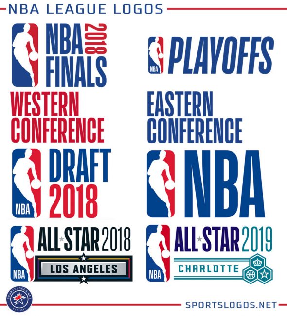
The National Basketball Association has adopted a standardized look across the entire league for anything at the league-level: the All-Star Game, the Draft, the Playoffs and Finals, both conferences, and the logo of the league itself.
They all follow the same format, the NBA logo is to the left and whatever the title of the event is written to the right in a modified version of “Action” font, customized for the league; the typeface is intentionally tall and lean, according to the league this typeface “embodies the NBA game and its athletes”… because players are tall and lean.
It creates a consistent look across the league, likely intended to increase brand recognition for a global audience. There’s no NBA event that does not include Jerry West’s famous red, white, and blue silhouette as the main feature; if you’re watching any NBA event, if you see anyone wearing anything from any event the NBA logo is always the most prominent element of it.
Of course, there’s also plenty of problems that come with using such a system, and instead of hearing my thoughts about it I thought it’d be best if we went right to the experts and asked three of the biggest names in sports logo design over the past twenty years to share their thoughts.
“A homogenized look for the draft and for the conference finals makes some sense, but it fails terribly for All-Star Games,” said Todd Radom, designer of several major league event and team logos as well as the author of the upcoming book Winning Ugly: A Visual History of the Most Bizarre Baseball Uniforms Ever Worn. “This event is a celebration of the league and of the communities that go to great lengths to host the event.”
“This particular style is a tough look to embrace,” Radom added. “The condensed letterforms are very cold and will likely be perceived by the public as being overly corporate.”
Over any other event, it was the standardization of the NBA’s All-Star Game logo which concerned those we spoke with; up until 2018 the game gave us an entirely different look from year-to-year, varying based on where the game was being played.
“Professional sports teams take great pride in hosting these events, staging an All-Star Game provides a showcase to build regional awareness, generate civic pride and when over, leave a positive lasting impression of the marketplace.” said Tom O’Grady, the NBA’s Creative Director for thirteen years in the 1990s and 2000s and now Chief Creative Officer of Gameplan Creative. “A team utilizes the All-Star Game logo to drive season and individual ticket sales, creating an ‘event within a season’. It’s a HUGE lost opportunity to brand the team, identify the market, and celebrate the energy and excitement of the NBA’s biggest exhibition”.
“[When I worked at the NBA] we looked at All-Star Game logos as a chance to push the envelope and think out of the box when it came to sport event logos,” O’Grady recalled. “Our creative teams loved designing All-Star logos because of the creative freedom we had creating something ‘cool’ “.
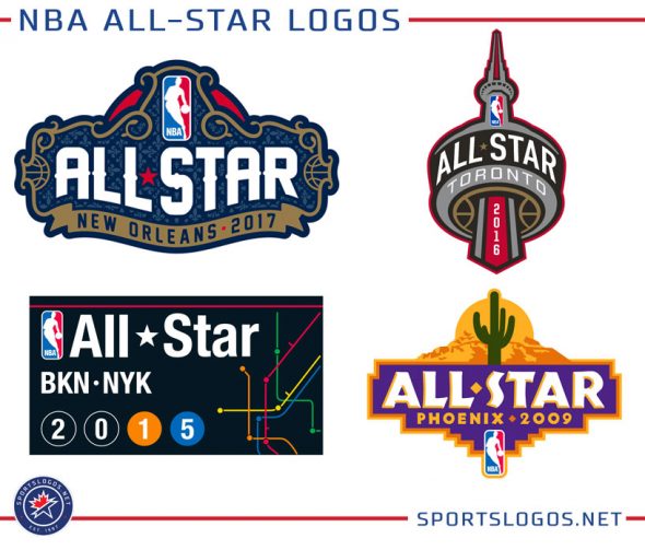
A look back over the history of NBA All-Star Game logos in recent years backs up O’Grady’s thoughts: the incorporation of the details of Bourbon Street architecture for New Orleans in 2017, Toronto’s CN Tower in 2016, a NYC subway map for the Brooklyn-New York joint host in 2015, a cactus and desert scene for Phoenix 2009. It’s even more evident and fun the further back you go, Cleveland’s electric guitar skyline in 1997, San Antonio’s chili pepper Alamo in 1996, and Phoenix again in 1995; the instant you look at the logos you know where the game is played, it gives something for city hosting to rally around and wear with pride while also introducing new design styles to the world of sports logos.
While the NBA Finals mark itself had been recycled from year-to-year for many years now, this particular design – again using the same format as everything else – took away anything that would suggest the NBA Finals are anything special, it’s basically on par with the new NBA Draft if you were to go by the logos alone.
“[Championship game logos] are an expression of the specialness of that dramatic moment when champions are made and take their place in history,” said Bill Frederick, Creative Director at Fanbrandz, who also cited the Super Bowl in his examples of other such offenders. “A league’s crafting of an event brand is a recognition of the stuff that ‘fan experience’ is made of, ‘cookie-cutter’ event branding is sadly a move away from the deeper attachments we have with our sports and a surrender to corporate efficiency.”
“It always seemed to me that the traditional script approach [of the NBA Finals logo in the 2000s] was elegant but stuffy,” added Radom, who had worked on several previous NBA Finals logos. “Showcasing the Larry O’Brien Trophy makes a lot of sense, and I’m missing that here, frigid letterforms aside”.
“The standardization of jewel event branding is contrary to the now popular concept of ‘fan-experience'”, said Frederick. “For many fans, jewel events are annual pilgrimages, for others a once-in-a-lifetime opportunity; for most of us, it’s a time to get together and tune-in with friends and family.”
We asked the league to explain why they went to a standardized format for their logos and they responded with a link to a press release from last summer. That release didn’t explain much about the move to the new look across the board, other than maybe this quote from NBA Chief Marketing Officer Pam El which said it “strikes the right balance between honouring our iconic logo and allowing us to be consistent and further adapt to changing digital and media landscapes.”
Ok.
Like Mr. Radom suggested above, I can see going this route for the NBA Draft and the conference finals, these are events which don’t really do much in terms of merchandise and people rarely associate a logo with them too much if ever at all…
But the All-Star Game? The NBA Finals? C’mon. You expect us to believe that this is how logo design is naturally evolving? We go from the dancing cactus in Phoenix 1995, to a stationary cactus in Phoenix 2009, to… what? A small cactus shown as a mobile app icon in the bottom right corner in Phoenix 20-whatever? Bah.
Fortunately we still have Major League Baseball developing a unique look every year for both their All-Star Game and World Series/Postseason, the only one of the big four North American leagues to still do so. The NFL and NBA both recycle the design from year-to-year, the NHL uses the same logo each season for the Stanley Cup Final but annually develops a new All-Star Game logo.
Let’s hope the NBA reconsiders this approach and gives not only us fans of creative design but also those who yearn to feel pride in their home city and see it broadcast to the world; it was just one of the many local benefits and incentives to hosting an NBA All-Star Game… sadly no more.
Related stories:
 New 2019 NBA All-Star Game Jerseys Leaked
 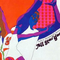 The Greatest NBA All-Star Program Cover Designs
  Drake Logo Memes Because Content
  2013 NBA All-Star Game Uniforms Unveiled
  Rockets Unveil 2013 NBA All-Star Logo, Is It Templatey?