

Back in March, I reported about new information I received concerning the Denver Nuggets and Memphis Grizzlies adjust their colour schemes along with some logo changes for the 2018-19 season.
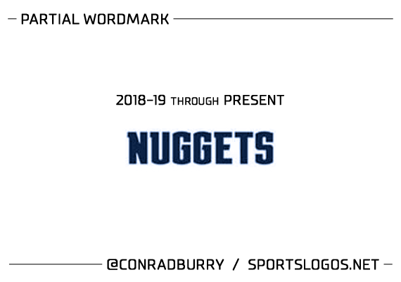
Now, just a couple days ago, a further piece of evidence surfaced on the European Trade Mark And Design Network. The below trademark has been filed for this specific typographic styling of “NUGGETS”:

Here is a slightly enlarged view of the wordmark, with my own colouring to the match the Nuggets shade of navy:
After studying the wordmark, I noticed many similarities to the existing custom typeface that Austin Peay University uses (designed by the ever-talented Joe Bosack & Co.):
![]()
It appears that this new Nuggets wordmark is very close to an “extended” version of the Austin Peay typeface. Taking that into consideration, here is a *speculative attempt* at what a full Nuggets wordmark *might* look like:

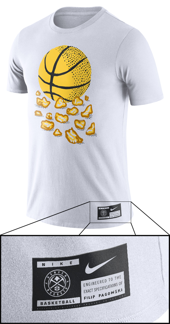
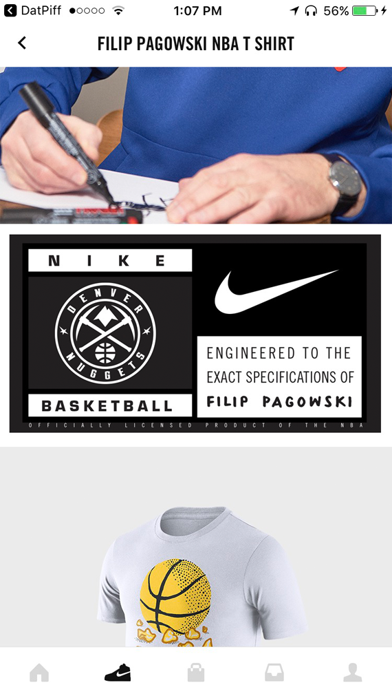
UPDATE: The keenly observant Troy Faulk shared a screenshot with me showing a clearer view of the Nuggets new Global Logo, as seen on the jocktag of the recent Filip Pagowski Nike t-shirt. Here is a full-view of the shirt and tag, along with Troy’s screenshot:
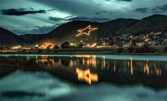
Troy’s screenshot helped me piece together a better speculative graphic of the new Global Logo. It appears that the graphic on the sides of the roundel is the Palmer Lake Star, seen here:
![]()
In addition to this recent find, I have received descriptions from a reliable source detailing the new logoset for the Nuggets.
We obviously already know that the “Primary Icon” logo will be the newly rendered and coloured “mountain-pickaxes-basketball” logo and that the “Global Logo” will be (similar to) the roundel logo shown in the image directly above the previous paragraph in this post.
I’ve been told that the team will also have three secondary logos, described to me as:
(1) 1-colour basketball silhouette with crossed pickaxes behind it
(2) roundel logo containing a different phrase than the name of the team, with a basketball+pickaxe combo inside the roundel (this logo also contains royal blue)
(2) half-circle basketball silhouette with city skyline + mountain skyline in front of the basketball (this logo also contains royal blue)
What do you think of the seemingly new wordmark typeface that the Nuggets will be sporting in 2018-19? A better “Denver feel” to it? Too close to the Austin Peay typeface? What about the 3 supposed new secondary logos? Let us know in the comments below…
Related stories:
 Denver Nuggets’ Mile High City Uniform “Evolves” for 2022-23
  Nuggets, Grizzlies Making Colour Changes in 2019
  Denver Nuggets switch to navy with new uniforms
  Massive Leak Shows Images of 54 New NBA Uniforms for 2015-16
  Nuggets Mine Their Past, Skyline Logo Returns on New Alt Jersey
  What’s new in the NBA for 2012