I love it when companies play with their branding during a playoff run.
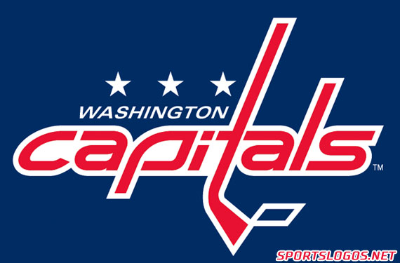
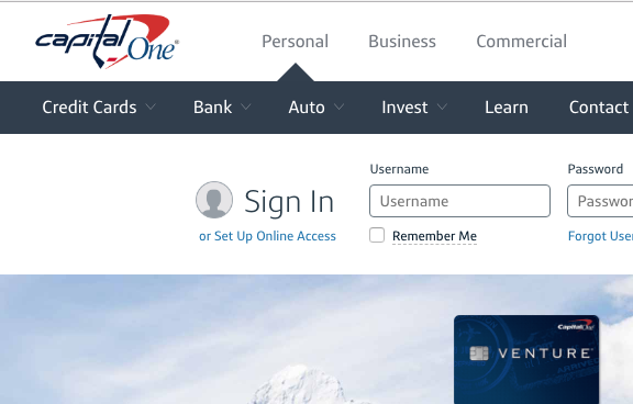
Capital One, the current naming rights holder of the home arena to the Washington Capitals have gotten into the fun of the Caps run to the Cup Final by changing their logo to feature the Capitals mark in place of their own:
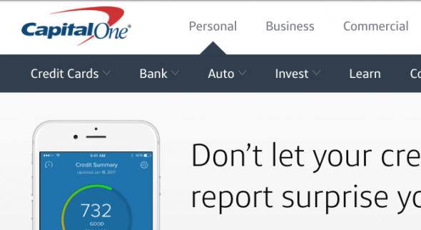
Here’s how it usually looks:
A few lifelong Golden Knights fans chirped back threatening to cancel their accounts in response to the harmless fun. For what it’s worth, Capital One seems to be ignoring that nonsense and continues to fly the Capitals version of their banner high above their site.
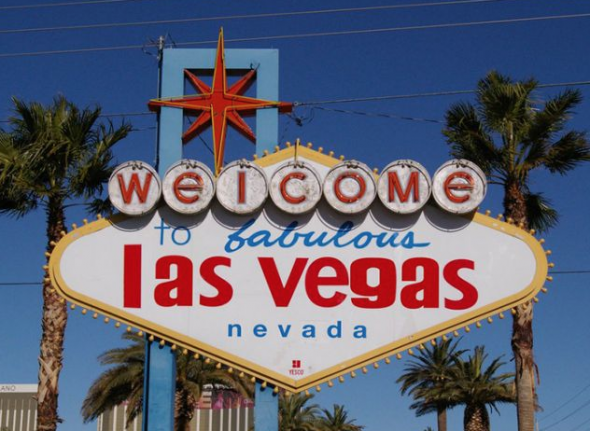
The City of Las Vegas is also having some fun with the series too, they Photoshopped a version of their iconic sign with all of the capital letters replaced with lowercase… No caps allowed! No word on if Capitals fans are now protesting the city.
The Capitals could of course get through this new policy, their logo also uses lowercase letters.
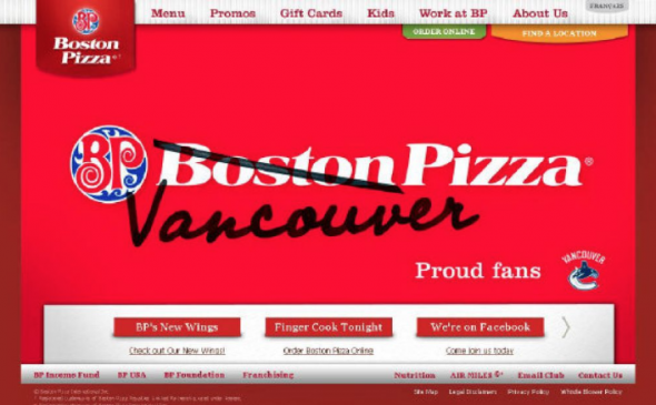
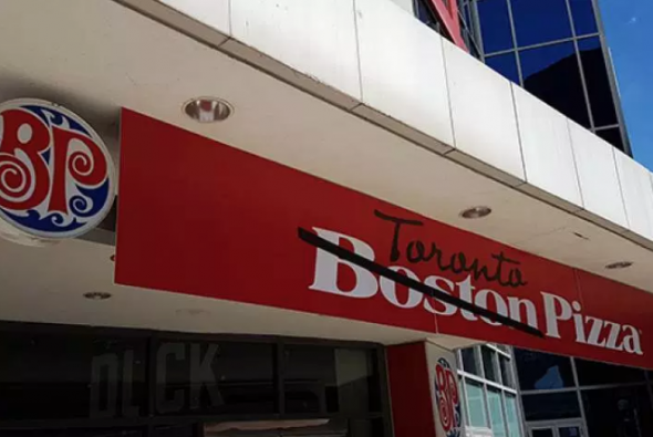
Previously up in Canada a few times over the years we saw something similar from Boston Pizza, a chain of pizza restaurants across the country, when they altered their name to “Vancouver Pizza” during the 2011 Stanley Cup Final between the Bruins and Canucks, and again in 2016 to “Toronto Pizza” at their location directly outside Rogers Centre during a big series between the Blue Jays and Red Sox near the end of that season.
So what do you think? Is this harmless fun or are you ready to cancel all your Capital One credit cards in a sacrifice to the hockey gods?

