
For the Atlanta Hawks, 50 equates to gold. From its 50th anniversary logo, first-ever secondary court design or the debut of Atlanta’s City Edition NBA uniform, Atlanta embraces all things gold. And, well, black.
“Knowing this is our golden celebration,” says Melissa Proctor, Hawks chief marketing officer, “we wanted to incorporate gold in the mark and on the court and have it stand out. The simplicity of black and white and letting gold stand out was important to us.”
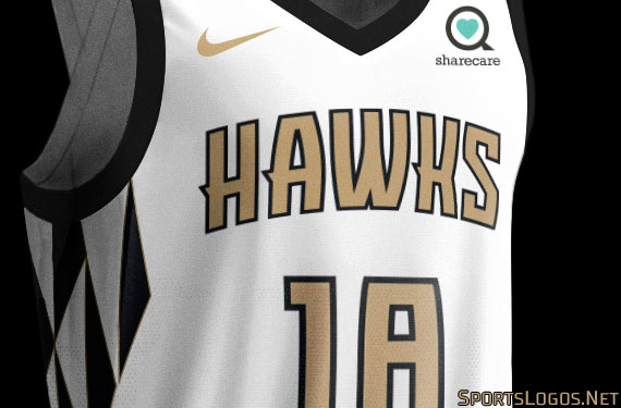
But it isn’t just about a black-and-white court design accented by gold. Atlanta knew the City Edition uniform proved central to the entire 50th anniversary programming. So, the Hawks welcomed more gold there and then created an entire departure from their norm with an updated feather pattern.
“We are going in a different direction as a team,” Proctor says. “It is a way to look back by celebrating with gold and a way to look forward to celebrate something never done before.”

Designed in-house in conjunction with Nike, the new City Edition uniform comes with a white background and black trim. It features the same Hawks wordmark and letter font as is standard across the club’s uniforms, but in gold. It is the side feather pattern, in black and white with gold accents, though, that gives it a differentiation.
“Let’s look at gold as a colour thread throughout and then our feather pattern and wings, an evolution and transition to create a cool design on the side of the uniform patterned on phoenix wings,” Proctor says. The Hawks and the city of Atlanta have tied to a phoenix rising theme for years and Atlanta wanted to make that pattern “represent flight and transformation as a team, an organization.”
The feather pattern incorporates “ATL” and extends from under the arm through the bottom of the shorts on both sides, akin to one long wing. “It is definitely a departure,” Proctor says. “When people see it, they ask if it is the Hawks because it is so different.”
With a Classic uniform already unveiled in a look that replicates Atlanta’s design from 50 years ago, the City Edition was about celebrating the past with a fresh perspective. “The feather pattern is not the same, it is stretched, it is elongated to make it look more like wings across the side,” Proctor says. “It is a cool differentiated design that signals change.”
Plenty of change.
“For me, I was surprised with how internally the reception has been for the City uniforms because it is such a departure from what we have done,” she says. “Last year was black and volt and the response (for this year) is ‘I didn’t think we would go there, but it is cool.’”
The Hawks knew having a City Edition available to tell a story allowed them to tie together both 50 years as a team and the transforming of the current club, whether the complete renovation of State Farm Arena or a roster loaded with youth. “It is the narrative of a team in Atlanta for 50 years, a constantly changing city and how we continue to evolve as well,” Proctor says.
With the uniform locked down early in the design process, the team created a 50th anniversary logo in black, white and gold, largely playing off the updated Pac-Man design — known internally as “EVO” for an evolution of Pac-Man — that already tied back to the history of the club. The team created differing colour versions of the logo, whether the full black, white and gold logo, a simplified black and white version or even a red version, allowing for versatility in use based on application.
“We wanted to utilize the primary mark as much as we could,” Proctor says. “It is all intentional. Internally we are trying to not put the 50th mark on everything. The EVO logo and this new 50th mark will be used interchangeably throughout the season. The idea wasn’t to overkill, but be thoughtful.”
That means you won’t see the mark plastered across every sign and design, but it won’t be inconspicuous either, such as with special-edition cups from concessionaire Levy that shows the Hawks logo evolution over time.
With the logo came a celebration court, the first alternate court design for the Hawks. The anniversary logo sits in the center with the current font and wordmark in white accenting the black border. “We were staying consistent with (the font and wordmark) so it feels like you are at a Hawks game,” Proctor says. “We had some designs that were very differentiated and bold, but we wanted a clean playing surface. We are going back to simplicity, what the courts were 50 years ago. We are going back to a simpler time and calling out our 50th season in a big way at center court.”

Proctor admits that early in the process with local agency Tantrum the court took a lot of design directions. But when it came time for league approvals and even the ability to see lines clearly on the floor, wild and crazy gave way to simplicity for something “equally strong.”
“I really love where we ended up, but the journey to get there was an interesting one,” Proctor says.
Embracing the black, whether on the court, in the logo or on the uniform, wasn’t something the Hawks set out to do. “We never saw it as heavy use, it is a differentiated one,” Proctor says. With the Georgia granite grey in the current colour set, going back to the original Atlanta days you’ll find plenty of black as a strong base colour. Black simply wasn’t used much in the more current decades, but black affords Atlanta a classic colour that has a strong history with the team.
The court debuts on Nov. 9 in conjunction with the City Edition jersey. The new jersey will only be worn when the Hawks play on the alternate court and every time the Hawks pull out the alternate court they will wear the City Edition, except for on Jan. 15 when they don the Classic Edition design.
“Celebrating 50 years as a team is different,” Proctor says. “It gives us creative license to do something outside the box. There is a little wordmark on the jersey that reads: ‘True to Atlanta.’ That was a special little nugget that people won’t see. We want to remember that as a mantra to the organization. As much as we can, we keep what we do true to Atlanta and true to the city. It makes it more special and relevant.”
Studio Stories is a monthly column from Tim Newcomb that explores the stories behind some of the designs dominating the sports landscape. Follow Tim on Twitter at @tdnewcomb
Related stories:
 The Pioneering Role of David Stern in NBA Logo, Uniform Design
  Studio Stories: Creating the T-Wolves Prince Uniform
  Studio Stories: Discussing, Re-Imagining City Unis with NBA ex-Lead Designer
  NBA and Stance begin to reveal team-colored socks for upcoming season