
This year’s Super Bowl matchup between Kansas City Chiefs and the San Francisco 49ers will make for one of the more classic uniform and logo matchups in recent memory.
In fact, footage from their second-ever meeting in 1975 looks nearly identical to the game we’ll see in Miami Gardens, Fla., on Sunday (6:30 p.m. ET on FOX) — save for a few small changes, including updated equipment and uniform materials.
With that said, we’ve decided to take a look back at the logo history of both teams ahead of Super Bowl LIV. For a complete history of the Chiefs’ logos, click here. And for a complete rundown of the 49ers’ logos, continue reading below.
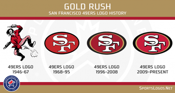
San Francisco’s earliest-known logo depicted a mustached gold miner (presumably from the 1849 California Gold Rush) dressed in a red button-down shirt and plaid pants. He’s jumping in the air, firing pistols while his hat is falling to the ground.
The 49ers’ colors were primarily scarlet and gray until the mid-1960s, at which time they introduced a scarlet and gold shield-shaped design featuring an abstract “49,” interlocking “SF” and contrasting football as their alternate logo.
That design was used as the basis for the iconic oval-shaped logo we see today.
First introduced in 1968, San Francisco’s classic design features the aforementioned interlocking “SF” inside a red oval outlined in black. It has undergone several minor changes throughout the years, though, including the addition of gold trim and drop shadows around the letters in 1996, as well as slight color variations in 1996 and 2009.
Interestingly enough, the 49ers actually introduced a new logo ahead of the 1991 season. It was met with an overwhelmingly negative response from fans, and was scrapped after just six days.
Photos via the San Francisco 49ers.
Related stories:
 Looking At The Kansas City Chiefs, San Francisco 49ers’ Super Bowl Uniform History
  Field Design For Super Bowl LVIII Between Kansas City Chiefs, San Francisco 49ers Revealed
  Kansas City Chiefs, San Francisco 49ers Unveil Uniforms For Super Bowl LVIII
  Why Did The Super Bowl Switch To Using the Same Logo Every Year?
  A Look At The Kansas City Chiefs’ Logo History A Look At Every Program In Super Bowl History Super Bowl Uniform History: Cartoon Edition Super Bowl LIV Uniform Matchup Announced