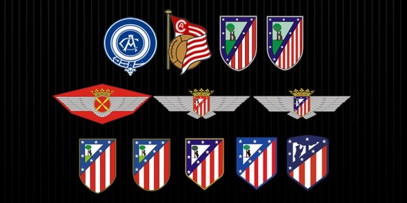
Spanish giants Atletico Madrid are due to move into a shiny new stadium for the 2017-18 season. Today was the day that they announced the name of that new stadium — the Wanda Metropolitano — and they also decided that this was as good of a time as any to unveil the new crest that they’ll be sporting as they move into that new stadium.
When you compare Atletico’s new crest to the one that they’re currently wearing, it’s pretty clear that this is more of a streamlining and tweaking than a brand new crest. All of the elements from the present crest are in the new crest as well, with the big difference being that all other colors besides red, white, and blue have been eliminated.
This was done on purpose, as Atleti wanted the focus to be on their main club colors.
The black, brown, green and yellow are eliminated, to focus on the main colours of the team, red, white and blue, modifying their intensity and tone to now be like the ones used in the first historical stage of the Club.
The link of the Club with the city of Madrid is reinforced visually. The badge reproduces the scene of the bear and the strawberry tree with more prominence.
Of course, the seven stars are a fundamental part of the badge. They have been relocated and their importance in the composition has been strengthened.
Since this crest is more of a tweak than anything else, the new crest fits perfectly in line with the rest of the logos that Atletico Madrid have had over the years. In fact, they were nice enough to give us a visual history lesson when it came to that.
So, what’s your verdict on the new crest? Is it acceptable, or should they have left it alone?


