
This is part 10 of a multi-part series chronicling the real-time development and design of a new logo for Baseball New Zealand. Check out our past “The Open Branding Project” posts here. *** This is one of those articles where a lot of work has happened since the previous, but the
Author: Brandon Moore
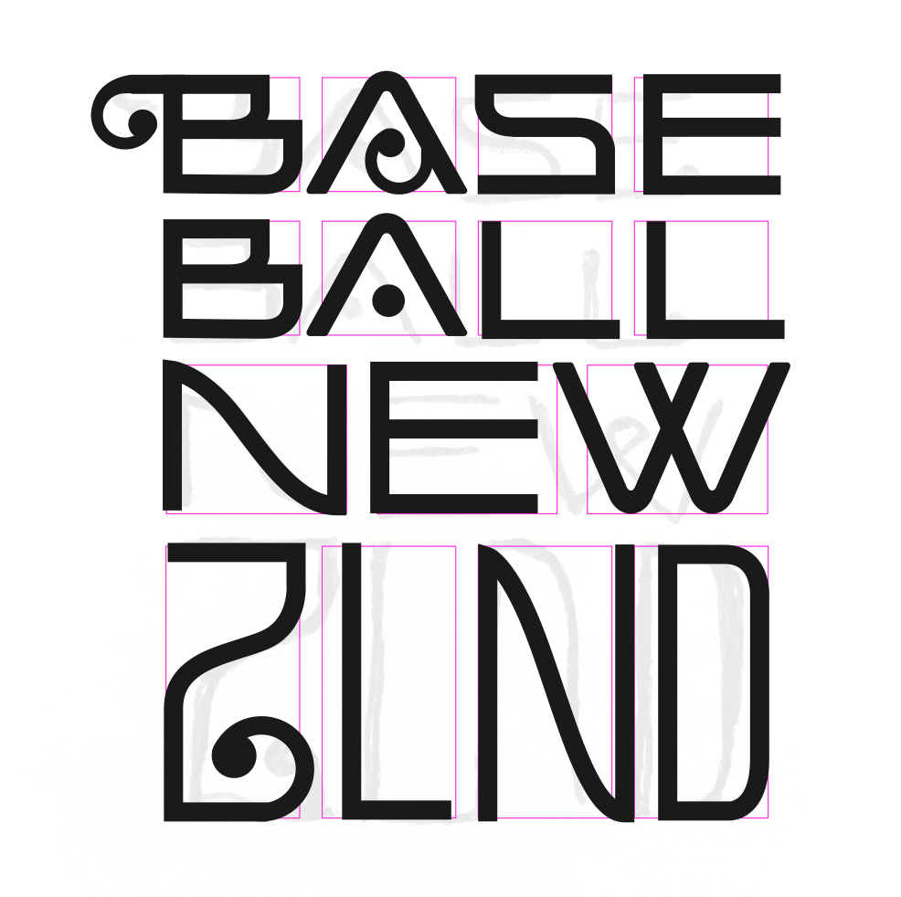
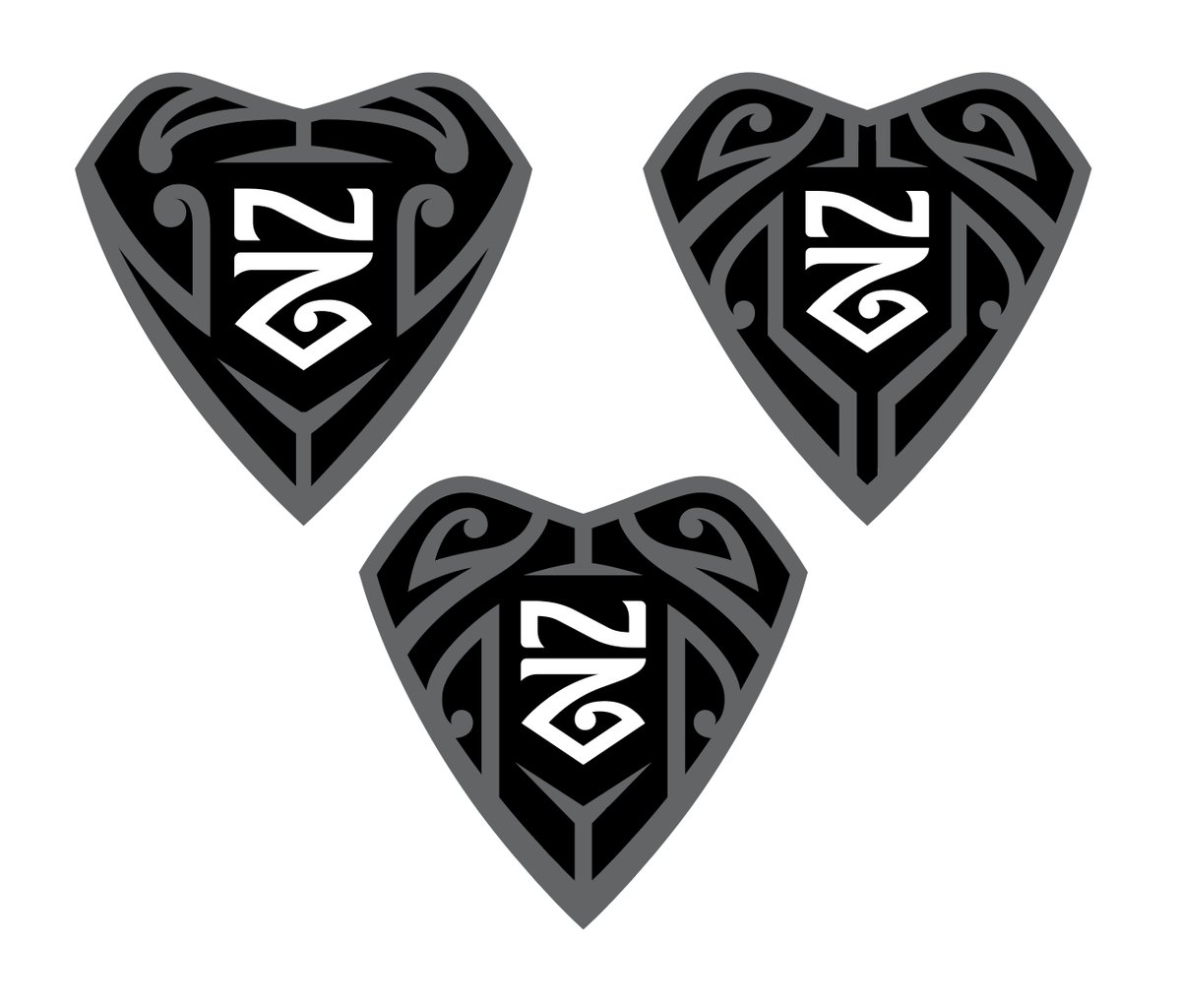
The Open Branding Project: Maori Patterns, Wordmark Challenges
This is part 8 of a multi-part series chronicling the real-time development and design of a new logo for Baseball New Zealand. Check out our past “The Open Branding Project” posts here. *** Hello readers, we’re just getting back into the swing of things after the holiday break. Our main focus
The Open Branding Project: Q&A #1
For our first Q&A, Brian and I have taken questions sent through SportsLogos.Net, Twitter, and BrandNew about Open Project: Baseball New Zealand. We’re just getting started on the project and will officially start in the coming days, so a few of the questions we were asked might have to wait
The Open Branding Project: A Crazy Idea & Baseball
“Subjective opinion is the rule of the day. ‘I don’t like it therefore it must not be good’. The public is not invited to sit in the lab. Design [has become] about communication with a public that’s unaware of motivations behind a design” – 99% Invisible, podcast It’s all too

Fix-It Friday: Carolina Panthers
The Carolina Panthers were an NFL expansion team in 1995 and, even though they updated their logo in 2012, have worn the same uniform since their inaugural year. While that design worked well twenty years ago, a lot has changed in uniform template design since then, and the Panthers current design

Fix It Friday: Cleveland Browns
For 2015 the Browns added a new logo, a brighter orange, and some significant uniform changes to their identity. What Nike has said about the uniform doesn’t add up for me; they’d make you think they felt obligated to honour tradition of a football team that resides in a blue-collar,

Fix It Friday: Dallas Cowboys
The Dallas Cowboys are widely considered to have one of the best uniforms of the NFL, an untouchable gridiron classic that no one dare alter, on par with the New York Yankees’ pinstripes. The uniform is absolutely a classic… but only because it’s been changed so little over the years,

Fix It Friday: Miami Dolphins
The Miami Dolphins’ 2013 logo update has drawn comparisons to cruise line branding, an opinion that is not too off base. Not surprisingly, the uniforms complete that look. The Good Those colours are absolutely gorgeous! Whether isolated or used together, the orange, aqua, navy, and white make for one of my favourite

Fix-It Friday: The Tampa Bay Buccaneers
The 1997 – 2012 Buccaneers uniform could be considered a modern classic, a near untouchable piece of design that could not possibly be improved upon. It may have had things that one would not care for aesthetically, but there were no major craftsmanship issues about it. The exact reasons the

Fix-It Friday: The Buffalo Bills
Welcome to the first in a series articles where we will be giving each team a proper critique, a grade, then try to repair the uniforms. Each article will feature a uniform concept with changes made (if any are needed at all) but this is not about what we would do to teams carte-blanche