

There was a time when you didn’t know a new uniform was coming until you saw the jersey presented to a player at the draft, in those dark days before those silly uniform and logo sites sprung up on the Internet and spoiled everything.
Anyways.
Tonight reminded me of those days!
We had five teams unveil new uniforms today, the Arizona Coyotes, Colorado Avalanche, Columbus Blue Jackets, Edmonton Oilers, and yes, even the Montreal Canadiens.
In case your head is still spinning from all of that, here’s a run-down of all the changes tonight:
Arizona Coyotes
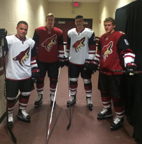
The Coyotes made the biggest splash of the night by unveiling a new home and road set.
While the logo stays the same the jerseys have added a large black stripe on each arm running from just below the shoulder almost to the elbow. From there it’s red-white-red before it runs white right to the cuff. There’s a single hem stripe, black on the homes and red on the whites.

On the home red jerseys we see an entirely new shoulder logo, a beige/sand coyote paw print with a black “A” on it. The road white jerseys feature a modernized “AZ/Map” patch, the font updated to match the new team wordmark.
Pants are black, socks feature red, black, and white stripes similar to those found on the arms.
Too much black guys… Make the black bits red and you might have a solid look here.

“We are fortunate to have one of the NHL’s best primary logos and as promised, that remains unchanged. We went through an extensive process with the NHL and Reebok which lasted about a year and produced numerous different uniform combinations. We wanted to maintain the classic design of our old jerseys but create a fresh new look that our fans can be proud of. The final product reflects the very best of those efforts and we are thrilled with the results.” – Coyotes Co-Owner, President and CEO Anthony LeBlanc
Colorado Avalanche

The Avs made a slight tweak to their jerseys, they’ve removed the “Yeti Foot” logo from the shoulder in favour of a re-coloured “CO” from the Colorado State Flag. As you can see from the image above the Avalanche are also wearing a 20th anniversary patch.

This icon was also worn on the shoulders of the old Colorado Rockies sweaters, in their amazing red/yellow/blue colour scheme, from 1976-1982.
Columbus Blue Jackets

Columbus has taken their popular alternate jersey logo, re-coloured it to match their primary colour scheme, and added it to the shoulder of their home and road jerseys.
I suppose this spells the end of the Civil War cap shoulder patch?
Edmonton Oilers
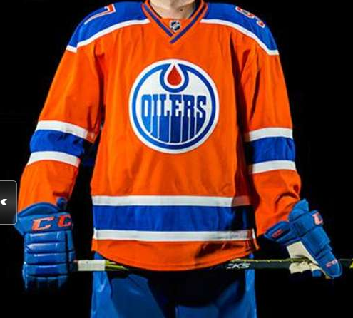
The Oilers unveiled a new orange alternate uniform in a way guaranteed to get the most eyeballs… by presenting it to the Number 1 pick at the draft tonight Connor McDavid.
Heavily influenced by the uniforms worn by the old World Hockey Association’s Oilers teams, the jersey is orange with blue shoulders and blue/white/blue stripes on the sleeves. The most interesting aspect of this jersey is the placement of the sleeve numbers, they’re up on the shoulders just like the original 1970s WHA uniform they’re based off of.

“This new orange jersey is an exciting addition to the roster of jerseys worn by the Edmonton Oilers over the last 40 years. It is both contemporary and fresh, while also paying homage to the great history of the organization. The wave of orange is going to look great during our Farewell Season at Rexall Place, and beyond.” – Oilers Entertainment Group CEO & Vice Chair Bob Nicholson.
The uniform will be worn 7 times throughout 2015-16, all of which will be at home, they’ll make their début during the Oilers home opener on October 15 vs St Louis.
Montreal Canadiens

The Habs making a uniform change… whaaaa? It’s okay folks, this is a change that seems so obvious it’s a surprise they haven’t *always* been doing this.
Collar changes from blue/white to just plain white and white laces are added to the collars.
Inside the collar the NHL shield on the home jersey will be changed to the French-language version, it will now read “LNH”. The English version of the logo remains on the road uniform.

Montreal wore collars like this, with laces, from the 1940s through the 1970s. They dropped the laces and eventually switched to a blue/white/blue collar in the late ’70s, their uniforms got Reebokified in 2007 which was the last time they made any adjustments to their look.
Related stories:
 Over a Dozen NHL Teams Getting New Uniforms in 2017-18
  Top Selling NHL Player Jerseys of 2015
  New Coach Needs Help: Blue Jackets Add Names to Practice Tops
  Coyotes Show Off Retro Jersey, Wearing March 5
  Phoenix Coyotes Announce Name Change for 2014-15 Season
  The Logocast Presents NHL Power Rankings