
The Milwaukee Brewers are heading into the future by going back to the past. At a media event tonight, the Brewers introduced their new primary logo, four alternate logos, and four new uniforms.
As we saw with the leak late last month, the logo is largely a throwback to the primary logo the team used from 1978-1993, referred to affectionately as the “ball in glove” logo. It’s been updated slightly, the colours darkened significantly, and it’s now enclosed inside a circle — it’s how we do 70s logos in the 21st century.

The new set was designed by Rodney Richardson and his team at RARE Design, based out of Mississippi.
New Milwaukee Brewers caps, jerseys, and more available here
“This is an exciting day for the Milwaukee Brewers and our fans as we usher in this next generation of Brewers baseball,” Brewers Principal Owner Mark Attanasio said in the press release. “As we reflected back on fifty years of the Brewers in Milwaukee, we turned to the past to inform our future. Our fans, our city and our state have been the fabric of our franchise since 1970, and they are the inspiration for our new look.”
Starting with the new primary logo, the ball-in-glove is back (it’s also an “MB”, which I’ve learned some had never noticed). The “webbing” of the glove is now connected, the baseball has updated its stitching and it’s now centered in the palm of the mitt. There’s a thin light blue outline near the outer edge of the circle.
You can see the differences between the two logos in our complete Brewers primary logo history graphic below:
New alternate marks include two new updated Beer Barrel Men (originally used, and seen above, from 1970-1977):
A State of Wisconsin logo, which appears on the sleeve of the two road uniforms:
And a new wheat baseball logo, which is on the sleeves of the home jerseys:
The new colour scheme is navy, yellow, and royal blue. The release states that the yellow represents Milwaukee’s “rich brewing legacy” and “joyful nature”, and the royal blue represents “the era that produced two postseason berths and a World Series appearance”. The Brewers wore the lighter shade of blue originally from 1970 up until 1993 including their appearance in the 1982 World Series.
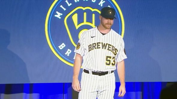
As for the uniforms, four were introduced. Two intended for home games and two for the road.
The home uniform is cream (a nod to the “Cream City” nickname for Milwaukee) with “BREWERS” arched across the chest in navy blue and yellow. Caps are navy blue with the new glove logo on the crown. The “wheat ball” logo and blue/yellow/blue stripes on the sleeves:


The new alternate home uniform is basically the same as the regular but with navy blue pinstripes and is white instead of cream. The striping on the sleeves is also removed:

On the road we have the usual grey option with “MILWAUKEE” arched in navy blue and yellow, sleeve stripes much thinner than those on the home creams. The Wisconsin logo on the sleeve.

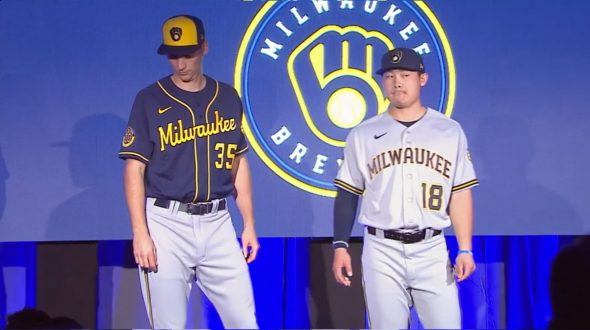

The road alternate is navy blue with Milwaukee scripted across the front in yellow with yellow piping down the front and around the sleeves. Cap is navy blue with a yellow front panel, again the Wisconsin logo is on the sleeve.


The patch seen above on the right sleeve of each of the uniforms is the Brewers new 50th anniversary logo celebrating the anniversary of their first season in 1970.
We’ll have much more on this tomorrow, please come back then to check it out!
New Milwaukee Brewers caps, jerseys, and more available here
Related stories:
 Pirates Release New Uniform, Tease A Second
  Studio Stories: Modernizing the Brewers Ball-in-Glove Logo