

More than one-third of all recorded great white shark attacks in the United States have occurred in an area of the Pacific Ocean called the Red Triangle, which lies along roughly 200 miles of the California coast from just north of San Francisco to just south of Monterey. Smack dab in the middle of this stretch is the city of San Jose, home to the NHL’s San Jose Sharks.
And while there has never been an actual shark attack in San Jose proper, in large part because it’s 30 miles inland, the Red Triangle is the main reason for the team’s name. That said, there were other factors.
In explaining the name, Dan Rusanowsky, the Sharks’ radio play-by-play broadcaster for almost two decades, cites Matt Levine, a longtime Sharks executive who played an integral role in bringing hockey to San Jose. “He said something like, ‘Sharks are relentless, they’re agile, they’re swift, they’re fearless, and we want to have an organization that has all of those qualities, too.'”
Also, “with the alliteration with San Jose and Sharks, it just sounds good,” said Rusanowsky, who was elected to the Bay Area Radio Hall of Fame last year.
San Jose was awarded an NHL expansion franchise to begin play in 1991. The name Sharks first turned up in a name-the-team contest that generated suggestions like Golden Skaters, Gold, Blades, and one that gave Rusanowsky pause just to say it out loud: “San Jose Sea Lions. Yikes.”
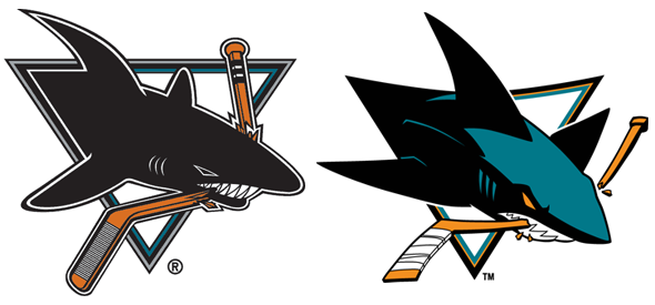
Both the original Sharks logo from 1991 and the updated version introduced in 2007 were designed by Terry Smith of Terry Smith Creations. The logo represents, in Rusanowsky’s words, “an aggressive shark swimming at top speed smashing through the opposition.”


 Secondary logos include an iconic dorsal fin, a version of the shark that includes the tail, and a rarely used tooth-themed wordmark designed by commercial artist Mike Blatt.
In the primary logo, the shark (probably a great white, one of the seven species found in the Red Triangle) is clenching a hockey stick in it jaws—a feature that inspired the minor league baseball Portland Sea Dogs‘ logo. And while the Sharks logo is inspiring other logos, to the team’s play-by-play guy, it is reminiscent another piece of popular culture.
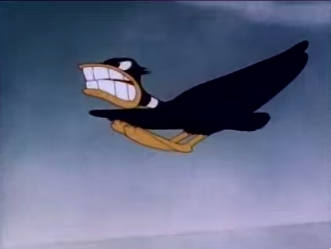 “The grimacing jaws remind me of the old Warner Brothers ‘Corny Concerto’ where the one bird turns into a P-40 Warhawk,” Rusanowsky said. “It’s kind of like that. It’s kind of like the old P-40 where they used to paint the jaws on the plane.”
One of the defining factors of the team’s identity is the color teal, the result of conversations with people who make a business of knowing about fashion trends. “They went to Bloomingdales, as I remember, and they said, we want to know the colors that are popular,” Rusanowsky said. “Here was what they really wanted. They wanted a uniform that the players would be proud to wear, colors that the players themselves would be proud to wear. They wanted something that would be popular with men, but they wanted to have colors that were very popular with women.”
So this being the ’90s, there was only one way this could turn out. “In talking with consultants at Bloomingdales and several other places,” Rusanowsky said, “they came to the conclusion that teal was really attractive, but they wanted to make that a little more rugged, so to speak, so they added the black to it.”
Given that color trends come and go and some of the teal teams from the ’90s have since gone another direction, I asked Rusanowsky if the team has ever considered making a change.
“Never. Hockey is a pretty traditional sport,” he said. “They slightly darkened it about five or six years in. But it really hasn’t changed that much. They’re never going to change from teal.”
Perhaps the most symbolic element of the logo is the triangular shield that the shark is bursting through. The triangle might be a reference to the Red Triangle, but it is definitely a reference to three major cities in this part of the country, San Jose, San Francisco, and Oakland—”because this is not only a San Jose team, it’s a Bay Area team,” Rusanowsky said.
According to Rusanowsky, the Sharks logo isn’t just attractive, it keeps some pretty elite company. “That logo that Terry Smith designed was just so beautifully put together…. It was allowing a new team to have a classy looking logo that would stand up to a lot of the old original six logos that are around. Those are among the most popular logos in the game.”
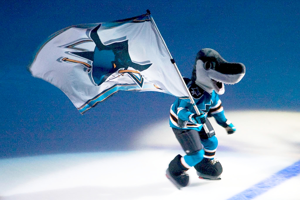
The team has embraced all things shark in creating the game experience. Their mascot is S.J. Sharkie, who famously debuted in 1991 by being born out of a zamboni. “It actually was whelped out of a zamboni and out came S.J. Sharkie,” Rusanowsky said. “It was an amazing experience as well. People couldn’t believe it.”
When the Sharks go on a power play, the team plays the theme to Jaws and fans “chomp” their hands together as if they’re shark jaws. “It happened just sort of spontaneously and people started getting into it,” Rusanowsky said, “so it’s a tradition that’s lived on.”
 And the Sharks have one of the most iconic pre-game entrances in the NHL, skating out of the mouth of a shark head with glowing red eyes lowered from the rafters. According to Rusanowsky, “that was initially only supposed to be for opening night and game one, but it was so popular and it was so cool that they said, ‘We gotta do this every time they come on the ice,’ so now it’s just become a tradition.”
To many fans of the team, the most important part of the name is not Sharks, but San Jose. For the people Rusanowski called “San Jose Patriots,” the presence of a major league sports team—regardless of the sport—was hugely important.
“Of the four biggest sports in the US right now, baseball, football, basketball, hockey, this was the first one that actually put its arms around the city of San Jose, and said, ‘We’re going to go to downtown San Jose and call ourselves San Jose,’” Rusanowsky said. “There was this group of people that didn’t know anything about hockey, had never seen a game, that said, ‘I’m buying tickets because I’m proud of where I’m from and this is something that I want to celebrate.’ Then they came and they fell in love with the game.”
Given that hockey has had a spotty record at best in northern California (the California Golden Seals left Oakland in 1976, to the dismay of no one) and that San Jose had never been home to one of the four major US sports, the success of the Sharks was not a sure thing. But with a fair amount of success on the ice and a strong brand (“the number one merchandise item in sports for a year or two” after their debut, according to Rusanowsky), the Sharks are the 13th-most valuable franchise in the NHL according to Forbes, have had strong attendance for most of their history, and will be rocking the teal for the foreseeable future.