
This is the first season for the Biloxi Shuckers, whose previous life was as the Huntsville Stars in the double-A Southern League. The thing is, nearly two months into their inaugural season, they still haven’t played a home game. Because of construction and funding issues, the Shuckers opened the season on an epic 55-game road trip, which is due to end when MGM Park in Biloxi, Mississippi, opens a week from today. (There was concern that the road trip might extend all the way into August, but that appears to have been averted.)

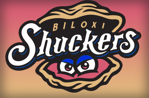
The Shuckers’ makeshift home-away-from-home games so far this season have taken place in locations like Jacksonville, Florida; their former home in Huntsville, Alabama; and Pearl, Mississippi. (It’s very much of note, to me, at least, that a team with an oyster as a logo was playing in a place called Pearl—the oysters in Pearl rather than the other way around.) When the Shuckers take their actual home field for the first time next weekend, they’ll do so wearing a popular new logo from Brandiose that pays homage to the prevailing local industry.
“There’s a big oyster industry around here,” said Christina Coca, the team’s director of social media and publications. “The shucker is the actual person who prepares and shucks the oyster, basically opening it into that half shell look that’s so iconic that everybody knows.”
Something was picking at the back of my mind as Coca explained this reasoning. “However you eat them, whether you eat them charbroiled or Rockefeller,” she continued, “it’s a tribute to the whole seafood industry around here.”
Then it clicked: The team is named for the people who prepare oysters to be eaten, and the logo is an actual oyster. Isn’t there a disconnect there?
“It’s minor league baseball,” Coca explained. “Everybody enjoys the fun names, the fun logos. I don’t think there’s a disconnect. I think everybody looks at it and kind of laughs about it because it’s cool, it’s unique.”

Speaking of laughing, you have to have a certain sense of humor to name your team something that rhymes so clearly with a famous curse word. “With a name like that, you kind of have to embrace it,” Coca said. “We have a little call at the end of our promotion for our radio broadcast is ‘Biloxi Baseball: Get Your Shuck On.’ You see license plates that say ‘Shuck it’ on it. It’s funny.” Coca also pointed out that the hash tag #shuckit has become a popular rallying cry for the team on Twitter.
 Another indication that the team isn’t afraid to accidentally-on-purpose invoke an expletive through branding is its road cap logo, which uses interlocking letters—a classic baseball tradition, to be sure, but not when those letters are the infamous “BS.”
“Maybe they take it as ‘BS,’” Coca said, “but it’s a symbol now that everybody will start recognizing—the BS on the hat, that’s the Biloxi Shuckers.”
As one of the individuals responsible for the team’s in-house graphic design, Coca embraces the opportunity to work with unique design elements, including the type (“We have our own font,” she said. “I think that’s amazing.”) and the colors, which she identifies as Gulf blue, sand, coral, and black. “We’re the first professional team that’s used that color combination,” she said.
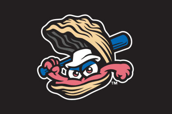
The team’s most popular mark, according to Coca, is their alternate cap logo, which features the oyster wearing a white Gilligan hat and holding a baseball bat—not swinging it baseball-style like many Brandiose character logos, but cocking it back like a mobster who doesn’t like that you think he’s funny like a clown.
“It kind of looks badass,” Coca said.
The hat is typical of the fishing hats you see on the docks in Biloxi, Coca said, and if oysters had feet, this one would be wearing what locals call “Biloxi Reeboks,” distinctive white rubber boots that local fishermen wear.
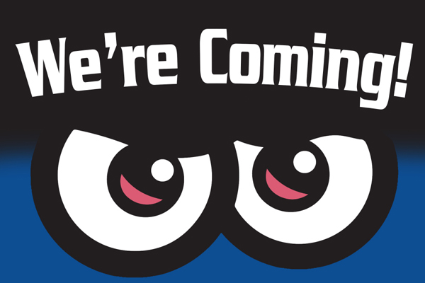
Part of what makes the oyster badass is his glowering stare, which the team used to tease their new identity during the offseason. “He does have those iconic angry eyes,” Coca said. “When we did our logo unveiling and our name unveiling, all we put up there as a hint was just those two eyes.”
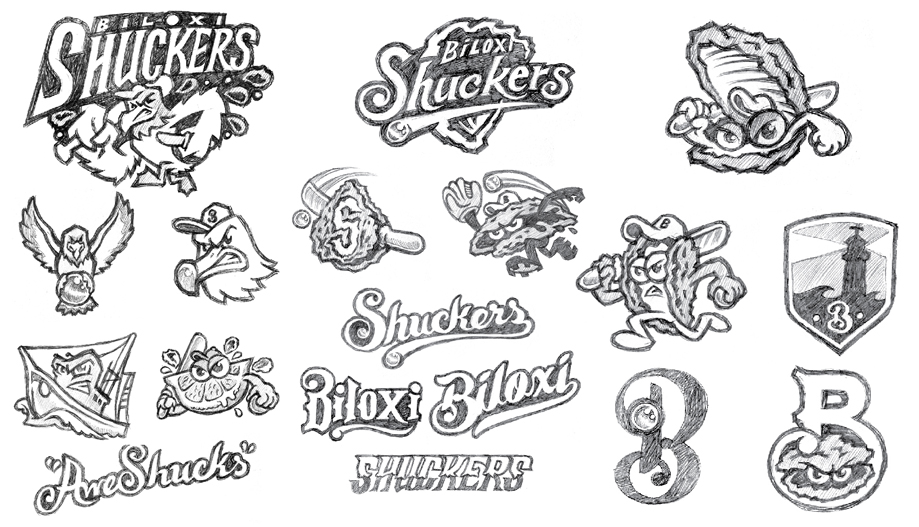
Early sketches of the logo, which can be found on Brandiose’s blog, the Clink Room, show that the team considered logo options such as a seagull, a fishing boat, a citrus wedge with those angry eyes, and the as-of-yet-unnamed oyster in various baseball scenarios. (Note that the oyster in the logo does not have a name, but the team’s mascot will be called “Shuck Norris.”)
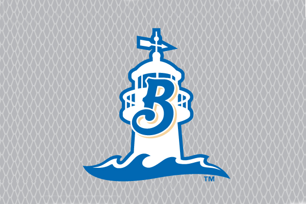
 While much of the Shuckers’ identity is whimsical and fun, part of their identity has a decidedly serious backstory. The name Beacons, a reference to the town’s iconic lighthouse less than a tenth of a mile from the new stadium, was one of the finalists in the name-the-team contest. With that in mind, the team developed a logo that would feature not only the lighthouse, but some of the state’s recent history.
“It has the waves at the bottom,” Coca said. “Those are majestic, huge storm waves … basically a dedication to those who were here and survived the storm, not just Katrina but Camille.”
Even though the Shuckers have been a team without a home, their identity has found early success. They’re a finalist, along with the Richmond Flying Squirrels, in Baseball America’s Logo Mania bracket, and they’re shoo-in to be among this year’s top 25 in minor league baseball merchandise sales. The Shuckers achieve that balance of connecting their identity to the local community while appealing to a national audience with a wacky, character-based logo.
Related stories:
 More Cowbell: The Story Behind the Visalia Rawhide
  Big Little Logo: The Story Behind the Jacksonville Jumbo Shrimp
  Pilot Episode: The Story Behind the Lakeland Flying Tigers
  The Evolution of Dinosaurs in Utah: The Story Behind the Ogden Raptors
  Got Our Eyes on You: The Story Behind the Chattanooga Lookouts
  Sweet Mosquitoes: The Story Behind the Sugar Land Skeeters
  Here there be the story behind the Dayton Dragons
  The Power of Pink (or Rubine Red): The Story Behind the Pensacola Blue Wahoos