
Yes, I’m fully aware that the 2003/04 NHL season is well underway, but here I am, three weeks late, to give you the uniform preview, review, or view of the upcoming, err…. current NHL season. To be completely honest, this preview is late because so many teams had yet to unveil their new alternate jerseys, so with all but one unveiled, let’s get this thing started.

Now, some of you may wondering, “What’s up with the home teams wearing the dark jerseys?”. Good question! The NHL has reversed the jerseys from now on, the dark jerseys are now the home jerseys, and vise- versa. This was the way the league had played from 1953 – 1970, they changed due to colour television. Fans wanted to see new colours every week (example, every Leafs game on HNiC was blue vs white). After the increased security in airports, and the introduction of alternate jerseys (in which all but 1 are dark), this led the NHL to switch ’em up. Teams always wanted to wear the alts at home, so road teams would have to bring their homes, and roads with them on plane trips. Problem solved!
Every year there seems to be one big change, and this year it’s the Phoenix Coyotes. The Coyotes went 180 from their previous design going to an extreme traditional look. The home jerseys are brick from head to toe, the roads white with brick pants. The numbers are one-coloured, which is not seen too often these days. The logos are also new, a brand new primary, and alternate logo. The primary is a coyote howling upwards, the alternate is a state of Aizona with the Arizona flag inside and ‘PHX’ underneath. No alternate is planned.
A change everyone was looking forward to came with the removal of the black road jerseys Calgary had been sporting in the past few seasons. The black horse jerseys are once again alternate jerseys, while these snappy new duds are in as the new homes. The jerseys are red with black trim and the familiar flaming-c on the front, this time in black. The horse heads are on the shoulders. The lettering and numbering is in the same style as the set last season, only in black.

They say the reason alternate jerseys were introduced was so teams could get creative, and that’s exactly what Dallas did with their new alternate jerseys. Definately going ahead in time, rather than back in time, the Stars are sporting black jerseys with green, and red trim with the constellation taurus as the logo. Get it? it’s stars in the shape of their state symbol! Definately a creative idea, perhaps poorly executed, but definately creative.
Time for an intermission from the major changes this season. The Florida Panthers made minor changes to their uniform set, by switching their road and alternate from last season. This season the Panthers will be wearing navy blue jerseys at home (logo sans hockey stick), while their alternates are now red (logo avec hockey stick). The Edmonton Oilers are celebrating their 25th season in the NHL with a patch on their jerseys, the Minnesota Wild are proudly displaying the fact that they are the All-Star Game hosts with a patch on their home, and road jerseys, and the Ottawa Senators are paying tribute to former head coach Roger Neilson, who passed away last Spring after a long bout with cancer, with a colourful patch that would make Rog proud.

Well the Zamboni’s off the ice, so let’s get back to business here. The Minnesota Wild introduced their alternate jerseys last week, top-secret style, they told noone what they looked like until the game started. The jerseys are red with large green stripes on the sleeves, and a crest made of old-fashioned material. The logo is the Wild primary logo in a circle. The numbering is basic block numbers.
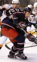
Arguably the nicest of the alternate jerseys to come out in a long time, the Columbus Blue Jackets joined their expansion cousins with this pretty little number. The jersey features two completely new logos, the main crest and one of the shoulder logos. The main crest is a star with the Ohio state banner wrapped around it in the shape of a ‘C’, while the shoulder logo is an oval with a union cap in it. The jersey is blue, with black sleeves, and stars running down the side. These jerseys were unveiled on Columbus Day, how clever!
If the jerseys of the Toronto Maple Leafs, Los Angeles Kings, and the OHL’s Oshawa Generals had a child somehow, they would look like the new alternate jerseys of the Anaheim Mighty Ducks. Last years Campbell Bowl Champions eliminated the jade from their colour scheme, and went mostly black, with purple and silver stripes. The shoulder logo features a Toronto Maple Leafs style ‘MD’ interlocking logo, while the jersey crest is very similar to the Oshawa Generals script/tail logo. If they were trying to create a look to break away from their cross-town brothers in Los Angeles, they failed miserably, watching on television these uniforms look pretty much dead-on with those of the Kings.

Hockey’s most storied franchise, Les Club de Hockey Canadien, introduced their own new look this season. Well, it’s not really a new look, it’s their road jerseys from the 1944/45 season. These jerseys are scheduled to be only worn during the 2003/04 season, and will be worn with it’s red counterpart on select nights, respectively. The Canadiens new look is getting a thumbs-up from practically all that I’ve heard on the topic. The only downside I can see, and have heard, is that the numbers are nearly impossible to read on television.
The Canadiens white jersey above is a part of NHL’s Vintage Jersey program that seven teams will be participating in this season. Joining the Canadiens this season will be the Boston Bruins (1960s), Edmonton Oilers (1980s), Los Angeles Kings (1970s), New York Rangers (1970s), St Louis Blues (1980s), and Vancouver Canucks (1970s). All of these teams will be wearing home, and road versions of these jerseys several times during the season.
Well that’s it for the 2003/04 NHL Season, if it wasn’t for the upcoming release of the new Atlanta Thrashers powder-blue alternates in late November there would be no reason to watch hockey anymore this season… I’m kidding of course! Go Leafs Go.
Related stories:
 Every Possible 2018 Stanley Cup Final Matchup and Other Musings
  Washington Capitals Going Big and Blue For Outdoor Game
  Spurs welcome The Great One to White Hart Lane by misspelling his name
  Confused NHL Combines Leafs and Lightning Uniforms
  Logo Links Mar 16, 2012: NCAA and High School Unis, New name for NHL arena New Islanders Third Leaked Again Tampa Bay Lightning unveil new logo and uniforms