The Tampa Bay Lightning unveiled their new logo and uniforms today at a noon press conference in Tampa, Florida… the new look features a relatively stripped down and traditional appearance for the typically modern looking franchise — presumably heavily influenced by long time Detroit Red Wing (the kings of tradition), and Lightning GM Steve Yzerman.
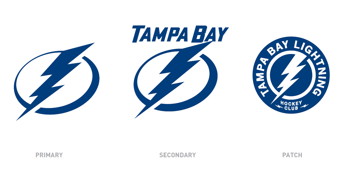
The press conference started off with the owner of the club inadvertently referring to the club as the “Tampa Lightning” — whoops! Perhaps an accidental slip of the tongue indicating a new team name? Eh, probably not but it sure sounds nice, doesn’t it?
Other things said at today’s terribly long and boring press conference (which felt more like an internal PowerPoint meeting than what should have been an exciting new-logo press conference)…
- Listened to Lightning fans and employees about the new team logo and uniforms
- Made use of a brand wheel — “used by several teams when developing a new look”
- Players are “proud to wear the bolt”
- SME Design, out of New York, designed the new brand
- They wanted a logo and uniform that is one colour, traditional, classic, elegant and iconic, similar to the Dallas Cowboys star
- Players gave positive reviews of new logo and uniforms
- Blue and white colour scheme chosen to reflect the colour of Tampa Bay (and ice, I guess)
It should be noted that after the logo was introduced the CEO told the audience “you can clap”, that says it all…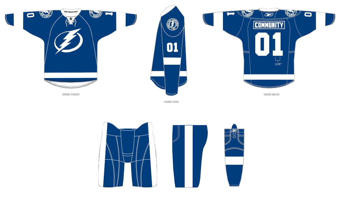
The new home uniform is blue, which is the only welcome change of this whole re-branding… the logo is extremely simple, a white Lightning bolt on a white circle — the players will wear one colour names and numbers, a shoulder patch which appears to be a bolt on a circle with “Tampa Bay Lightning Hockey Club”.
The new road uniform, white – as expected – basically a reverse coloured version of the home — the logo, like Nashville’s roads, has TAMPA BAY written above it, the same shoulder patch and one-colour name and numbers from the home jerseys are present.
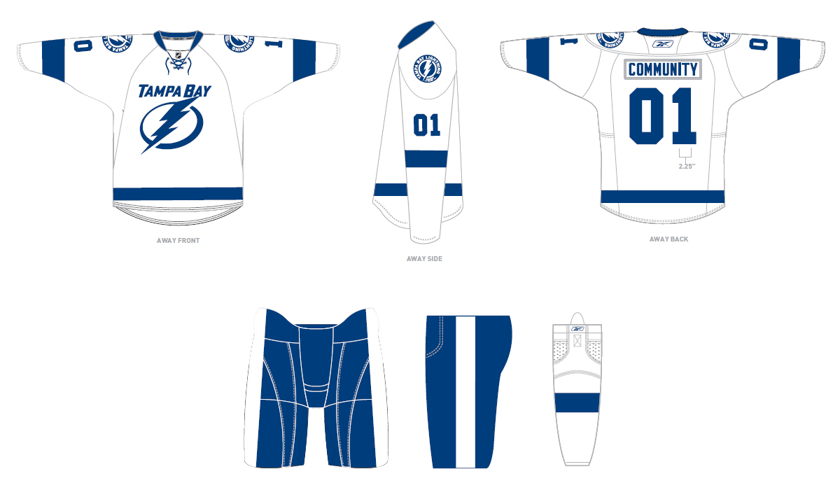 The existing alternate jersey will be carried over into 2011-12.
The club announced that they unveiled the jersey now to prevent it from being leaked and kudos to them for that because they did just that, it was not leaked whatsoever, other than hints about how it would look — first time in a long time that a team has been able to pull this off. Also announced was that every season ticket holder will be given a team jersey affixed with a tracking device so the club knows when you are in the building, also to automatically give discounts, etc. — an interesting idea… just don’t use that information to hassle fans who have skipped a few games in a row.
One of my favourite features of the previous Lightning identity has NOT carried over to the new look, the victory stripes under each arm, originally added so they’d be visible while the Stanley Cup was paraded around the rink by their players… perhaps they don’t think they’ll be needing them anytime soon.
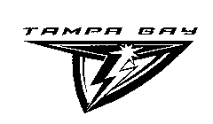
This is the third re-brand for the Lightning and the first time the logo contains no wordmark on the home jerseys (they’ve seemed to bugger it up every time, in my opinion). For those who may not remember, the Bolts attempted to introduce either a new logo or alternate logo back in 2001 when they registered to image to the right with the USPTO but once the news of this hit the fans they eventually backed off with their plans — plans back then also reportedly included adding red to the colour scheme which obviously never happened.


