Brace yourselves, Buffalo sports fans; it’s happening again.
As has become nearly ritual over the past decade and a half, one of Buffalo’s major league sports teams is overhauling its uniforms. This time it’s the Bills who will be trotting out redesigned togs when (and if) the NFL resumes play in 2011. It is presumed that the Bills will be taking the most recently published page out of the uniform overhaul playbook of their in-market NHL counterparts the Buffalo Sabres and rolling out a uniform that returns “traditional” (translated “abandoned”) elements in a contemporarily designed and formatted system of dress (and thanks for that term, Nike).

I am careful to suggest that the Bills will be taking only the most recently published page from the Sabres’ playbook because their road to their present uniforms was a twisted and tortured route. The whole mess began in 1996 when the team discarded its original, relatively simple blue, yellow and white color scheme, logo and uniform design and replaced it with a very 1990’s, angular uniform design complete in black, red, silver and white. The simple but elegant shield containing crossed swords and a charging buffalo was replaced with an enormous, alarmingly detailed bison head in quarter profile. This complete departure of a uniform design just so happened to coincide with a fairly brief re-emergence of the team as a championship contender including one trip to the Stanley Cup Final (a feat the team wearing the original uniforms also managed to accomplish – once). After a decade, however, the uniforms were relegated to “dated 90s holdover” status and as popular opinion clamored for a return to the team’s “traditional” colors of blue and yellow, the team acquiesced to popular opinion — sort of. What the Sabres presented their fans was the epitome of the old saw “be careful what you wish for; you just might get it.” Blue and yellow did make its triumphant return, however it returned in the form of a uniform that included quasi-parabolic swooshes along the sides and yet another logo, this time of a “stylized” (using the word most liberally) profile bison that appeared to lack legs and a tail. It was almost immediately dubbed (derisively) the Buffaslug. This atrocity lasted four seasons before the Sabres finally got the message and produced their present kits which I think most people would consider a respectful yet contemporarily updated take on the original uniform set. It took fifteen seasons, two overhauls and one unmitigated disaster to produce the appearance most Sabres fans would have liked to have had in 1996.

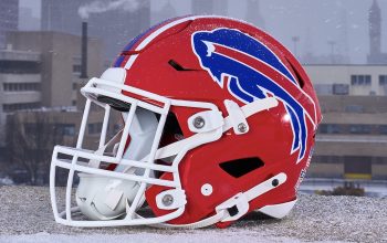
This is not to say that the Bills have not been without their uniform changes over the years. The footballers have ten years on the Sabres in the history department and, save for the franchise’s first year in the old AFL when just about everyone was wearing whatever matching uniforms and equipment they could get their hands on, the team has remained true to its general color scheme (blue, red, white in assorted variations, plus a few minor trim colors). From 1962 through 1983 the team wore white helmets with a bison decal. The original decal was a red bison standing in profile, looking ready to graze. In 1974 the team turned the bison blue, tilted its profile skyward, set its legs in full charging mode and incorporated a red “motion streak” (for lack of a better term) into the profile so as to give the logo the appearance of a bison-propelled comet. Simply put, the logo worked then and it works now and although it’s been tweaked for size a few times over the years, it’s clearly the franchise’s definitive design fixture and largely an untouchable in any uniform overhaul going forward.
Over time, the Bills have changed up their primary shades of blue, have played around with number fonts, striping patterns and in 1984 made their most noticeable change (to that date) – turning in their white helmet shells in favor of fire engine red models. Hard as it is for an old timer like me to believe, the Bills have had a red helmet longer than they have had a white helmet.

And in 2002, sartorial disaster struck this proud franchise – a radical uniform overhaul to bring the franchise into the 21st Century — unfortunately it was some sort of demented Fritz Lang 21st Century.
The Bills’ 2002 design (which is the one being overhauled) rivals the hockey Buffaslug kits in that it is visually distracting (unmatched side striping between jersey and pants, multiple helmet stripes and contrast stitching to name just a few). And when I say “visually distracting” I really mean “ugly.” But the design element that I found to be the most poorly thought out was the yoke. Both the “home” darks and the “road” whites featured a navy blue shoulder yoke. Given this franchise’s history, I think it’s safe to say they’re dealing with enough proverbial yokes that the literal ones that appear on their battle garments do nothing beyond heighten the misery. Four consecutive Super Bowl losses, the civil and criminal legal troubles of former franchise cornerstone O.J. Simpson, the team’s longest playoff drought in franchise history (now standing at 11 consecutive seasons), the loss of a handful of home games to nearby Toronto – these are the crosses that the loyal Bills fans have been bearing for years and years. Throwing a yoke on their underachieving gridders just seems to be a bit on the antagonizing side and, really, hasn’t the team performed enough of that type of antagonism on draft day? At what Houlihan’s is J.P. Losman presently tending bar? Anyone? Anyone?
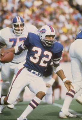
Several weeks ago Bills season ticket holders were informed that the team was indeed undergoing another uniform overhaul. Nothing has been officially confirmed and of course speculation is running rampant that the new design will fall in line with the Sabres’ recent efforts to bring back the old in a more contemporary iteration. Most of the mock-ups I have seen (based, I should reiterate, on mere speculation/wishful thinking/adult beverages[?]) are riffs on what I would consider O.J.-era togs – white helmets, larger sleeve striping schemes, blue pants for the road uniforms – no yokes. Some concepts continue to incorporate small amounts of 2002 color additions navy and nickel as trim elements. None have included piping or contrast stitching.

Candidly, I’m not sold on the prospect of a return to either the O.J.-era kits or, as some fans would like, the uniforms worn during the team’s Super Bowl runs. While one man’s actions long after he left the team and a remarkable four consecutive conference championships are hardly reasons to relegate entire eras of a team’s history to the rubbish pile, there’s no crime in making an effort to putting that one unifying element – Flash Bison – into an entirely new design environment. Red, white and blue are certainly not difficult colors to work with and it would be refreshing to see what a capable designer could do if given the charge to create a new look for a team with a few restrictions in place – (1) Flash Bison goes untouched, (2) keep it relatively simple – no yokes, no side panels, no piping, no contrast stitching, three helmet stripes tops, (3) Classic does not necessarily equate to throwback.
Naturally, it’s too late for these instructions. The uniforms designs have likely been approved for months and the prototypes locked away in some undisclosed location in Orchard Park. It’s presumed that the 2011 draft will be the coming-out party for the new-look Bills uniforms unless, you know, they wind up getting leaked somewhere else first . . . .


