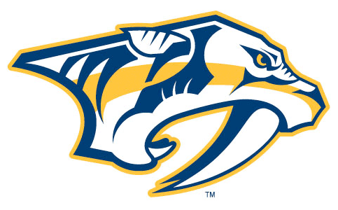
The Nashville Predators unveiled a new set of logos today, three re-coloured logos from their previous set and a new alternate logo.
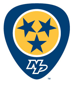

Above is the new secondary logo, from the official Nashville Predators release, “Designed to represent the Tennessee state flag and Nashville’s music city heritage. The guitar pick shape recognizes the Music City heritage and influence, while the three stars signify the East, Middle and Western parts of the state in similar shape and design as the state flag.”
Section303.com describes how the new alternate logos will be used in relation to the yet-unveiled new uniforms:
The SECONDARY LOGO. This will replace the skull shoulder patch on the current sweaters. The idea is, obviously, the three stars of the Tennessee flag and a guitar pick-shaped outer design. Pretty awesome.
The ABBREVIATED MARK logo. This will not only be seen on Pekke Rinne’s new mask but also on the pant legs of all Preds next season.
The WORD MARK is just the “Nashville Predators” written out with the same color scheme as the logo (obviously) and with a slight font change.
The new uniforms will be unveiled over the Summer with the new road jersey appearing first on Friday during the NHL Draft.


