UPDATE (4:30pm 7/22/11): The Winnipeg Jets have announced they will be unveiling their new logo officially at 5pm ET on their official website

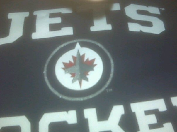
According to several posters on the site JetsOwner.com this here picture is a shot of a new Winnipeg Jets logo, either a primary or alternate.
I’m not reporting this is the real deal because honestly, I’m not sure, it does match a lot of the rumours we’ve been hearing about the new logo such as similarities to the old Team Canada RCAF logo and the inclusion of a maple leaf.
Also the t-shirt style matches that of a recently launched line of merchandise on the NHL Shop website — browsing through the entire collection on the NHL Shop site only one team is missing, Winnipeg/Atlanta.

If this thing is a fake, someone did a lot of research to make it believable.
And if it’s real I’m both impressed and disappointed with the outcome.
I like that it’s a little retro, I like that they kept the same basic colour-scheme of the original Jets but modernized it, but…
I hate that there’s a maple leaf in it – I just do… I don’t see the point in showing off that you’re a Canadian team in a league where there’s several. It’s like when the Ottawa Renegades CFL team launched their logo with a big maple leaf — it’s the Canadian Football League… who are you representing here? Everyone?
I hate that there’s that little notch on the “north” side of the logo, presumably a nod to ownership group “True North Sports and Entertainment”.
Supposedly someone got a shot of the new jerseys in the last 24 hours, if we get that pic we’ll post it too. Until then, this isn’t confirmed as the new logo but it looks like there’s a good chance it is.


