The big news of the week was, once again, the Winnipeg Jets who have dominated the attention of the sports logo world this Summer (and just when you thought we were done covering the new Jets identity remember, we’re still waiting for the new uniforms…)
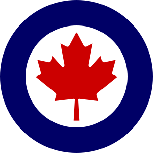
Reactions to the new Winnipeg Jets logos were a mixed bag – divided amongst those who focus on judging a logo for it’s design versus those who look at it’s inspiration. The Jets honouring the Royal Canadian Air Force in their logo is a nice tribute, even if True North had to slap their own mark on the long-respected Canadian military symbol.
When I first saw the new logo I hated that notch in the top of the logo pointing to the north, I still do, I also hated the maple leaf behind the jet. Over the last few days I’ve accepted a maple leaf on the primary logo, honour a national branch of the military with a national symbol – okay, I get it. The maple leaf in the alternate/secondary logo is a must, it looks great on there, the best look of the bunch.
Now as for that script logo? Eh… not so much.
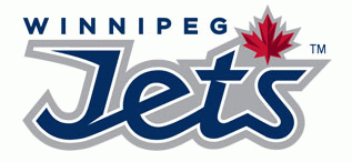
I touched upon this earlier in the week but I just knew deep down that this set would have a maple leaf slapped in wherever possible, that’s the thing now, the marketing staff for most new teams in Canada apparently say “put a maple leaf in the logo, doesn’t matter if it looks good or matches the colour scheme – just do it!”

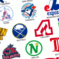
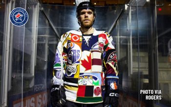
You can see examples of this slapped-on maple leaf strategy on that Jets script logo, on the sleeves of the uniforms of the Toronto Blue Jays (despite there being no red at all in their colour scheme), the logos of the Toronto Rock, Mississauga Ice Dogs and Ottawa Renegades among others.
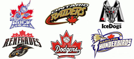
To me this is one of the worst trends in new brands – I consider it borderline insulting as a sports fan, a design fan and a Canadian. Do they think we’re idiots? Do they think we’re incapable of supporting a team if we don’t see a maple leaf on there reminding us that, yup, they’re a Canadian team, as if the fact they list a Canadian city right on the logo means nothing.

Then again, maybe we are idiots – when the Toronto Blue Jays launched the first logo in franchise history to not have a maple leaf in it the public lost their minds. Jays then-President Paul Godfrey shot back with “sorry, we couldn’t stick every colour in the rainbow in the logo”. Nice. But despite Paul’s best efforts to restore sanity the team put the maple leaf on their sleeve as soon as Mr. Godfrey left the club.
So now we’ll wait for the next team to end up in Canada so we can see the latest and greatest way they shove a maple leaf in there – what’s that? The next new team might be in Quebec? Okay, we’ll wait for the one after the next one.
Now if you’ll excuse me, I’m off to McDonald’s for breakfast…

Nevermind.

