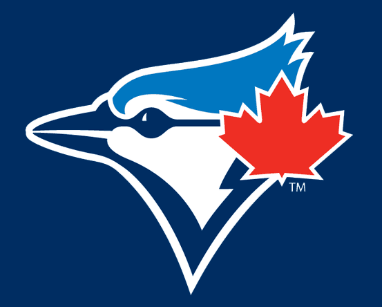
Major League Baseball clubs in Miami and Toronto were the latest teams to be victimized by a manufacturer’s error yesterday after a PDF file containing 2012 t-shirt designs for all 30 MLB clubs was discovered. This resulted in Internet users getting their first sneak-peek into the new identities of the Miami Marlins and Toronto Blue Jays.
The Toronto Blue Jays responded to reports of this logo leak with, “when we are ready to make things public we will do so at that time.” While that’s not at all a confirmation of this being the new cap logo it does suggest there may be an announcement of a change eventually.
The Marlins, who will join the Angels as the only former World Series Champions since the Washington Senators -> Minnesota Twins shift in 1961 to change their name or relocate, offered both a “no comment” and denied its accuracy.
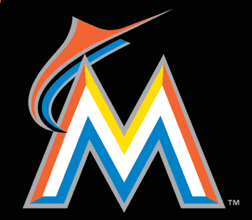
While both clubs refuse to confirm these logos to be a part of their new identity, we here at SportsLogos.Net have learned from our very reliable sources that these are indeed the new cap logos for both these teams beginning in the 2012 season.
The Miami Marlins have announced they will introduce their full new identity package on November 11th. Their yet-to-be-seen-by-the-Interneters new primary logo is very similar to the cap logo shown above with slight differences to account for the logo being shown on a white background rather than the black you see here. There is also the inclusion of a team script below the logo.
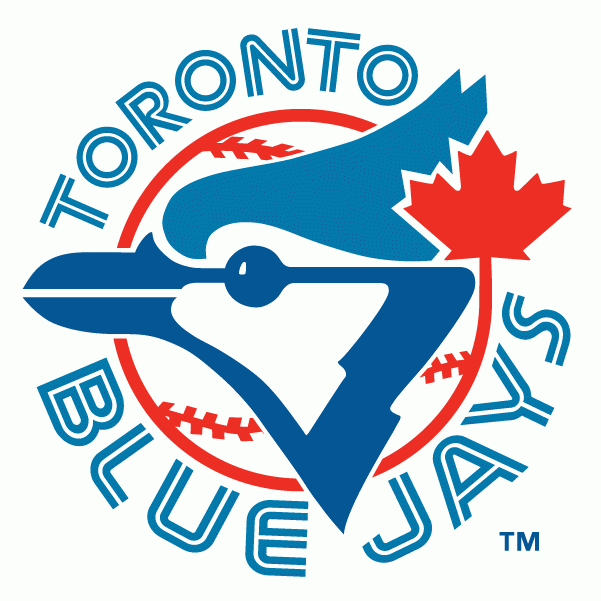
The Toronto Blue Jays, who have a policy to not comment on rumours, have not flat-out acknowledged they are even making a change for the upcoming season. Several attempts to get a release date were met without an answer but if history is any indicator they will likely unveil their new logo package in mid-to-late November. Their hopefully-doesn’t-get-leaked new primary logo includes the cap logo above while incorporating a baseball, team script (featuring snazzy looking, updated split-lettering) and a circle to encompass it all. It is very similar to their 1977-1996 primary logo. I love it and I know the fans will love it.
The Toronto Star has been reporting for a few weeks now that the club will be “more Canadian than ever before”, this is simply not true. The extent of the extra-Canadianism of the new look is seen in the cap logo linked to above and their identity was far more Canadian with their 1997-2002 look. The Star this morning also reported that the new club logo is missing the baseball that was present in the original club logo, while this is true of the cap logo the primary logo will indeed include a baseball.
A big thumbs up to the Blue Jays on this update, they listened exactly to what the fans wanted instead of just throwing them a bone (see Sabres Buffaslug update, “well you wanted blue and gold didn’t you?!”) – very rare in a re-branding these days.
The Marlins I’ll give credit to for trying something outside-the-box and really making it known that this is Miami’s team now rather than Florida’s team. I wasn’t a fan of the design the first time I saw it but as every day passes it looks better and better to me. Start the countdown to November 11th, I wanna see the uniforms!

