Maybe the key to keeping your new logo from being leaked is to do it yourself and hope nobody notices…
That may have been the strategy employed by the Los Angeles Dodgers in rolling out their extremely-subtle change to their primary logo for the 2012 season. Technically not official until the end of this season, the Los Angeles Dodgers have been using their new 2012 primary logo in all forms of marketing since at least February of this year.
The fact that nobody has noticed all season should indicate just how subtle this logo change is… did you even know that the image headlining this article is actually the new logo?
If you didn’t catch this change don’t feel bad, nobody did. Nobody noticed. Maybe nobody cared.
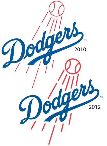
Below is a side-by-side comparison to help you out with seeing the change:
The major minor-changes involve:
- the leading script into the ‘o’ of ‘Dodgers’, it’s there in 2010, it’s gone in 2012.
- the ‘D’ in ‘Dodgers’ also had a slight change, specifically the curl in the 9-o’clock region of the logo, it’s much shorter in the 2012 edition.
- the flight lines of the baseball have been corrected.
Not the most necessary change to ever occur but it does tidy the logo up nicely.
As far as we can tell this it the first adjustment of the Dodgers primary logo since their move to Los Angeles from Brooklyn in 1958, that leading tail on the ‘o’ had been around in one-form-or-another since the 1930s.
Kudos to the Dodgers for sneaking this one past us right up to the final series of the season.

