Skip to content
Saturday, May 14, 2022
  • Logos
  • News
  • Forum
  • Facebook
  • Instagram
  • Twitter
  • Youtube
SportsLogos.Net News

SportsLogos.Net News

News and blog on new sports logos and uniforms, rumours, concepts, and history in baseball, basketball, hockey, football, soccer and NCAA at Chris Creamer's Sports Logos Page SportsLogos.Net

  • Logos
  • Forums
  • Baseball
  • Football
  • Hockey
  • Basketball
  • College
  • Contact
Baseball Logo MLB

Dodgers change logo, nobody notices

Sunday, September 25, 2011Friday, June 5, 20152 min read Chris Creamer

Maybe the key to keeping your new logo from being leaked is to do it yourself and hope nobody notices…

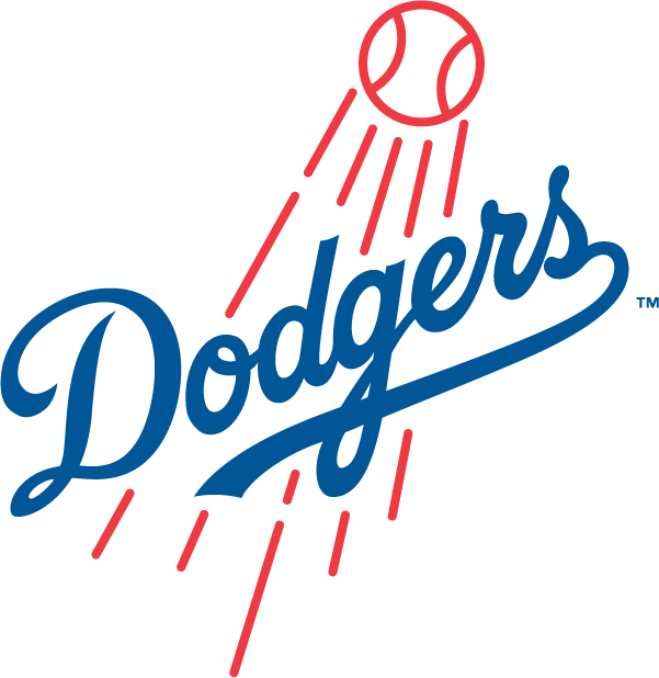
That may have been the strategy employed by the Los Angeles Dodgers in rolling out their extremely-subtle change to their primary logo for the 2012 season. Technically not official until the end of this season, the Los Angeles Dodgers have been using their new 2012 primary logo in all forms of marketing since at least February of this year.

The fact that nobody has noticed all season should indicate just how subtle this logo change is… did you even know that the image headlining this article is actually the new logo?

If you didn’t catch this change don’t feel bad, nobody did. Nobody noticed. Maybe nobody cared.

Below is a side-by-side comparison to help you out with seeing the change:

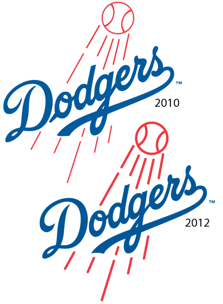
The major minor-changes involve:

  • the leading script into the ‘o’ of ‘Dodgers’, it’s there in 2010, it’s gone in 2012.
  • the ‘D’ in ‘Dodgers’ also had a slight change, specifically the curl in the 9-o’clock region of the logo, it’s much shorter in the 2012 edition.
  • the flight lines of the baseball have been corrected.
Los Angeles Dodgers using their new 2012 logo in their “Social September” promotion for September 2011

Not the most necessary change to ever occur but it does tidy the logo up nicely.

As far as we can tell this it the first adjustment of the Dodgers primary logo since their move to Los Angeles from Brooklyn in 1958, that leading tail on the ‘o’ had been around in one-form-or-another since the 1930s.

Kudos to the Dodgers for sneaking this one past us right up to the final series of the season.

baseball, logo, los angeles dodgers, mlb, new logo
Share
Facebook Twitter Pinterest Linkedin

Post navigation

Jays, Marlins 2012 Logos Leaked
Remembering the Florida Marlins Identity, 1993-2011

related stories

  • Traverse City Pit Spitters unveil Up North Cork Dorks alternate brand

    Friday, May 13, 2022Friday, May 13, 2022
  • Our First Look at the 2022 World Series Logo

    Wednesday, May 11, 2022
  • Dodgers, Giants Both Wearing Pride Caps In-Game in June

    Tuesday, May 10, 2022Tuesday, May 10, 2022


SportsLogos.Net may earn a small commission from the sales of any products linked to from this page, we thank you for your support

MLB 2022 UNIFORM PREVIEW


A team-by-team look at all the new logos, uniforms, and more for the 2022 Major League Baseball season


OFFICIAL TEAM MERCHANDISE

Search News Articles

Latest Logos News

  • New 2022-23 Kits Unveiled by Clubs Based in France, Scotland, Germany
  • Juventus, Borussia Dortmund Headline Quartet of 2022-23 Home Kits Released Friday
  • Traverse City Pit Spitters unveil Up North Cork Dorks alternate brand
  • NBA Releases Redesigned Playoff Trophies, Introduces Two New Awards
  • AS Roma Unveils New Home Kit for 2022-23 Season
  • Our First Look at the 2022 World Series Logo
  • USL’s Orange County SC Teams Up with Punk Legends Social Distortion for Warmup Jersey, Other Merch
  • Lionel Messi Shirt from 2017 El Clásico Sells for $450,000 US at Auction
  • Dodgers, Giants Both Wearing Pride Caps In-Game in June
  • Bundesliga Sides Mainz 05, Hoffenheim Unveil New Home Kits for 2022-23 Season
  • Premier League’s Brighton & Hove Albion Kick Off ‘Shirt Buy-Back Initiative’
  • Kansas City Current, Racing Louisville Break Out New Kits for NWSL Regular Season Opening Weekend
  • Akron Zips Unveil New Set of Athletic Logos
  • Happy Mother’s Day: All 30 MLB Teams Wear Pink and Grey in Honour of Moms Everywhere
  • Help Redesign The Detroit Lions’ Uniforms
  • Crown College Unveils New Athletic Logos, Nickname
  • Atlanta Braves to Wear 1974 Throwback Uniforms This Weekend
  • Marlins Minor League Team Offers Fans Chance to Design Their Uniform
  • Liverpool FC Unveils ‘Bold, No-Nonsense’ Home Kit for 2022-23
  • Bayern Munich Combine Modern and Traditional with 2022-23 Home Kit

Logos News Archive

Popular Topics

AHL Apparel/Shoes Arena Football Baseball Basketball CFL CHL Chris College ECHL European Featured FIFA FIFA World Cup Football Getting Blanked Hockey IIHF Jersey Logo Minor League Baseball Misc MLB MLS NBA NBA D-League NBA G-League NCAA NFL NHL OHL Olympics Other Sports Phantom Merchandise QMJHL Soccer SportsLogos.Net Studio Stories Super Bowl The Story Behind the Nickname Throwback Uniforms Uncategorized Uniform WHL WNBA
Chris Creamer's Sports Logos Page - SportsLogos.Net is your virtual museum dedicated to education of the history of sports logos and sports uniforms. All site design is Copyright ©1997-2021 Chris Creamer. The SportsLogos.Net "Leaf-Star" Logo is trademarked and property of this site. Please note: SportsLogos.Net does not own any of the team, league or event logos/uniforms depicted within this site, we do not have the power to grant usage rights to anyone. All team and league information, sports logos, sports uniforms and names contained within this site are properties of their respective leagues, teams, ownership groups and/or organizations. If you'd like to use any of the research from this site, please properly credit this site and provide a link back. This site is maintained for research, educational, and historical purposes only, do not abuse it.
Proudly powered by WordPress | Theme: Refined News by Candid Themes.