Days are shorter, leaves are changing, and we still got a turkey in the freezer – that can only mean one thing, it’s the start of hockey season!
The National Hockey League kicks off its 94th season tonight and as with every season there’s a few things us logo and uniform nuts have to look out for. This article will give you a run-down of all the major, minor and insignificant alterations to teams, uniforms, logos, and equipment that have taken place since the Boston Bruins blew up the City of Vancouver this past June.
The first changes we’ll note apply to every team across the board:
One change fans will surely notice right off the first puck drop is the addition of giant numbers on the front of every player helmet.
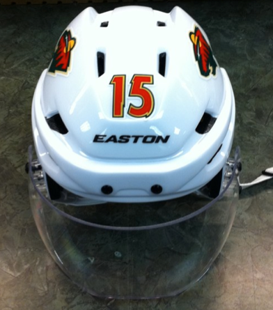
It looks horrid.
Said to aid on-ice officials and photographers in identifying players. Couldn’t we just move forward with those front jersey numbers teams were starting to adopt? Those weren’t that bad compared to this. Bad NHL, bad!
I predict these numbers will not last long, someone will protest it, probably the Rangers.
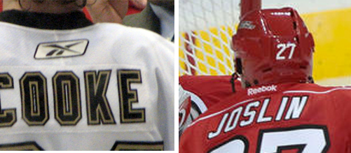
Another league-wide change, the Reebok tag. Gone is the Reebok “vector” logo which had been under the back collar of the jersey since the lockout season, in it’s place is a plain text logo reading “Reebok”.
Moving on to changes to individual teams, what better way to start than a team that changed everything, the Atlanta Thrashers.
New city, new name, new arena, new logo, new uniforms, new coach, new GM, new, hmm… trainer probably, same players though. In their place:
Winnipeg Jets
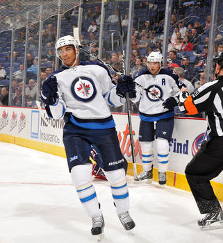
The Jets stole the show in the logo/uniform community over the summer. Originally planning on branding themselves the Manitoba Moose before Winnipeggers proved to the world that beggars can be choosers, the team announced they would re-adopt the old Winnipeg Jets name with a different logo and altered colour scheme.
A month later a logo leak forced the Jets to hastily hold a press conference and confirm that the leak was indeed their new logo. Heavily borrowing elements of the logo of the Royal Canadian Air Force, the Jets new identity focuses more on the military jet whereas the previous Jets team seemed to honour the commercial jet airliner.
The new uniforms avoided being leaked and were unveiled at an air force base in September just a few weeks before the pre-season began. The team has yet to wear their home blue jerseys even after playing numerous home games. The wait will continue as they are expected to once again wear the road whites for their first regular season home game on October 9th.
The Whiteout returns, they made it seven.
Tampa Bay Lightning
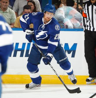
One of the more bizarre re-brandings for this season came from the Tampa Bay Lightning. Gone is their black jersey (and black in general), the Phil Esposito “Victory Stripes” and bland Edge paint-by-number template. In its place you will find blue and white (sound familiar?) with an extremely simplified primary logo.
The new logo still exudes “Lightning” by featuring a bolt framed by a broken oval, and (just in case you forget where the team is from) the text “Tampa Bay” is riding above the logo on the road whites (which are an exact inverse of the home darks… as it should be!). A new secondary logo can be found on the shoulders that evoke a “retro” feel by placing a circle around the logo and having the team name inside. The lettering from the Edge jersey has carried over, but now only an after-the-fact black outline can be found around the numbers. In addition, the not-so-retro breezers feature a white lightning bolt going down the side outlined in black.
The Reebok Style Guide mentioned that the team was getting a new alternate jersey for the upcoming season… speculation lead to it being the existing alternate with updated shoulder logos. Unfortunately the 2010/11 alternate jerseys (complete with old logo) have been rebranded with the new “Reebok” word mark and are for sale. The best-laid plans have not come to fruition and one can only hope that next season the Lightning introduce a new alternate that is identical to their current set… except in all black. Come on, if the Blackhawks could get away with it, why can’t Tampa Bay?
Nashville Predators
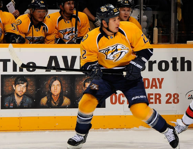
Another team that had conflicted with the Reebok Style Guide in the past was the Nashville Predators, who finally introduced their rebrand this offseason. For those unaware, last year the Predators were supposed to promote their checkered alternate jersey as their home and create a road version in addition to an all-new alternate. After going back to the drawing board the Predators have launched their new look for this season, one that has probably caught most fans by surprise.
A simplified logo was introduced – same sabre-toothed tiger head, with MUCH less definition and swatches of colour, now emphasizing yellow and navy blue – the colours used primarily in the new jerseys. Two new alternate logos were introduced – a guitar pick and a stylized ‘NP’ – to compliment the refreshing new look. New numbering includes guitar strings passing through the middle, complimenting the guitar pick logo.
In all, Nashville has gone from one of the more unique designs that included an insane amount of colours to one that now monopolizes the yellow jersey look and should help tie the team more to the Tennessee culture.
Los Angeles Kings

In Los Angeles, the writing was on the wall (well, on the ice) when during their past two post-season appearances they would ditch their standard home jerseys and replace them with the very clean black, white and silver alternate jersey.
The official rebranding occurred this off-season and also conflicted with the changes originally outlined in the Reebok Style Guide. Instead of introducing a new matching home and road jersey, the team decided to keep the existing black and silver alternate jersey as their home and create a road that was only vaguely similar by removing the bottom-hem piping and adding a waste stripe. Otherwise, the upper-halves of the jerseys are identical.
Had the Kings’ been planning to keep the current template for the home jersey it would have been listed as such in the style guide. Since this wasn’t the case one can assume that the Kings’ had designed slightly different jerseys but decided to bail for reasons unknown. One school of thought is that their original home jersey design was an exact clone (with colours reversed) of the new road, perhaps this change was too subtle to warrant producing a whole new line of merchandise.
An all-new alternate jersey was also expected to be introduced, but instead (according to NHL12), the Kings’ have relegated their old home jersey to an alternate, at least for this season.
The Kings are also planning to hold a series of “Legends Nights” during which they’ll wear classic jerseys – these games are Dec 10, Jan 2 and Feb 18.
Florida Panthers

The red is back! Finally!
For the first time since 2003 the Panthers will be predominantly wearing red jerseys, a colour that should have always been the primary shade of their non-white uniform. They also slightly changed their road white jerseys, eliminating that silly piping that was all over last years one.
The Florida Panthers are facing another problem, the alternate jerseys they introduced two years ago. They are contractually required to wear it a minimum amount of times per season for three years and word on the street is the club hates them. The solution? Wear them as much as possible during the pre-season to eat up those games and sprinkle the rest throughout the regular season before ditching them for good. We’ve yet to see the new red jerseys on ice because of this.
The lesson here? Think twice before getting silly with your alternate.
Edmonton Oilers

The “City of Champions”, Edmonton, has FINALLY corrected a horrendous mistake by replacing their road jersey with one that reflects their home jersey (a/k/a they’re going back to the orange and blue of the Gretzky years). While the old half-sleeve-striped navy blue jerseys remain as an alternate, fans no longer have to watch their bright young stars (on the road) in such a drab, boring jersey. Maybe one day Mr. Katz will bring back the Todd McFarlane designed oil-and-nut logo as an alternate to forever wipeout any sign of the early Rbk Edge jersey (or better yet, how ’bout that mostly-orange Oilers logo from the 70s?).
Also of note is the primary logo has also been altered, the oil drop has been changed from copper to orange and the old ring around the logo is kaput. Good move.
Toronto Maple Leafs

Toronto, the original blue and white team (I’m sure Boston can relate Pittsburgh) has decided to remind everyone that they were indeed once a successful team by introducing a new alternate jersey that is strongly connected to the last Stanley Cup victory in 1967.
While finally conforming to the league majority by having a dark alternate jersey (their first in over 15 years), the new alternate jerseys are close to the ones worn from 1967-1970 – the difference being the thicker striping on the arms and around the waist (a problem that was evident with the CCM Vintage production that was just… terrible) and a fairly decent replica of the original crest. The crest and numbering is now a felt-material (like what is found on the Minnesota home crest, or Calgary’s heritage jersey) that feels great to the touch but is unnoticeable to anyone who is watching the game.
A great addition for the Leafs’ but sadly, not as fun as their old 1950’s inspired white alternate that had been in use on-and-off for over a decade. A blue version of that would have been welcomed.
Ottawa Senators
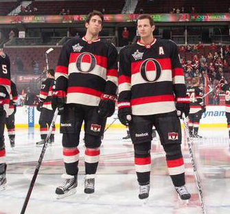
Twenty years after taking their name, claiming their Stanley Cup titles and borrowing bits of their identity the Ottawa Senators finally just decided to take the whole uniform of the original Ottawa Senators. I’m a fan, I love the new alternate jersey, especially when you factor in that this killed off those ridiculous”SENS” jerseys they had been wearing.
On the shoulders are two shield logos, one English, one French, containing the team name.
The team will also be wearing the 2012 NHL All-Star Game patch on the front of all their jerseys and also have a 20th anniversary logo which will not be worn on the jerseys.
Pittsburgh Penguins

Much to no ones surprise, Pittsburgh has decided to replace their stale powder blue alternate jersey with the one worn during the 2011 Winter Classic.
While it isn’t a true throwback (a composite of various jerseys worn by the team during the early years), the jersey nonetheless continues the theme of using blue as a primary colour with the contrasting yellow of the upside-down triangle. There is nothing new to be said about this jersey apart from it now being produced and sold as a replica on the Edge template (the Winter Classic jerseys were sold on the old CCM/Koho air knit design). Not a fantastic jersey (and one forever to be associated with Crosby’s concussion), it still refreshes the Penguins’ brand and replaces a jersey that became a little stale from being overused so much.
Speaking of bringing back a Winter Classic jersey…
Washington Capitals

The Capitals brought us all back to their classic red-white-and-blue days when they ditched the black and bronze for the 2007-08 season and replaced it with a modernized 21st-Century take on the old look. In 2011-12 they’ll be going even more true to the original look by trotting out a clone of that original 1970s jersey as their new road alternate jersey. Yes, a road alternate. This jersey will be worn exclusively away from Washington… which is a shame as I’m sure the fans would love to see this look at least once during the season.
As with Pittsburgh’s new alternate, this is the same as the one they wore in the 2011 Winter Classic, the main (and most welcome) difference being that they’ll wear white helmets instead of the red ones.
New York Islanders
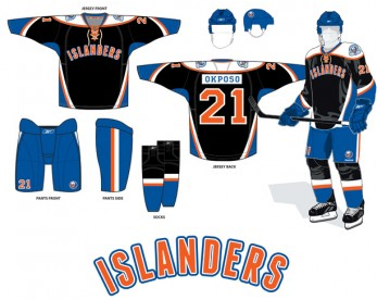
Is this still happening? The above image was leaked over the summer and the club quickly said it wasn’t “100% accurate”. Since then I’ve heard nothing. All we can assume is an announcement in the next couple of months unveiling a new alternate uniform that looks similar to the one above.
So much for that traditional look the club was going for, eh?
Also, the Islanders are wearing a 40th anniversary patch on the shoulders of their home and road jerseys.
MEMORIALS, ETC.
With 2011 being an incredibly tragic summer for active and former NHL players, several teams will be honouring their fallen ex-teammates either by way of a patch or helmet sticker.
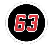
The Carolina Hurricanes will be honouring Josef Vasicek, who played with the team from 2001-2007, with a patch on their jerseys:
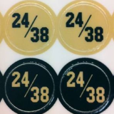
The Minnesota Wild will be honouring former players Pavol Demitra and Derek Boogaard with a sticker on the team helmet with both numbers (meaning Wild players will have 4 sets of numbers on their helmets, wild!):
Boogaard’s memory will also be honoured by the New York Rangers who will also have a helmet decal for the fallen tough guy:
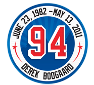
Both the Vancouver Canucks and Winnipeg Jets (the Jets had a death before playing a game!) will be honouring Rick Rypien with helmet stickers this season

The Nashville Predators lost former player and tv analyst Wade Belak during the off-season, they will also be wearing a helmet decal in his memory:
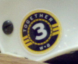
The Dallas Stars have announced they will be honouring Karlis Skrastins but they have yet to release a photo of this tribute.
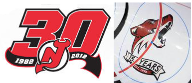
Taking a break from all this death, the New Jersey Devils have a logo making note of their 30 seasons since relocating from Denver and the Phoenix Coyotes have a 15th anniversary logo. Neither of these logos will be worn on the team jerseys.
MERCHANDISE
In regards to replica jerseys, the Reebok “vector” logo once found on the left sleeve has also been replaced by the text logo mentioned way up at the top of this article (and, good news, it is now directly sewn into the material instead of being a glued on patch, bonus!).
For those who enjoy wasting splurging on authentic jerseys, the “authentication safety measures” have been upgraded. Instead of the black piping found under the collar on the inside of the jersey that read “Reebok” (formerly RBK) in repetition with a centre tag displaying the sizing, you will now find a yellow/lime green piping that has the jersey size embedded into it (and gone is the tag). Hopefully this can help prevent some unfortunate individuals from wasting their money on items that most jersey snobs (people who read articles like this) can easily pick out as being fake.
There you have it folks, there’s your run-down of changes in the National Hockey League for the 2011-12 season, hopefully there will be a 2012-13 season so we can do this again next year… start workin’ on that new CBA already guys!
—
Special thanks to Matt Irving for his contributions to this article


