It only took them 19 seasons and a wild roller coaster of a franchise history but Miami’s baseball fans finally got a team that they can call their very own.
The Florida Marlins have officially re-branded themselves as the Miami Marlins, effective 9pm ET today at a press conference at their new stadium which was streamed live on their official website. Along with their new name that they unveiled a very bold new logo, uniform and colour scheme.
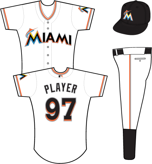
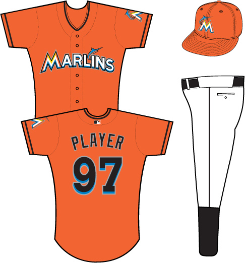
Goodbye teal, literally, Marlins owner Jeffrey Loria tossed a Florida Marlins cap as part of the change. Hello orange (or “red-orange” as Loria described it)… a lot of orange. Black remains as a primary colour on the home, road, batting practice and one of the alternates. Orange dominates on their home alternate jersey, an all orange jersey paired with an orange cap… a quick scan of my brain’s database tells me only the 1970s Baltimore Orioles came as close to that much orange on a baseball uniform.
The primary logo features a multi-coloured “M”, with a colour scheme reminiscent of the city of Miami, orange, yellow, blue and black – they really should have gone all out and added a hint of pink to the mix. Flying off of the “M” is a stylized marlin, seemingly leaping out of the ocean, “MIAMI” in black capital letters finishes it off. Perhaps the only primary logo in recent memory to feature only the city name and not the team nickname? All we know is the emphasis on this being Miami’s team is loud-and-clear.
What’s my opinion on the new look? It’s out there, that’s certainly true, and that does keep in line with the history of this franchise. We all thought the teal look when they first took the field in 1993 was as equally bold and unfamiliar to us but a lot of fans now pine for the days of teal, perhaps one day we will look back and remember these loud orange uniforms in the same way?
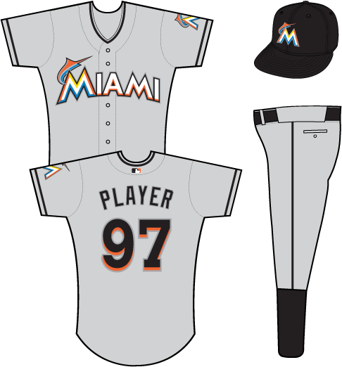
What I’m really not a fan of is the numbering on the jerseys, nowhere else in this set is there a dropshadow featured in the way it is on the player numbers, no do we see anything even close to working with that font in the rest of the package.
Also, and this may be nitpicking, but what’s with the marlin leaping out of the “I” on the orange alternate jerseys. Sure, it says “MARLINS” instead of “MIAMI” across the front, but why would you not just stick with the marlin leaping out of the first letter – it’s not like they have different first letters, match it up!
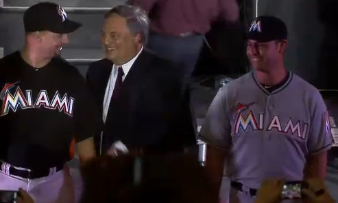
All-in-all the fan reaction has been mixed, ranging from “worst re-brand in history” all the way to “it’s not as bad as I thought it would be”. Still I can’t wait to see how bright those all-oranges will look on a sunny Miami afternoon next Summer – get your sunglasses fans.


