Happy New Year everyone, welcome to 2012 and the start of SportsLogos.Net‘s 15th anniversary season. We had our best year ever in 2011 and we’re looking forward to doing even bigger and better things during the year to come.
The 2011-12 National Baseball Association season, delayed 2 months by a players lockout, finally got underway last week. There were a few changes to some team uniforms and logos during the off-season, here’s a run-down of what’s new entering this season.
Washington Wizards
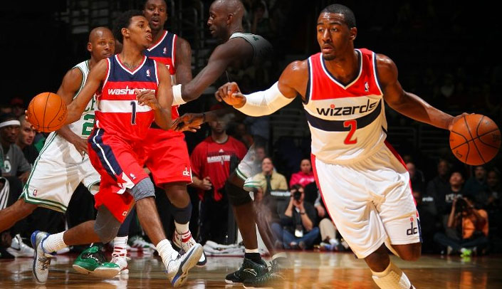
The Washington Wizards made the biggest change to their set coming into the season, the blue, bronze, and black colour scheme which the team had used since their first season as the Wizards in 1997-98 has been swapped over to the red, white, and blue colour scheme used by the club when they were known as the Washington Bullets.

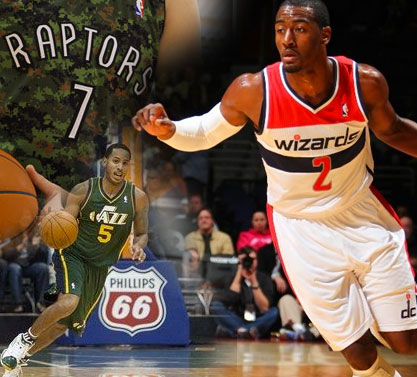
Like several NBA teams (Toronto Raptors, Denver Nuggets, Utah Jazz, etc.) their primary logo has changed only in it’s colour scheme and will be rarely seen outside the official team stylesheet. The club is using their new alternate “dc” mark in the same way a club would normally use a primary logo. A new logo featuring a basketball and the Washington Monument has been added as an alternate logo, this new alternate logo has one of the highest user ratings of any logo on SportsLogos.Net garnering a score of 9.1 out of 10.
The new uniforms are a homage to the uniforms the Bullets used throughout the 1970s, with contrasting red, white, and blue horizontal stripes at the top of the uniforms.
New York Knicks
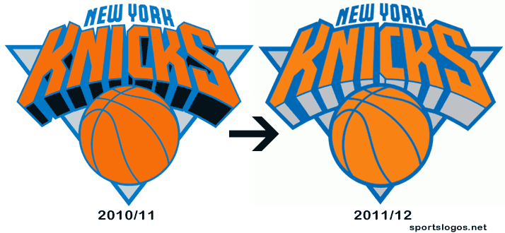
Continuing a welcome trend in New York City, the Knickerbockers have removed black from their colour scheme, sorta. Their official logo set has them going back to the basic blue, orange, and white for the first time since 1992. A new alternate “subway token” logo featuring “KNICKS” written on a basketball has been added to the set.
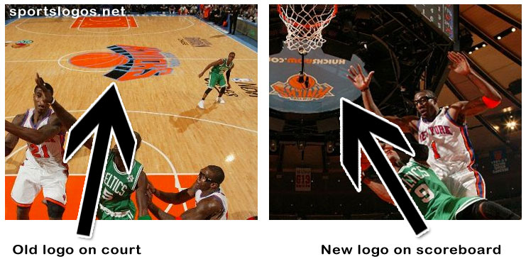
I said “sorta” in that previous paragraph because interestingly the black still remains on the Knicks centre-court logo, and their uniforms, but is missing mostly everywhere else. Confusing? Incredibly. But I can confirm that this new black-free logo is indeed their official primary logo for the 2011-12 season. Hopefully there will be uniforms removing the black to match in time for next season.
Utah Jazz
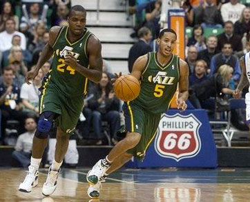
The Utah Jazz unveiled a green alternate jersey earlier this month, the new jersey is an homage to the green road jersey the team originally wore beginning with the 1981/82 season through the 1983-84 season.
Miami Heat
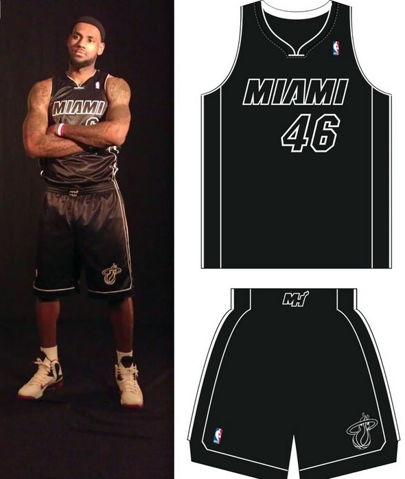
The Miami Heat unveiled a new all-black alternate jersey which they have officially branded as their “Back in Black” jersey. The jersey eliminates all red from the colour scheme and only trace amounts of white, used to outline the team script and player numbers – leaving them otherwise non-existent. As we’ll show a graphic of later in this post, the Heat will also be wearing a Miami Floridians ABA throwback jersey during the season.
Toronto Raptors
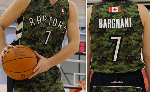
In an effort to honour the Canadian Military the Toronto Raptors unveiled a camouflage alternate jersey becoming the first NBA club to sport such a tribute uniform. The jersey will be nearly identical to the regular Raptors road jersey with the camouflage pattern in place of the red and “CANADA” written across the back of the shorts. A Canadian flag instead of just a maple leaf will be above the player name on the back of the uniform. The uniforms will be first worn on March 21st and then again four more times in the next three weeks (Mar 26, Apr 1, Apr 16).
Dallas Mavericks
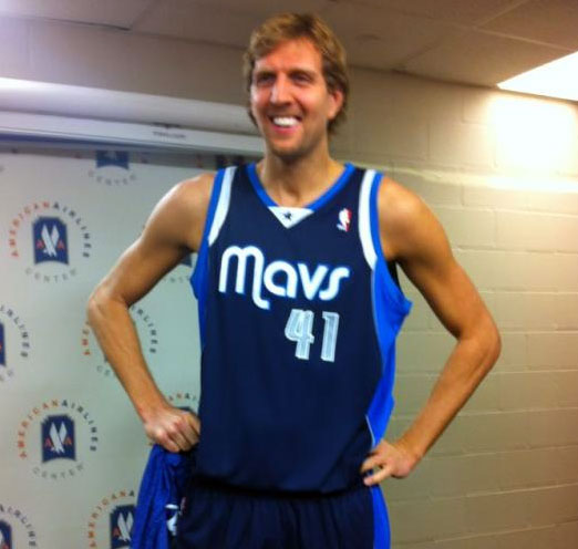
Defending NBA champions, the Dallas Mavericks have made some alterations to their alternate jerseys unveiled late last week. The basic concept remains but a darker blue is now the predominant colour as well as the swapping of the placement of the script with the player number on the front of the jersey.
Sacramento Kings
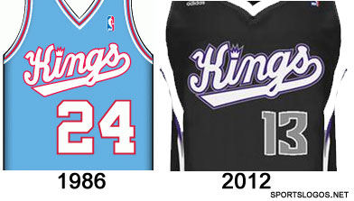
Nearly relocated following the end of last season, the Sacramento Kings are still here in 2012 with a new black alternate jersey. Across the front of the jersey is a script extremely similar to the one used in the Kings’ first seasons in Sacramento but now in black, purple and white instead of their 1980s colour scheme of red, white and blue. Silver numbers are placed below the script.
Golden State Warriors

The Golden State Warriors will be sporting a patch on their jerseys throughout the 2011-12 season, the patch commemorates 50 seasons playing in the Oakland-San Francisco Bay Area of California. The logo is a ’50’ in yellow outlined in gold with the Bay Bridge graphic from their primary logo across the zero in blue.
New Jersey Nets

For their final season in New Jersey, the Nets have introduced a 35th anniversary logo, the logo makes reference to every logo the club has used since their inception in 1977. In what has been one of the slowest re-locations ever, the Nets will be finally moving to Brooklyn for next season (2012-13) and will be renamed the Brooklyn Nets with a whole new logo and uniform set.
Hardwood Classics
According to official league stylesheets (which, to be honest, haven’t proven to be the most reliable sources as of late) there will be eight teams wearing Hardwood Classic uniforms during the 2011-12 season, all of which will be honouring ABA teams either linked to their current franchise or which previously played in their home city:


There’s all your changes for the upcoming, albiet shortened, NBA season. Thanks for reading and have I hope everyone has a very happy new year here in 2012.


