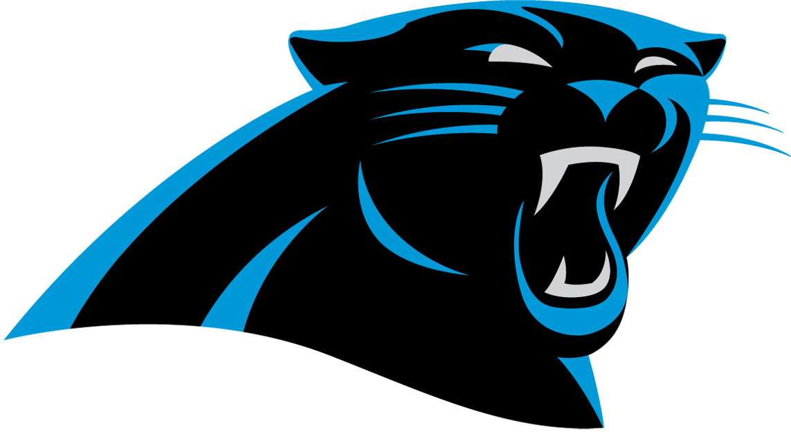
The Carolina Panthers inadvertently had their new primary logo for the 2012 NFL season unveiled by Nike just prior to yesterday’s Pro Bowl.
The new, slightly modernized version of the original Panthers logo was shown by Nike via their Facebook page displaying team-logo gloves players were wearing for the Pro Bowl game, the shot of the Carolina Panthers gloves showed this new logo.
Carolina Panthers President Danny Morrison explained the change after the new logo was discovered, “We have one of the finest and most recognizable logos in the NFL and (we) wanted to make it as modern as possible without losing the dramatic essence of the mark”
The Panthers further explained the change via a post on their official website:
Staying true to the roots of the panther with subtle updates reflecting a tougher, more defined panther, the evolved logo is evocative of the popular panther statues found on the grounds of Bank of America Stadium. The white outline around the logo has been removed to create a more dimensional feel and to keep the focus on the features of the panther.
The logotype has been refined to be a modern reflection of the Panthers brand. The new font subtly nods to the swipe of a panther, through a three stripe element incorporated into the “A” of “PANTHERS.” The angle and graphic accents in the letters were custom created and inspired by the swift, sleek nature of a panther.

The uniforms are not expected to be changed drastically, the Panthers and the rest of the NFL will be switching uniform manufacturers from Reebok to Nike in time for next season leading many to believe major uniform overhauls are coming.
Along with the new logo, a new wordmark logo was also unveiled.


