With just over 24 hours to go until the big game, we’re taking a close look at some of the best Super Bowl programs since the big inaugural game took place January 15th, 1967 in Los Angeles. This year’s Super Bowl should be a great match up and a record number of people (a reported 173 million) are expected to be watching. This means close to $11 billion will be spent on decorations, snacks, apparel and memorabilia.
Programs have long been a integral part of a football fans proud Super Bowl Collection. In fact, if you wanted to collect an entire library of Super Bowl programs from 1967-2012, it would probably set you back almost $2,200. So before you rush over to eBay to supplement your collection with some shiny new (or not so new) programs, here’s a look at the best…

Lets start off by first introducing this year’s program. Thankfully, this year’s cover design draws attention away from the awful “clinical” Super Bowl logo which won’t be going away anytime soon thanks to the introduction of a standardized logo design by the league last year. While there certainly is something to be said for “keeping it simple, stupid”, like last year’s offering it is lacking in any kind of personality. The design however, is well-balanced and bold. That being said, I fear the trend of a trophy slapped onto an ultra-slick and super-minimal graphic is here to stay which is…well, sad. Are the days of cleverly designed programs that pay unique homage to the host city gone forever? Lets hope not.
Looking back over 45 years of Super Bowl programs, one is really struck by the complexity of some and the ultra simplicity of others. Even the ones that look like someone spewed their Super Bowl Sunday nachos onto the page (like Super Bowl VI) still have a nostalgic appeal.
Having said that, here’s my Top-Five favourite Super Bowl program covers of all time:
NUMBER 5:
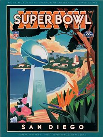
Super Bowl XXXVII January 26th, 2003…The last Super Bowl to be played in California
Tampa Bay Buccaneers defeat Oakland Raiders 48-21
Fun Fact: Tampa Bay wins its first ever Super Bowl. This was only the second time in history that a host state for the Super Bowl also hosted the Stanley Cup finals in the same year.
The Program: Anyone who’s ever visited San Diego knows that this place is a true gem. The program pays homage to the stunning beaches, perfect “Simpsons Clouds” that constantly fill the blue sky and of course the picturesque waterside communities that dot the shoreline. This program not only accurately depicts the host city but for once it doesn’t feature the stadium which is a nice, refreshing change. Simply designed and bold in colour, this program is a great example of form and function working together. Some might think its not “football” enough but maybe that’s a good thing.
NUMBER 4:

Super Bowl XXXV January 28th, 2001
Baltimore Ravens defeat New York Giants 34-7
Fun Fact: The Ravens are the first NFL team “created” after the 1970 AFL/NFL merger to play in and ultimately win the Super Bowl
The Program: This stunning program is one of my favourites because of the way that the Vince Lombardi Trophy shines next to the well-designed and simply rendered palm trees, boats and Tampa skyline. What a great way to feature the city while making the true focus of the program stand out. It’s like a shining beacon of football goodness…..all that is right in the sporting world. A nice touch is the Super Bowl XXXV logo which isn’t so hidden away this time around and is a good example of what a well-designed emblem of the game should look like.
NUMBER 3:
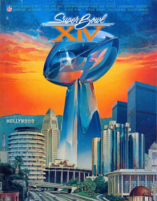
Super Bowl XIV – January 20th, 1980
Pittsburgh Steelers defeat Los Angeles Rams 31-19
Fun Fact: Despite throwing three interceptions, Steelers quarterback Terry Bradshaw was named the game’s MVP by completing 14 of 21 passes for 309 yards and two touchdowns.
The Program: The Super Bowl XIV program really makes you feel that during this weekend, “Football was King” in Pasadena. Marked by a 1950’s car hood ornament inspired logo and a unique setting sun background, this cover art is perfectly balanced. The detail in the reflections on the football portion of the trophy is the star of this show. Rising from the Rose Bowl, the trophy has an otherworldly look. Like a chrome alien spaceship erupting out of an underground hiding space where its been waiting to be launched for thousands of years….whoa, too deep. I think I’ve watched “Sphere” too many times.
NUMBER 2:

The second AFL-NFL World Championship Game (later known as Super Bowl II) – January 14th 1968
Green Bay Packers defeat Oakland Raiders 33-14
Fun Fact: Unlike the first Super Bowl, this game was televised live on only one network, which remained that way for all following Super Bowl games. The Orange Bowl was sold out for the game but unconditional blackout rules in the NFL prevented the live telecast from being shown in the Miami area.
The Program: I really struggled with this one. It’s a masterpiece of original sports artwork and a really desirable collectors item in any form. A program signed by all 21 players from the Green Bay Packers is going for over $500 on eBay and tickets from the game, which also don the stylized players on the green background design, are even harder to get your hands on (depending on seat location they can go for up to $1,000). The nostalgic feeling created when inspecting this cover is incredible. Each team is represented in a complicated but visually simple design and it’s all hanging out on a bold green background….you can’t stop looking at it…I dare you to turn away! A brilliant example of not over-doing it.
NUMBER 1:

Super Bowl XXVIII – January 30th, 1994
Dallas Cowboys defeat Buffalo Bills 30 – 13
Fun Fact: Many sports writers and fans were upset that the Bills had advanced to their fourth consecutive Super Bowl. Many didn’t wish to witness another loss (like in Buffalo’s three previous attempts). Bills fans went on the defensive about their ability to win. During Buffalo’s victory in the AFC championship game a week earlier, one fan displayed a banner defiantly proclaiming, “We’re back; deal with it, America!”
The Program: The internal battle I had between this cover and number two in my prep for this article was pretty legendary. I’m a real sucker for nostalgia and number two is so very 1968. But if we’re looking at Super Bowl Programs we really have to consider the top program to be the one that really exemplifies the genre. When I think of football I think about the broad appeal that the game has, from muddy pick up games on local high school fields between friends to 80,000 seat stadiums filled to the gills with screaming, painted faced fans. Take a look at the program for Super Bowl XXVIII above and tell me that it doesn’t make you feel nostalgic for home, for a friendly game of ball in the yard with your family on a Sunday. So whats so good about this program? From a design perspective it’s perfectly balanced, well thought out and even though it does have a lot of elements, it isn’t overwhelming. While the setting sun beyond the peach tree-lined football field draws you in like a lullaby and sets the scene, the main shield design tells the story of the game itself. An homage to the host city, a peach is featured prominently next to the NFL logo and the NFC and AFC banners are craftily interwoven into each side. The Georgia Dome and Lombardi trophy are prominently featured without being the center of attention. As a whole this cover screams “Super Bowl!” for me. Every element belongs and there is nothing I would remove. You might have noticed that the Super Bowl XXVIII logo is missing, which is just as well. It doesn’t match and would have stuck out like a sore thumb.
And to finish up….

There is definitely no better way to wrap up this article than to introduce you to the worst artwork ever produced for the Super Bowl. It just so happens that it’s from this year’s game. The city’s host committee commissioned the below atrocity for their official poster (yeah, I know it’s not a program but hey, how could I leave this beauty out?). Now, I don’t blame this poster entirely on the artist, speaking from experience when dealing with a client disguised as a “committee” I can tell you that something as simple as a poster design can take on a ridiculous number of individual opinions.
Here’s how I can see that conversation going:
Committee: Mr. Artist, please design us a Super Bowl poster
Artist: Ok, here’s my interpretation…its the stadium, featuring the logo and a football
Committee: We really like it….can you add in something that symbolizes “Victory”?
Artist: Alright, I have added the Victory statue
Committee: Looks perfect, my seven year old wishes there was more excitement
Artist: Ok, I added confetti and fire, but this really doesn’t represent me as an artist anymore
Committee: Thanks, we’ll go with this for now. Please sign your name on the bottom and our PR rep will schedule you for interviews to talk about your work
Related stories:
 Correcting the Record: The First Four Super Bowl Logos
  Mercedes-Benz Stadium reveals local logo for Super Bowl LIII
  Peyton Manning wore a champions hat with “champions” printed upside-down
  A look at the 10 best Super Bowl uniform matchups
  Falcons, Patriots Phantom Conference Champs Gear
  NY Giants Add “Ring” App; now you can be a Super Bowl Champion too!

