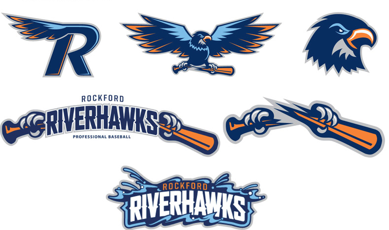
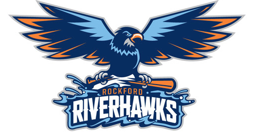
The Frontier League’s Rockford RiverHawks unveiled their new logo set on Sunday replacing this logo which had been in use since 2007. The new logo is very reminiscent of the team’s logo previous to their logo from the last few seasons seen here, which was used up until 2006.

From the official team news release:
“We wanted to rebrand the RiverHawks, show a ‘rebirth,’ if you will,” said team president Bryan Wickline. “I keep reiterating that it’s a new era for professional baseball here in the Rock River Valley and our new branding starts with the logo. Our club has received great initial feedback on the new look, and we hope our fans like the changes,” Wickline added.
The new logos feature the addition of orange to the familiar navy and columbia blues. “We felt it needed to be brighter and, most importantly, represent power and strength,” said Wickline. “Tony Neary and his entire crew at Traction were wonderful to work with and made the potentially painful task of creating a new logo from scratch a truly enjoyable experience. Tony has worked with many other professional sports teams, as well as national companies, and their work is amazing. They are an exceptional company,” Wickline added.
In addition to the new logos the team also announced their mascot Rocko will be getting a makeover which will debut on May 25th,
For more check out the official news release from the team here.


