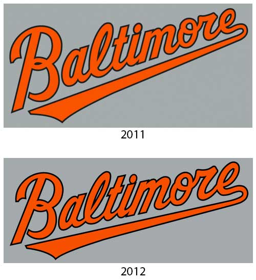
Baseball fans everywhere loved Baltimore’s off-season changes, the various logos of their new identity are rated at least an 8 out of 10 here on SportsLogos.Net.
The Orioles made several changes design-wise during the off-season, some big, some very small. I take an in-depth look at all the changes the Baltimore Orioles made to their logos and uniforms heading into this 2012 season over at The Score’s Getting Blanked blog.


