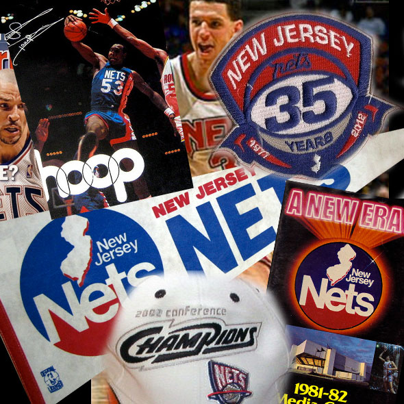
Tonight the New Jersey Nets will play their final game in the NBA.
After 35 seasons it’ll all be over just a few short hours from now. The team will be relocating to Brooklyn for the 2012-13 season. The Brooklyn Nets will have a new logo, and reportedly a new predominantly black colour scheme.
Almost always forgotten in the shadow of their more popular neighbours the New York Knicks, the New Jersey Nets have had their fair share of memorable moments in the NBA.
There was the back-to-back Eastern Conference Championships in 2001/02 and 2002/03.
The four Atlantic Division titles in five seasons.
Superstar players in Buck Williams, Jason Kidd, Vince Carter, Jayson Williams.
The tragic tale of Drazen Petrovic and the disappointing end of Michael Ray Richardson’s basketball career.
Those memories will surely be carried on with the team into their new home at Brooklyn’s Barclays Center, but they’ll never be “New Jersey” ever again.
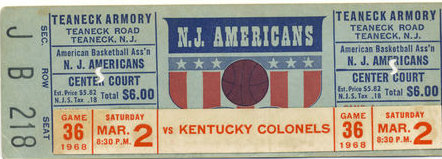
The franchise started life in 1967/68 in the new American Basketball Association as the New Jersey Americans. After a season playing in front of only 2,000 fans a game and losing half-a-million dollars team owner Arthur Brown announced they were taking off for Long Island on July 17, 1968.
Along with this shift to Long Island came a new name, New York already had the Mets and the Jets, so it was only natural the city’s newest basketball team join the party – ladies and gentlemen, your New York Nets.

Life as the New York Nets were great… Dr. J, two ABA championships in 1974 and 1976.
But we’re not here to discuss their days in New York.
The Nets merged into the NBA in 1976 and a season later were relocated back to New Jersey to play on the campus of Rutgers University while the new Meadowlands Complex was under construction. The New York Knicks opposed to this relocation claiming New Jersey to be a part of their territorial tights, it took a $4 million payment from the Nets to the Knicks for the team to drop their block of the move.
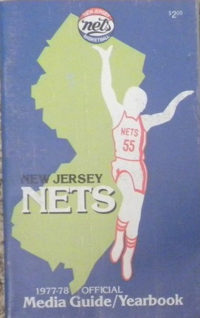
This was the beginning of the New Jersey Nets era.
The Nets used a tri-colour basketball logo in their first season as the New Jersey Nets, carrying over their ABA heritage, the uniforms were the same as those worn during their time in New York.
After one season the Nets re-designed their logo really playing up their new home state, an outline of the State of New Jersey was featured prominently.

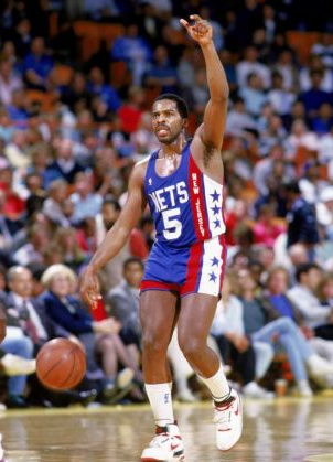
It wasn’t until 1982 that the Nets wore uniforms baring the name of their new home, a script “New Jersey” which was only worn for two seasons before the team switched to these beauties full of retro goodness…
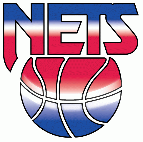
For the 1991-92 season the Nets unveiled a very generic red-white-and-blue gradient logo as their new primary mark. You could call it the Oklahoma City Thunder logo of that era, it felt interchangeable, just change the name in the logo and it would work with any team as needed.
This new logo saw the introduction of one of the more interesting uniforms in NBA history, and they didn’t last long. Commonly referred to as the “tie-dye” uniforms, the Nets wore a road uniform which transitioned from blue to white and back again in a seemingly random pattern.
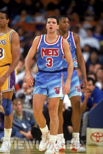
The Nets ditched this uniform after just one season, for 1992-93 the team replaced the tie-dye with a solid blue. Thankfully.
“This is the dumbest idea you’ve ever come up with”
It was the Summer of 1994 and the Nets had gone through several seasons of low attendance, poor merchandise sales, and little impact in the NYC metro area. Team president Jon Spoelstra felt he needed to spice things up a bit to get people interested again.
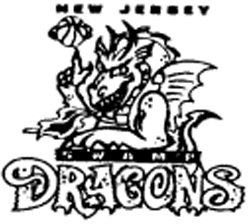
His solution? Change the name of the team from Nets to Swamp Dragons.
Yes, the New Jersey Swamp Dragons. The 90s were a scary time.
“We knew we were going to get criticized, just like the Mighty Ducks did. But I felt kids would buy the merchandise, and I was thinking more of an image overhaul” – Joe Spoelstra, Nets president
Spoelstra went into the NBA head offices to meet with commissioner David Stern about the idea and (according to Joe himself) Stern said, “This is the dumbest idea you’ve ever come up with”. Stern was absolutely right but twenty minutes of heavy persuasion later Stern was all for it.
The Governor of New Jersey caught wind of the rumoured change and took issue with their usage of the term “Swamp” in the new name, having just spent 20 years trying to convince the world that the Meadowlands were anything but a swamp; 65% of those polled were against the name change; but the Nets steamed ahead with the plan.
A new logo was created and registered by NBA Properties on June 30th, 1994. The logo featured a dragon popping up above the SWAMP DRAGONS script spinning a basketball on his clawed finger – predominantly teal.
Everything was all set for the Nets to change their name, all that was left was a NBA board of governors vote, 27 teams voted yes, 1 team voted no.
Can you guess who voted “no”?
It was the New Jersey Nets.
At the last second one of the Nets owners changed his mind, and that was that. No more Swamp Dragons. The Nets name lived on.
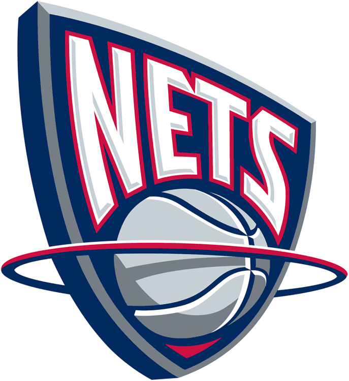
On June 23rd, 1997 (just two weeks after this site was launched) the New Jersey Nets unveiled what would end up being their final logo during their years in the Garden State. Described at the time as “a 3-D shield representing a futuristic backboard” it marked the introduction of silver into the Nets colour scheme.
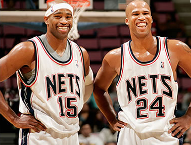
The Nets were most successful during their time in New Jersey using this logo, it was this logo and identity which saw the team make their only appearance in the NBA Finals, and they did it twice.
In their last NBA Finals appearance in 2003 against fellow ABA alumni the San Antonio Spurs, the New Jersey Nets did something few teams in sports history have done before. They wore retro throwbacks in a championship series game – complete with NBA Finals patch.
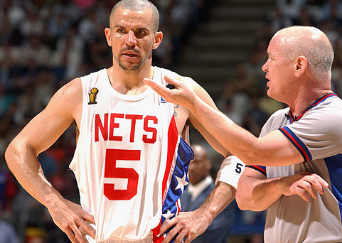
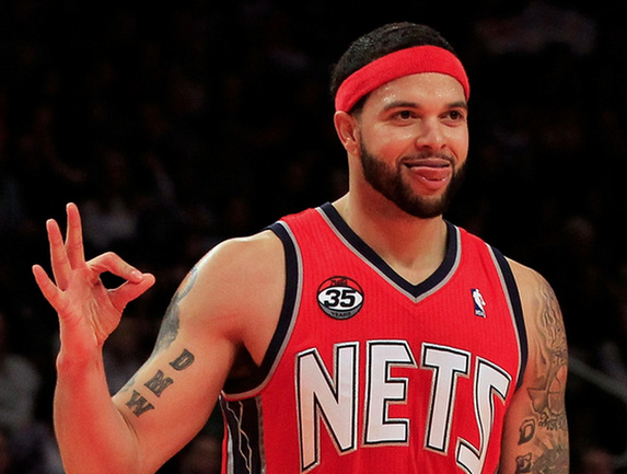
During this period the Nets introduced their first non-blue uniforms, a silver alternate for 1998/99 and eventually a bold bright-red alternate in 2006/07 which has since been promoted to the full-time road uniforms for the Nets.
Being a Toronto Raptors fan I have my fair share of memories involving the New Jersey Nets:
- New Jersey were the Raptors opponents in their first ever game back in November 1995; they were gracious enough to give the Raps the victory in their franchise opener
- The Vince Carter trade, yeah, they beat the Raptors good on that one
- 2007 NBA Playoffs – Raptors marketing was pushing hard for the fans to all wear red for home games in the Nets/Raptors series. The Nets respond by wearing the red alternates for every game in Toronto. Well played.
So this is it, the New Jersey Nets are in Toronto tonight playing those Raptors, the last time “New Jersey” will appear on an NBA scoresheet, in a game recap, boxscore, ticket stub, you name it.
The team will officially continue on as the New Jersey Nets for the rest of the week. On Monday, April 30th the team will officially rebrand themselves as the Brooklyn Nets, a new logo and a new colour scheme is expected to be unveiled on that date.
A rumoured logo for the Brooklyn Nets made it’s way onto the Internet late last night, I cannot confirm nor deny that this is the new look. If it’s back story is true (employee of the new arena says it’s everywhere in there) then it sounds promising.
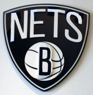
If this is it, I guess it’s okay. Black and white seems very unexciting but I like that they’re at least carrying something over from the previous identity (the shield). We’ll have to wait until April 30th to see if this is indeed accurate.
Cheers to the New Jersey Nets.

