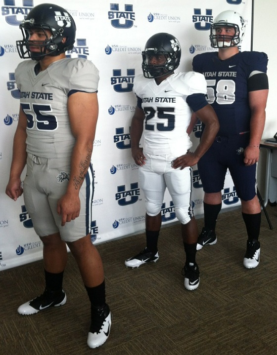
Utah State announced not only a new athletics logo, but a new set of football uniforms on 4-28-2012. They will have a three color set, with choices from Navy, White, and an extremely light grey.
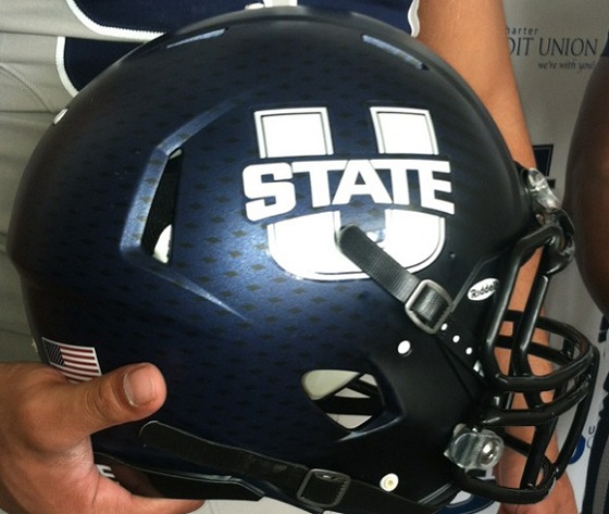
The new logo is featured on the white and on the blue helmets. The blue helmets do appear in some photos to have a dotted texture. The white helmets don’t seem to have a texture, but might in fact have a pearlescent coating. Further photos will need to prove that theory.
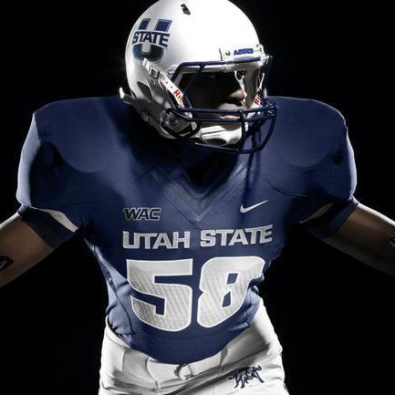
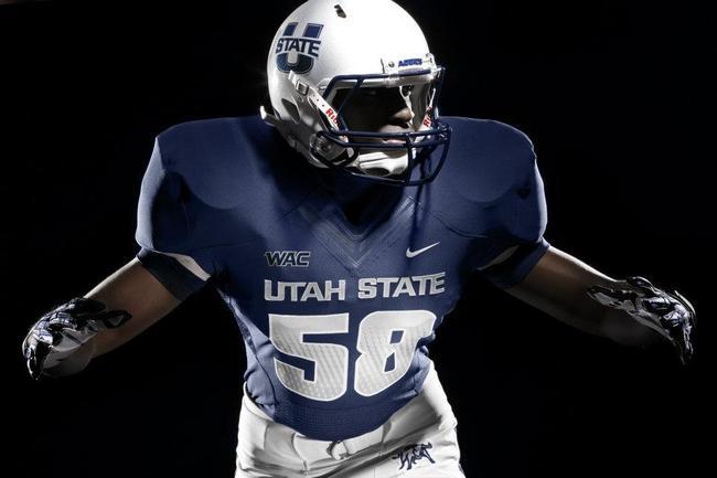
The jerseys are of relatively traditional design, the white having a dark navy, textured number outlined in grey and a blue sleeve-ending stripe. The blue jerseys are the inverse of the white, with a white textured number, grey number outline, and a white sleeve-ending stripe. The “grey” jerseys are identical to the white, but in a very light shade of grey.
The numbers in the photos, curiously, don’t seem to match the blue of the helmet or sleeve stripes (which do match one another.)
There are reportedly pants in white, blue, and grey, though those were not featured heavily in the press photos. Once assumes they are devoid of substantial design elements, such as stripes.
The biggest difference from previous years’ Utah State jerseys is obviously the backing off of stripe usage. Last year’s jerseys had a neck stripe that adjoined a chest stripe and created the look of a camping backback, clipped closed in the front. The new jerseys are devoid of all but the sleeve cap stripe.
Take a look at the new jerseys:


Compare those with 2011’s version:

Opinion:
- The design is clean and solid, and while some may complain that they are too much so, this author respects a simple look.
- The color palate is familiar, so it can’t be helped to point out similarities with BYU. Though, previous iterations looked a lot like Penn State, so there is danger in taking blue and white in any particular direction.
- The helmet texture seems to be subtle as well as the number texture, which is a nice detail that keeps from being distracting.
- I will have to take their word for the grey being different. It looks a LOT like the white. Maybe it will show up live or on TV
- The navy numbers being so much darker than the helmet and sleeves will really be misfortunate if this makes it to mass production. One expects better from a company the size of Nike.
Would you buy this new jersey if you were an alumnus? Is this a blatent rip-off of BYU? Is it a step up for the Aggies?
UPDATE: Some new pictures, not taken in a studio, show a better view of the helmet pattern and show exactly how different the grey really is.
