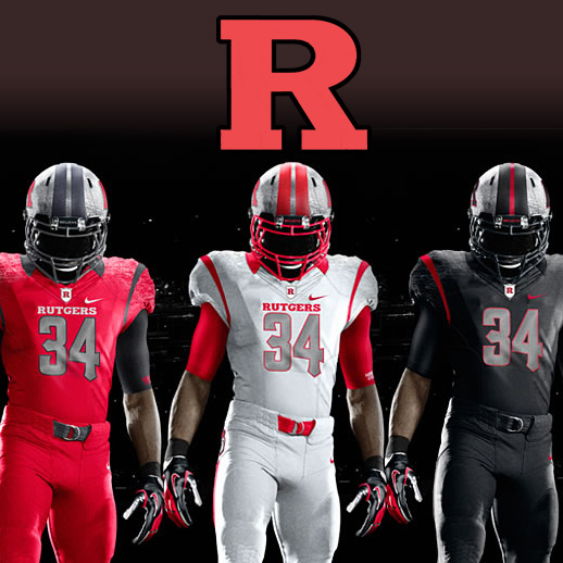
On May 1st, Rutgers University of New Jersey announced its new uniforms for the 2012 season. Three separate sets of jerseys, pants, and helmets were shown in a press release.
The hallmark of this new uniform is the new helmet. Moving away from their previous red helmet, they showed a fully chrome helmet in three different logo and striping variations.
Though not exceptionally clearly shown in the photos, the jerseys will have a shoulder treatment that consists of an inset ribbing to create the appearance of iron plate. Nike claims this will allow for less give and fewer grab points.
More noticable, and quite distinctive, is the antiquing or “designed abrasion” to the helmets. They will not be polished chrome all around, rather they will sport a “rough” look with pre-distressed scrapes, in a pattern that will give the appearance of metal being scarred. This is intended to give this chrome color a realistic feel and a tough image.
Continuing that metal-look will be the numbers, adorned with a chain mail texture. Again, a detail not easy to recognize on the photos, we will need to await close up pictures to see this detail.
Previous Rutgers teams were a simple red and white with their traditional “Block R” with the uniform rendered in white and scarlet. Now, they embrace or even add a fourth and fifth color to the set, in silver and black.
Unclear if the jersey and pants will be mix-and-match, as they were shown color-on-color in the release.


Opinion:
- I can’t say enough about the unique and interesting worn and rough-look texture. This is a unique direction as far as I know and really stands out in a sport known for going more pearlescent, more shiny, more detailed.
- Rutgers previous look was nestled between “high school” and “old-school NFL” with the outcome being either simple or boring, depending on your perspective. This is an upgrade in interest at the very least.
- The Chrome helmet is what seems to be garnering the most input, and largely negatively. This author respects the unique nature of using a chrome look rather than the traditional helmet concept of metallic flake silver paint. The additional detail of the aging or scuffing of the helmet really adds texture and a distinctive look.
- Hoping to see the red jersey with white pants, the white jersey with red. The unitard look of football players in jumpsuits or Cooperalls is very tired and should be avoided. However, based on these press photos, Rutgers may go full unitard every game, which would be a shame.
- The metallic numbers are a neat detail, but if you notice in the pictures, when a player is less than facing directly towards the viewer, they go dark quickly, which may be difficult for refs, or more vocally, alumni to see form the sidelines. Remember this, and check back to see if those change to a simple grey at a later date.
Are the designs just what Rutgers needed to stand out and stand up in the Big East? Are the Chrome helmets your new favorite? Does anyone else wear their uniform to the first game pre- “worn out?”
Related stories:
 Rutgers To Honor 37 Alumni Who Died In Sept. 11 Terrorist Attacks With Alternate Uniforms
  Rutgers Scarlet Knights Unveil Long-Sleeve Throwback Uniforms
  Oregon Ducks Unveil New Uniforms for 2013 Alamo Bowl
  Oregon Does What Oregon Does Best and Announces New Jerseys… Except, They Aren’t New
  Northwestern University will “Reclaim The Stripe” with their new 2012 Under Armour uniforms
  Texas A&M Releases New Adidas Uniforms, Inspired By 1970’s Look
  Eastern Michigan Announces a Mind-Boggling 20 Different New Uniform Looks
  Arkansas Finally Goes Official With Their New Uniforms

