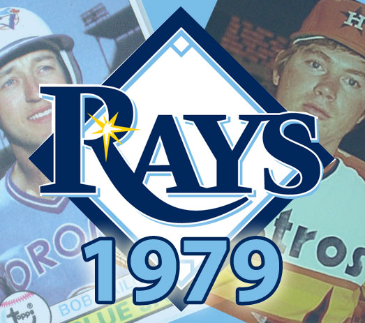
The Tampa Bay Rays are planning on holding a Turn Back the Clock game where they will wear the uniforms of the 1979 Tampa Bay Rays.
What’s that you say? There were no Rays in 1979? Well, you’d be right, and the Rays have created “faux-back” uniforms as if they did exist in 1979.
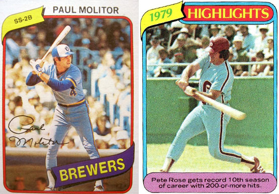
The uniforms include most of the classic elements of the uniforms of the era:
- the cap with the alternate coloured front-panel
- the pullover jersey with sleeves in another colour from the base
- thick sleeve trim striping
- and some good old-fashioned powder-blue
The logo and jersey script is not the same as the current 2012 Rays looks, it’s all been re-created to look as if it was designed in the ’70s.
Unfortunately they did not go with elastic waist-band on the pants, but really that’s the only thing they missed in this near-perfect set.
The opposite of the horrid “Turn Ahead the Clock” games held in 1999 where teams went forward to 2027, this new promotion creates all sorts of opportunities in the future for other clubs – clubs around the league, regardless of their establishment date, can now turn back to the 1920s, 1950s… I can’t wait to see what the Miami Marlins would do with a 1970s look!
The Rays have yet to unveil this uniform, so I won’t be sharing the photo, but I’m very confident this promotion will be a hit – kudos to the Tampa Bay Rays and whomever came up with this concept.
The 1979 Tampa Bay Rays turn-back-the-clock game will be held on Saturday, June 30th against the Detroit Tigers where “Earth, Wind, and Fire” will also be performing after the game. The Tigers are unfortunately not taking part in the promotion.
If you live in the Tampa Bay area, you HAVE to go to this game.
UPDATE (June 12, 8:57am): Some more details of how this uniform looks:
- The ‘tb’ on the cap is blue, lowercase (not overlapped, but still diagonal) with a yellow sun in the hole of the letter ‘b’
- The cap is all blue, looks like a lighter shade than the current Rays blue. The front panel of the cap is powder blue, similar to the Rays current powder blue.
- The jersey is a pullover with a blue chest and back, light blue arm sleeves. There is a patch on the left sleeve which I could not make out in the photos I’ve seen.
- The sleeve trim is blue/powder blue/blue
- The script across the front of the jersey is similar in execution as the 1978 San Diego Padres uniforms, in powder blue, “rays” in lowercase with the yellow sun in the hole of the letter “a”
- A yellow number is below the script on the front.
- Pants have a belt (why??), they are powder blue with blue/light blue/blue stripes down the side.
- Socks are solid blue.
- I have not seen the helmets or the back of the jersey.
- No word on when this jersey will be unveiled, but it’s gotta be soon as the game is less than 3 weeks away.

