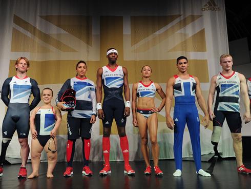
While the athletes prepare for the “Big Show” we here at SportsLogos.Net will be taking a look at some of the official team uniforms unveiled for the upcoming London Olympics. From the looks of it, we’ve got something for everyone….from the boring to the ridiculous.
First up, and fittingly so, is the uniform set for Team Great Britain. This year’s host unis have drawn mixed reviews. Two years ago British Olympic-wear fabricators Adidas named London native Stella McCartney as the Creative Director for the project. It’s the first time ever that a fashion designer has been asked by Great Britain to take on the challenge of outfitting its athletes. But Stella is no stranger to athletic-wear. She partnered with Adidas in 2004 to debut “adidas by Stella McCartney,” a critically acclaimed line which has since branched out to additional disciplines including winter sports and tennis and has been a commercial success.

For this new challenge, McCartney had to oversee the design of 46 event uniforms from cycling to track to swimming. The unique challenge for Stella this time was perfecting a marriage of technology, performance and aesthetics….not to mention making it all fresh and original. Stella told reporters that she was inspired by the Union Jack “one of the most beautiful flags in the world”. and that “Working on the kit was, a lot of the time, not about being a fashion designer – it was about creating something for the nation and the Union Jack seemed like the right place to start.”

At the unveiling in the Tower of London, Adidas and McCartney presented a series of uniforms that seemed to slightly under-whelm the nation. The critics however, have been quite harsh….faulting her for not using enough red in the design, a colour some sports analysts insist is linked to high performance (not to mention the flag). Scientist have even found that referees have shown to be slightly biased toward athletes wearing red as compared to their blue-clad counterparts when teams are evenly matched. In the August 2008 issue of Psychological Science, a journal of the Association for Psychological Science, researchers found that referees tested in one-on-one boxing, tae kwon do, Greco-Roman-wresting, and freestyle-wrestling matches at the 2004 Summer Olympics in Athens, Greece awarded on average 13% more points to the red competitor over the blue.
But what about the design itself. McCartney certainly has taken into consideration the needs of both male and female athletes, ensuring that each gender has its own cuts and functionality. The flag is really the main focus of the look, and you certainly think “Britain” when you see it from an international perspective. Aside from the look itself and also worth mentioning is that environmentally conscious McCartney has also featured eco-friendly construction and materials in some of the uniforms, specifically Andy Murray’s, whose uniform is made from 100% post consumer recycled PET.

We’ll be watching to see how effective the athletes are without the overuse of red…..could be that they don’t need it to succeed.
And look at it this way….at least the athletes dont have to wear the pink flamingo atrocities that the London Olympic Ambassadors are being asked to wear. Even London’s Mayor Boris Johnson issued a joking apology to volunteers, saying “‘It’s quite striking, isn’t it? I hope you don’t feel too ridiculous. We need to overcome our natural British reserve and be a little bit more like the Australians!”.

Join us next time as we take a look at the uniforms of thoose cooky Aussies!


