The Las Vegas Wranglers, an ECHL team with no NHL affiliation, today unveiled their revamped logo set as well as a 10th anniversary logo for their upcoming 2012/13 season.
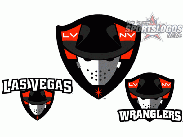
In the graphic shown above, the large logo in the centre is the primary logo, flanked on either side by the new alternate marks.
The Wranglers describe the new primary logo as follows from the official release:
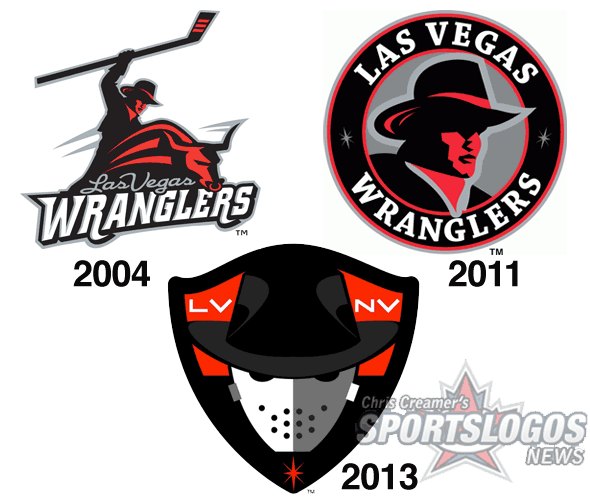
The logo features a hockey-masked cowboy, keeping with the Wranglers’ tradition. The new crest design honors the city of Las Vegas with “LV” and “NV” lettering flanking the cowboy, and a red bling carries over from the design of the original Wranglers jerseys.

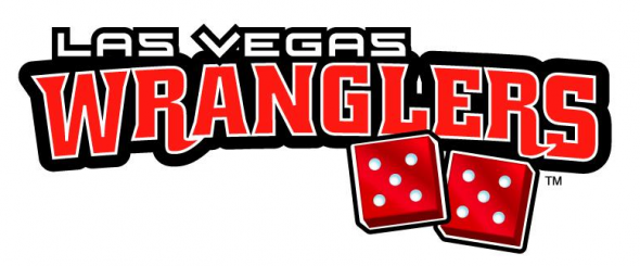
The tenth anniversary logo has some fun with the fact that the club calls Las Vegas home, featuring two dice each showing “5” (in case you don’t get it, two fives equals ten).

Back to the official release, Las Vegas Wranglers president Billy Johnson had this to say about the new logos his team will be taking the ice to this fall:
It’s a simple and bold new look to celebrate a terrific ten-year run in one of the greatest cities in the world, we have always striven to bring a major league caliber experience to Las Vegas through sights, sounds and entertainment, and the new branding is the next step up.”
New uniforms are expected to be unveiled in August.


