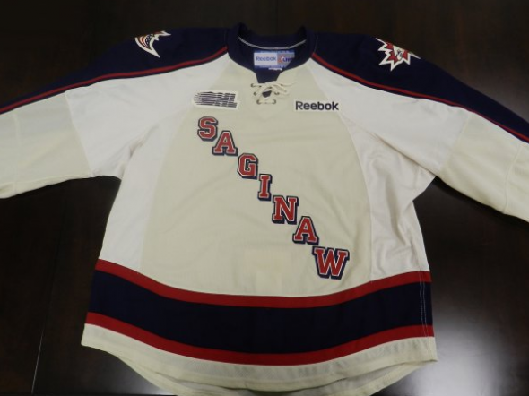
The Saginaw Spirit of the Ontario Hockey League have unveiled their new alternate jerseys to be used beginning with the upcoming 2012-13 season.
The new uniforms are white with blue sleeves trimmed in red and also across the waist of the jersey, “SAGINAW” is diagonal across the front of the jersey NY Rangers style, a new shoulder patch has been added. A lace-up collar is also present.

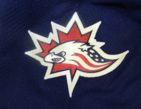
On the shoulder is a new logo, a variation of the Saginaw Spirit 5th anniversary logo used by the club in 2007/08. The logo features the eagle from the Spirit primary logo complete with stars-and-stripes with a maple leaf in the background. With this logo the Spirit are honouring both the United States (where they play their home games), and Canada, where the majority of their players are from and also the home of the league in which they play.

White uniforms are worn both at home and on the road in the OHL (teams wear lights at home for the first half, darks at home in the second) so the Spirit will be able to wear this in front of the home fans without much co-ordination required with the visiting team.
The new alternates replace the LA Kings-inspired black thirds the team had been wearing last season. This new look is much more co-ordinated colour-wise with the main branding of the Spirit, whereas the old look really had absolutely nothing to do with everything else the team was wearing.

Honouring two nations at once on a uniform is nothing new in the world of sports, Major League Baseball’s Toronto Blue Jays and the Toronto Raptors of the NBA have both worn patches bearing the flags of the United States and Canada in recent seasons. Another Michigan-based minor league hockey team, the Port Huron Flags of the United Hockey League, use a logo which also honours both nations.


