Today marks the opening of the 2012 Women’s Baseball World Cup, held by the International Baseball Federation and hosted by the City of Edmonton in Alberta, Canada. Eight nations from around the world will take part in a 7-game round-robin tournament to determine which country is tops in female baseball talent.
Debuting in 2004 and held bi-annually ever since, 2012 marks the fifth playing of this tournament and the second time Edmonton has hosted. Japan is looking to defend their crown once again, the Asian nation has taken the last two gold medals (2008 and 2010) while the United States is the only other country to take first place (2004 and 2006) they haven’t finished above third place since Japan took over.
Fun fact: at the previous tournament in 2010, hosted by Venezuela, a game between Hong Kong and the Netherlands was stopped in the 3rd inning when a player from Hong Kong was shot in the leg during the game. Apparently a stray bullet made its way into the stadium striking the player. Hong Kong withdrew from the tournament and the remaining games scheduled to be played in that stadium were all relocated to another, safer, venue within the country.
Anyways, let’s take a look at what the ladies will be wearing during this years tournament…
JAPAN
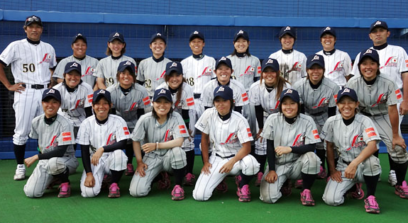
We’ll start things off with the champs, Team Japan. Japan is wearing the same uniforms that brought them success in 2010, home and roads carry the same design (just the base colour switches from white to grey). An orange square-shaped sponsor patch is on the sleeve.
An interesting design element with the pinstripes, certainly not your traditional pinstripe style, the stripes are much more spread apart than we’d ordinarily see and they’re doubled – each pinstripe is actually two thin pinstripes side-by-side. They’re also carried over onto the roads, which is never a good look.
The logo on the jersey and caps are the same, a stylised “J” in red next to “Japan” with a Japanese flag (modified to include gold accents) above the script.
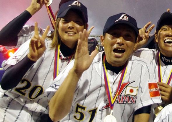
Caps are navy blue and carry the same logo as the jerseys only with the red script now in white.
The player names and numbers are the same navy blue as the cap but ignore the red from the uniforms altogether, instead taking on the gold used on the flag design from the uniform as a trim colour.
The one bit of this uniform separating them from the Japanese men’s team of recent years, the pink shoelaces, well done ladies.
AUSTRALIA
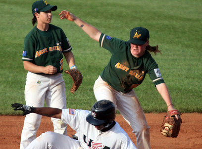
Next up the team from down under, Australia came from out of nowhere to take silver at the 2010 Women’s Baseball World Cup.
Dressed in their national colours of green and gold combined with their “A” cap logo, the Australian team can’t help but look like the Oakland Athletics out on the field.
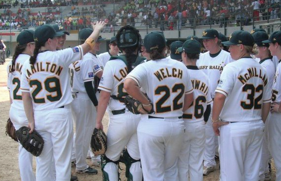
The Aussies wear a traditional white jersey as well as a green jersey as their “road” uniform, both jerseys have the same Australia script with the Southern Cross star-pattern across the front and an Australian flag on the sleeves.
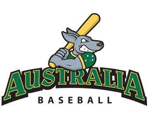
New in recent years is their team logo, which I just have to share…
It’s an angry kangaroo, also known as “A-Roo” ready to swing a baseball bat, hard to design Australia Baseball in a better way than that.
Caps are green with the same yellow “A” logo we’ve seen in recent World Baseball Classics, the script from the front of the jersey appears across the back of the cap.
Aside from lookin’ like the Athletics, it’s a solid, professional get-up.
CANADA
Oh Canada! Silver medalists in 2008, bronze medals in 2004 and 2006, but came in a disappointing 5th place last go-round in 2010.
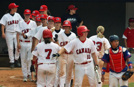
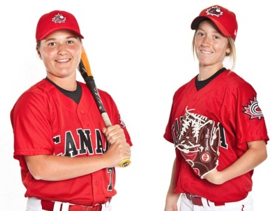
The Canadian team has a very clean and simple look, like the national flag their main colours are red and white (and unlike the flag there’s a black trim on everything).
Different from the uniforms we saw the men wear at the World Baseball Classic is the removal of the red sleeves on the white jerseys, creates a much better look overall.
Red uniforms are worn as a road jersey, the “CANADA” script across the front (as well as the player number) is in black with white trim on these jerseys.
The script and cap logo is exactly the same as it’s been for as long as I can remember watching the national baseball team, including the previous two World Baseball Classics.
CHINESE TAIPEI
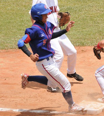
I can’t find much information on the Taiwanese women’s baseball team, aside from the one photo you see above. It appears their uniforms are very similar to those worn by the men’s team at the World Baseball Classic in 2009, and those uniforms are much easier to find, so…
 We’ll use a photo from the men’s side to give an example of the home whites.
The logo is a red “C” paired with a blue sorta half-“T”, and baseball stitching in the white space of the “C”.

This logo worn on the upper left of both the home whites and road blue uniforms, as well as on both the caps and the helmets.
CUBA
Ah the Cubans. Team Cuba has never finished in the top 4 at the Women’s Baseball World Cup, finishing in 6th at the last tournament in 2010.
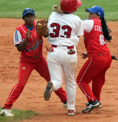
Cuba goes with the all-red look, pants too, thankfully they at least change it up with a blue cap. A blue “Cuba” script is across the front of the jersey.
Sleeves are white with three blue stripes down them (adidas is the manufacturer), white piping goes down the front along the buttons. Numbers and names are one colour (white) with no trim and a standard block font. The cap logo is a white “C”.
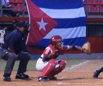
Cuba also has a white uniform, but this is the only shot of it I could find. Based on this it appears to be a flip of the red jersey, white goes where red was and vise-versa.
Unfortunately Cuba is the only team I don’t have the official graphics for, so I can’t show you any detailed shots of their cap or jersey logos.
NETHERLANDS
Europe’s only entry in women’s baseball, Netherlands finished 10th in the 2010 World Cup (and was also on the field during that shooting in the game against Hong Kong).
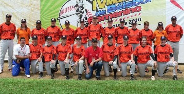
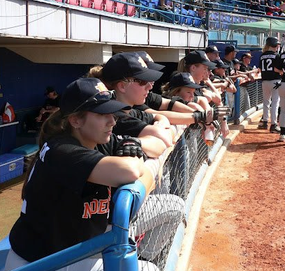
The Dutch women wear orange uniforms with black caps and their local name across the front “NEDERLAND”, also in black.
Caps are black with an orange “NL” logo on the front.
When they’re not sporting that classic Holland Orange, Team Netherlands can be seen in their alternate/road black jerseys, which feature their nation’s name across the front in orange. The black cap is also paired with this jersey.
UNITED STATES OF AMERICA
Well, things started out fantastic for the US women’s baseball team, as expected, with back-to-back golds in 2004 and 2006. But since then they’ve failed to qualify for the gold medal game, taking home the bronze in both 2008 and 2010.
Revenge will certainly be on their minds as they take the field tonight in Edmonton looking to get back on top of that podium.
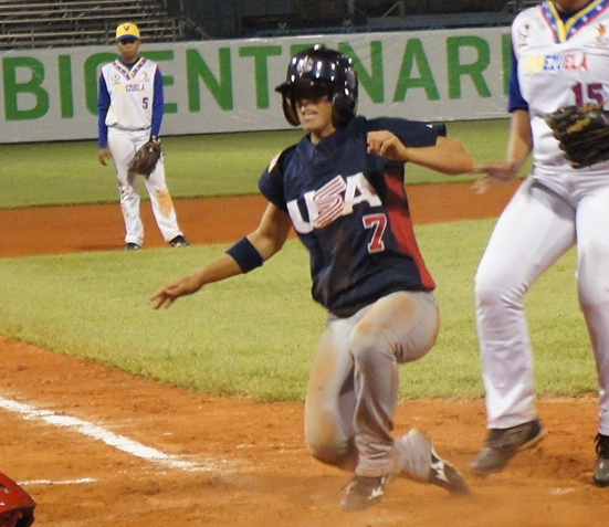
Along with the whites, Team USA wears a blue jersey with red stripes up the sides, red numbers on the front and back (no player names) and a flag on the sleeve.
The flag is reversed from your typical US flag design because the blue field of stars are supposed to be in the direction the object is moving, to create the illusion of the flag blowing as the player moves.
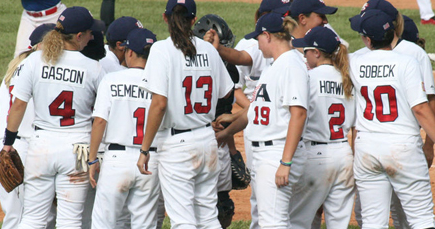
The white uniforms feature no fancy stripes, or piping, it’s your no nonsense, “we’re here to win” look. Red numbers with blue trim, simple blue block names on the back.
Both jerseys have the ‘USA’ script across the front with the ‘S’ designed to mimic the red-and-white stripes of the US flag.
Caps are blue with the “US” logo on a silver star.
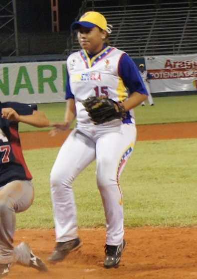
VENEZUELA
And finally, Venezuela!
The hosts of the previous games, Venezuela made great strides on their home turf making it to their first medal game, ultimately losing to the United States in the bronze medal match.
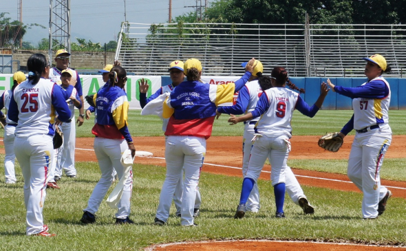
The Venezuelan team certainly has the most colourful uniforms of the group, totally embracing their national colours of red, blue, and yellow.
Their pant stripes are the most unique feature of their set, a yellow, blue, and red lightning bolt with stars along the blue portion of it. This pattern is utilized again (not in lightning bolt form) around the collar of the jersey.
The “VENEZUELA” script across the front of the jersey is smaller than typical and a little hard to read since a third of it is in yellow on a white field. The other portions of the script in red and blue, again patterned after the flag. At first glance I did not see the country name in the script, my brain assumed it was an advertisement… they might want to fix this considering how much national pride they put into this design.
Blue sleeves are worn with a white vest to complete the jersey, caps have a yellow crown and blue bill, a blue “V” logo on the front.
—
So there you have it, the logos and uniforms of the 2012 Women’s Baseball World Cup, as stated earlier the tournament gets underway today in Edmonton and will wrap up with the gold medal game on Sunday, August 19th.
If you’re in the Edmonton area I strongly encourage you to get on out to the ballpark and see some talented baseball players put on a show. The complete schedule can be found here.

