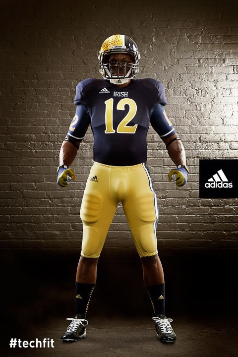
Notre Dame has partially scrapped the golden domes on their helmets. Or exactly 1/3rd which is now navy blue. The Irish announced their Shamrock Series uniforms for their game in Chicago against Navy. The good news is, its for one game only. The bad news is, its almost 100% completely terrible.
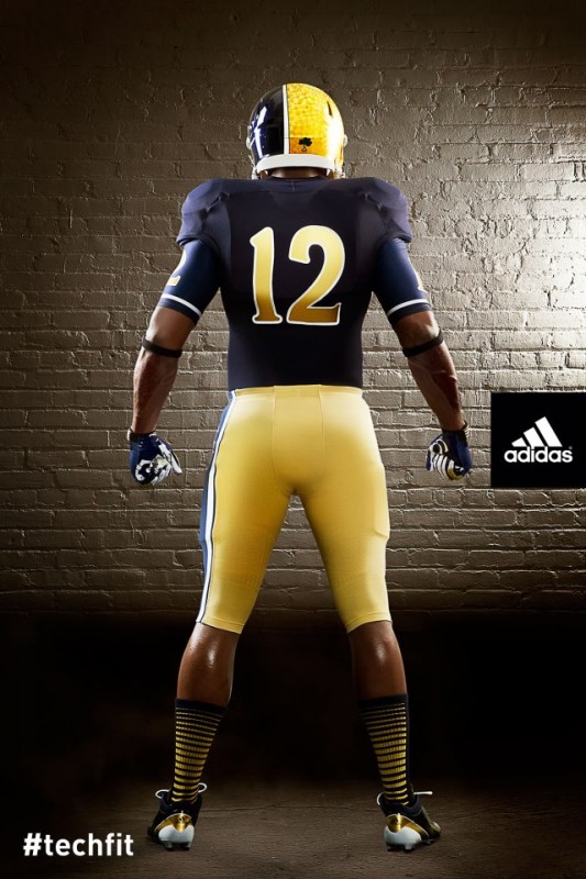
Notre Dame’s adidas TECHFIT football uniform is supposed to be a modern take on the classic blue jersey and features gold metallic numbers and IRISH in a Celtic font. The bright gold helmet is split with a blue section highlighting a large white Leprechaun graphic. Notre Dame’s gold pants feature a blue stripe on the left leg and the updated Leprechaun graphic.
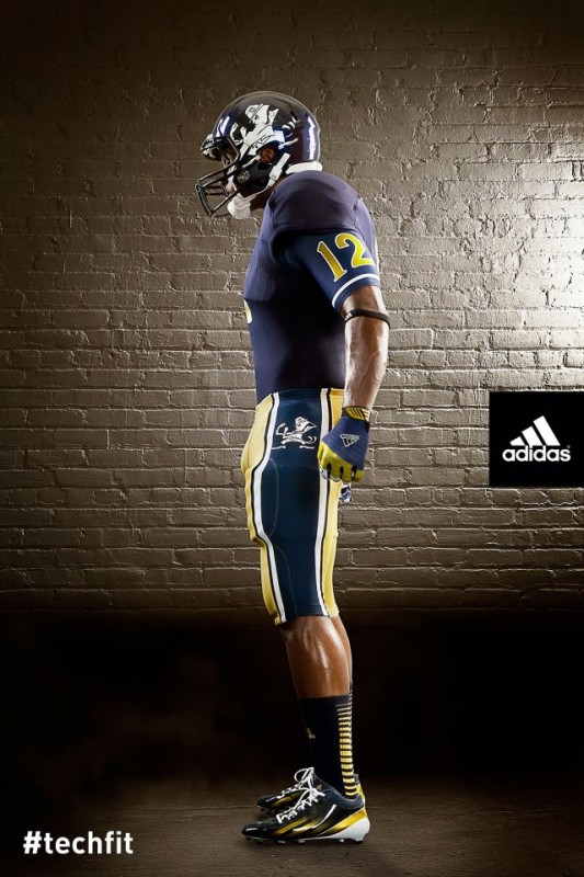
The Fighting Irish’s alternate uniforms are for their Oct. 6 game against Miami at Soldier Field. Even the socks get into the mess, with gradiated stripes, only on the back side. The pants, while still gold, have a giant blue stripe surrounded by white, with the Leprachaun.
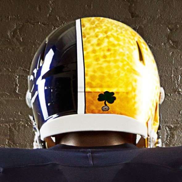
The feature of this uniform is undoubtedly the helmet. At best strange, and at worse an homage to Batman villain Two-Face, the head-buckets have the same textured gold as the one-time use helmets last year, but only across approximately two-thirds of the helmet. The remainder is a opalescent navy with a rather large white rendition of the leprechaun.
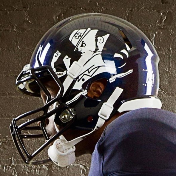
That is two appearances of the leprechaun, and we aren’t yet done. Again I must draw your attention to the sheer size of the decal on the side. It is simply huge.
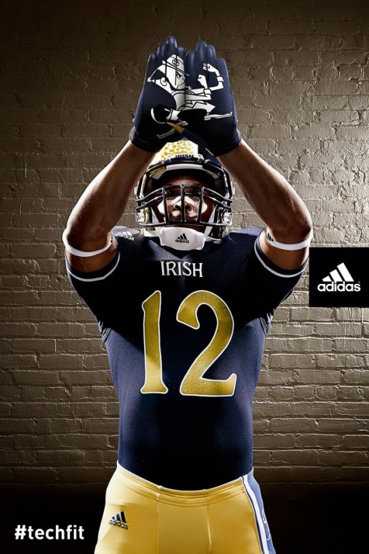
There is our third! Its like a scavenger hunt for racist iconery! Though, to be fair, the logo may be the single traditional item in this entire unholy mess. Check out the custom jersey numbers. Metallic and outlined in white, the color palate is very strong, the font, however, is almost PrintShop Pro awful. One can only imagine the other numbers, in particular the 5 or 7 which could likely have the descender well below the baseline.
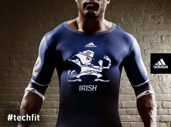
The undershirts will have not only our fourth appearance of the leprechaun but also jersey numbers on the sleeves in two colors.
How did we arrive here? Has “Shamrock Series” always been code word for “Arena-esque?” Not really. This will be the third in the series, which is planned for 3 future matchups. Last year, the uniforms were relatively standard, save for a unique texture in the gold of the helmet, carried over this iteration, and a shamrock, which has not continued.
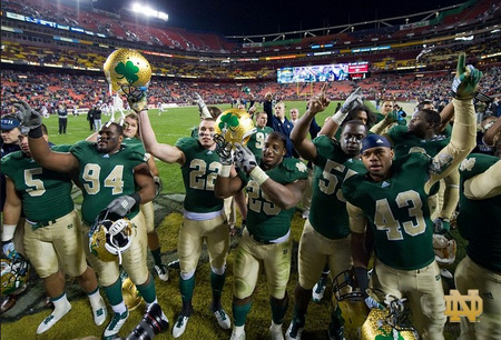
The Series has been at a neutral location each time, and has been against a particular rival. In the 2011 game, the Irish’s odd helmets were practically unnoticed, when on the field with the abomination that were the two-sided, Maryland-flag-inspired, Terrapin uniforms. Apparently Notre Dame was interested in the two-sided look enough to steal it for the 2012 game.
In 2010, the Irish looked practically traditional, in their “lucky” green jerseys.
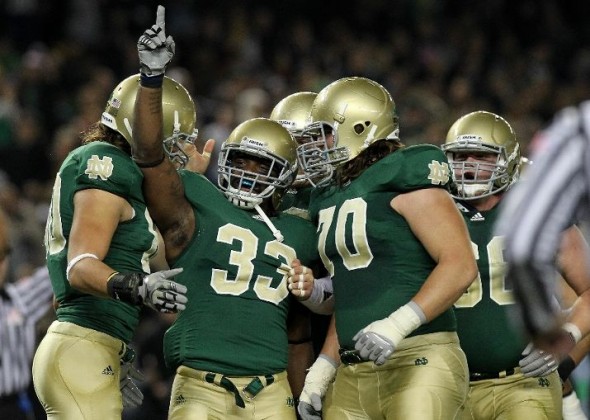
These helmets were coated in genuine gold leaf, and Adidas was attentive to colors, making sure the helmet matched the numbers and pants. No such luck in the following years.
So, there was a gentle ramping up of lunacy, but it is full blown here in 2012.
There are players on the team who have tweeted their support, and news agencies are careful to mention items from the press release indicating support for the unifoms.
But this is an absolute slap in the face to generation after generation of tradition and honor at Notre Dame. No matter what your personal rooting interest may be when the Irish are on the field, but any sports fan must genuinely nod to the program’s deep and rich history. These uniforms puke all over that in a shameful act of capitulation to the mercurial concept of “youth appeal.”
This is not the last this website will write on this topic. But it may be the proverbial straw that broke the camel’s back.
What do you think? Does anyone honestly support this garbage? Anyone, anywhere?


