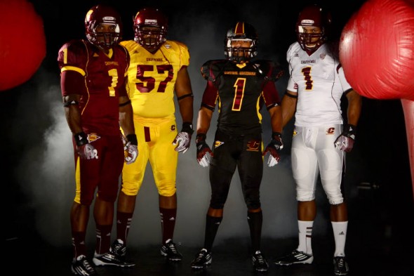
Central Michigan announced yellow, maroon, black, and white sets of jerseys and pants, along with a new black matte helmet. The pieces are meant to be mix-and-match, with the exception of the black helemt, which is said to go with the all-black look only.
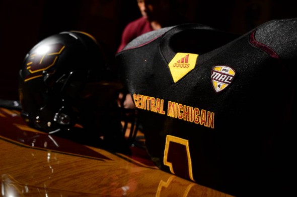
The black uniform features a maroon piping and a grey inset shoulder. This goes with the flat black helmet.
As is standard in new uniform reveals, there is a custom undershirt.
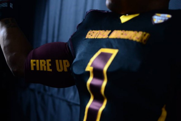
The undershirts feature the team’s rallying cry, with Fire Up on the right arm…
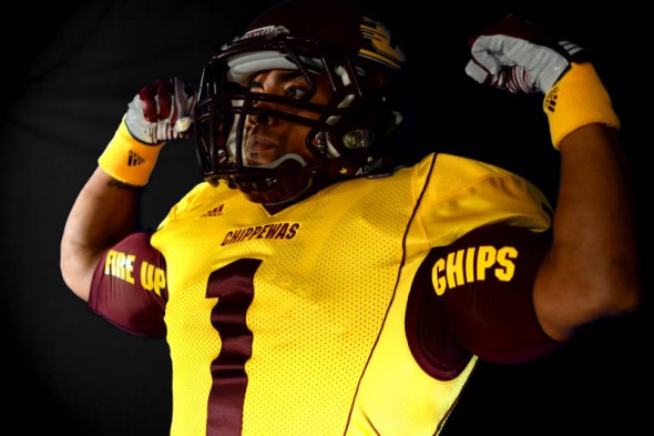
…and Chips on the left.
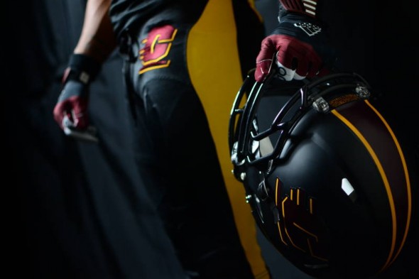
The matte black helmet has a tapered stripe down the middle in the maroon and gold team colors.
Also worth noting here is the large C logo on the hip. Not shown here, but in photos above and below, is the large NCAA Football logo on the opposite hip. Very odd inclusion on the pants. especially since they (of course) included the Adidas logo, which makes for a total of 3 large logos on the front of the pants.
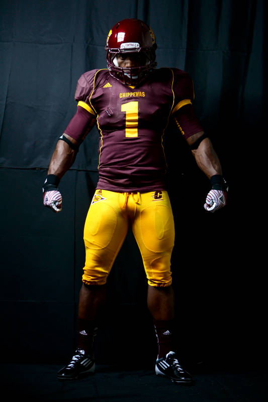
While avoiding the monochrome look by pairing the maroon jersey with gold pants, this photo brings up a problem some teams seem to have; non matching colors. The maroons between the helmet and jersey are blatantly, obviously, not even similar.
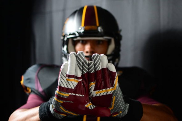
Flying C with extra lines and gradiations decorate the glove, per football requirements. (Not really, it just seems like its a law.)
So, Central Michigan releases the assorted color set of jerseys and pants, some of which even have a different cut or piping look. The combinations should last them seasons of few repeats.
We think this is a good look, color appropriate, even if the matte black is gimmicky and an all black uniform is intimidating no one. Do you agree? How would you have designed the Chips?

