Houston Astros owner Jim Crane provided some clues as to what we may see the Astros wearing next season during a charity event this past Thursday.
According to Crane, in a Houston Chronicle article, the new uniform includes “traditional” designs based off of Astros uniforms of the past and that the new uniforms “incorporates them in a very modest way… they’re classy.”
Crane confirmed that their new uniform designs have been submitted to Major League Baseball and the club is now just waiting for approval at this point, unless there’s something very strange with their design I doubt MLB will have any objections.
The Astros will be changing their uniforms to coincide with their shift to the American League for the 2013 season.
Back in May, Crane had the following to say about the new uniforms:
“We’ll blend some of the new with the history of the team and some of the colors in the past, we’ve selected it all and we’re about to submit it. We’re due in on the 30th (of May), so everything’s set to go to baseball for approval… We’ve gone to great lengths in getting everyone involved including the guy who washes the uniform, the locker room guys, the players, the fans, everybody involved in the process.”
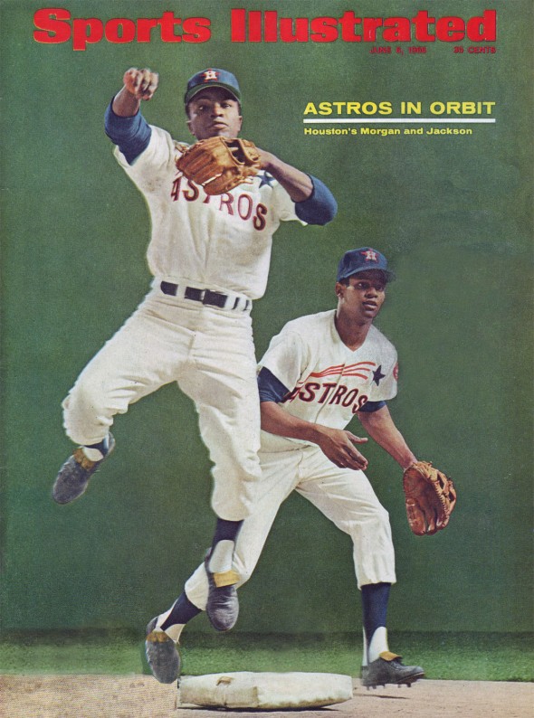
“Traditional” designs based off of Astros uniforms of the past could mean a few things, the team has had a few distinct eras from a design point-of-view but some things stuck around for a lot longer than others.
In terms of colours, the Astros/Colt .45s were dressed in navy blue and orange for their first 32 seasons (1962-93) while the blue and gold era, lasting only 6 seasons, was done in a blink of an eye by comparison. The current black, brick, and sand look has been around now for 13 seasons.
The “streaking star”, the first uniform style the Astros used and what seems to be most popular in Astros uniform re-design concepts among fans, was used for ten seasons from 1965-1974, the last 4 of those seasons in orange caps. I haven’t seen nor have I heard what they’ll be doing, but this design is my pick for what they’ll end up basing their new design off of next year.
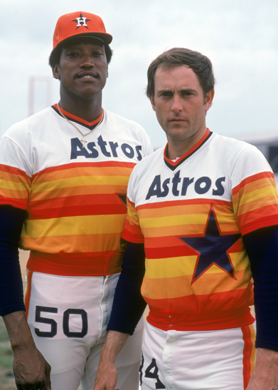
Those infamous “rainbow guts” uniforms came next beginning in 1975, finally phased out completely after 12 seasons in 1986. I would be absolutely stunned if the Astros brought this look back full time – this would be an example of a uniform that I think would be rejected by Major League Baseball if presented. Button-up jerseys would also not be possible with this design.
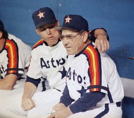
The “Rainbow Sleeves” era started off as a road uniform worn alongside “Rainbow Guts” in 1980 eventually being promoted to full-time home and road (with a slightly lighter version worn at home) in 1987. This uniform was phased out along with the orange-and-blue colour scheme at the end of the 1993 season. If the Astros are borrowing elements from various uniform designs of their history, maybe we’ll be seeing those rainbow striped sleeves on the new uniform?

In 1994 the blue and gold “shooting star” era began, the first complete uniform/logo overhaul in team history. The Astros recently wore this uniform over an entire weekend claiming it was a good luck charm. This event would have occurred after the deadline for submitting the design to MLB would have passed, so don’t think it will be factoring into their design decisions.

Finally, the current look debuted in the 2000 season, their first at Minute Maid Park. Another new colour scheme, this time a more “western” theme of black, brick red, and sandy beige. While this uniform was worn during the Astros greatest single-season accomplishment, winning the National League pennant in 2005, I wouldn’t expect to see much of this look carrying through to 2013. If anything, maybe the cap logo.
So… what could it look like? It’s obvious that it’ll be blue and orange, that much is clear. So, throw all of the elements of the past into a blender and you’d get something like this:
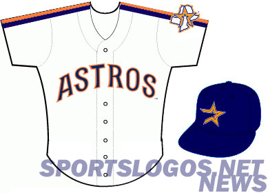
Which, admittedly I’d probably be okay with.
What about you? What would you LIKE to see the Astros do in 2013? That brings us to our poll question of the week!
[cardoza_wp_poll id=3]


