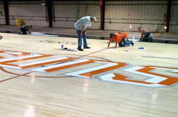
It looks as if the Phoenix Suns are making some changes to their logos and possibly uniforms for the 2012-13 season.
Photos of their new home court design (see above) show a very different font in a Suns wordmark logo than we’ve ever seen before as well graphics from their official website and Facebook accounts suggest there will also be other changes in store…
The secondary logo (which the Suns have been using as if it were their primary logo) has gotten a slight modernization it seems. The PHX font is now bevelled, the basketball has black seams on it instead of purple, shading on the lower part of the basketball has also been toned down. Overall a much simpler and cleaner design

Also on their website shows a new script logo, perhaps one that will appear on the uniforms. This script logo features a similar font to the one shown in the court painting photo at the top of this article.

One neat thing about the new centre court logo is that it’s an ambigram, in that it can be read exactly the same upside-down as downside-up, now fans sitting on the opposite side of the court will not have to view their team logo upside-down.

No word on when or if the Suns will be announcing these changes as official, the latest NBA stylesheets still show the Suns as using the same logos and graphics as 2011-12 but clearly the team is definitely doing something new.


